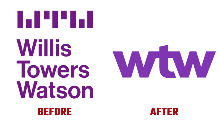
The world’s oldest Willis Towers Watson Public Limited Company, a brokerage venture that has been in existence since 1828, recently unveiled its new identity—created in its current format in 2015 by the merger of Britain’s Willis Group Holdings plc and America’s Towers Watson & Co. Further expansion of the structure required significant changes in strategy and plans, which needed to be reflected through a new visualization. But time was of the essence in this matter, as the rebranding of the international company had to be accomplished in the shortest possible time. This was dictated by today’s environment; implementing external changes using traditional techniques with a delayed process to consider hundreds of different options is “death. The effectiveness of modern branding of a large international company of this type with more than 200 years of history requires the ability to recognize the opportunities and seize the moment quickly. Studio Monigle was able to cope with such a task and presented a new look for WTW in just 100 days.
The success was due to the brand’s and artists’ desire for quick, focused, and confident decision making, which ensured the result in less than four months. The many years of change and change that the brand experienced through its mergers and acquisitions required a rapid restoration of a self-identity that allowed it to boldly and accurately define and showcase its promising future. Beginning with the formation of a new strategy, the designers immediately set about designing a logo that would be able to activate employees in a short period and form a clear signal to the entire industry.
The new identity was based on a modern minimalistic style, according to which a brief visual communication of what the brand wants to communicate about itself was created. The new logo demonstrates the boldness, clarity of the company, its desire to be an important connector for each of its clients. The brief was based on the high level of intelligence, experience, and relationships that the company has always prided itself on. In doing so, it provided a detailed demonstration of the rethinking that has occurred of how an industry leader can use branding to enhance its strengths, setting the course for a promising future as a renewed unified company – WTW.
The updated company’s signature color is ultraviolet, which not only supports but doubles down on the company’s fearless and dynamic spirit without any limits. The logo brings a unified and bold perspective to the visualization, filling it with humanity and an important message about the beginning of a new era in the company’s development.


