Convenience and comfort for dog owners are provided by the Ollie electronic online service, which provides the opportunity to subscribe to elite food for their pets. The subscription includes only freshly prepared dishes from natural ingredients, making them suitable even for humans. The subscription guarantees their timely delivery without loss of freshness and taste. The idea of such a delivery belongs to Randy Jimenez, Alex Douzet, and Gabby Slome, who has assembled an experienced team of specialists and true animal lovers.
The brand’s nutritionists developed the main formula of the dishes and their recipes, which were approved by experienced veterinarians, who divided according to weight, age, activity, and the presence of individual characteristics for each animal. All dishes are a combination of fresh, natural products and healthy additives. The cooking process takes place under the strict control of experienced technologists at appropriately low temperatures. Packaging is carried out manually in volumes according to incoming orders, which does not allow the product to accumulate and be stored for a long time with the risk of loss of nutrients and the possibility of spoilage. This uses innovative atmospheric packaging that effectively preserves products. The design of this package and the formation of a new brand identity was entrusted to Strand Studio, a design studio based in New York, NY- and Los Angeles, CA.
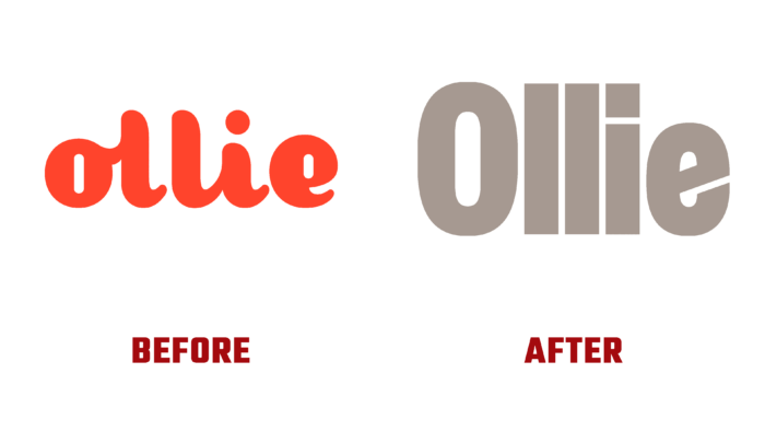
The new brand logo has become more minimalistic and informative. The bold Founders Grotesk sans-serif font used to write the text module retained its friendliness but acquired the ability to scale, which greatly expanded the number of interaction points. The text has become more concise, somewhat imperfect but has acquired a visual softness, demonstrating the brand’s real attitude towards its wards. The ingenious play with negative space in the “e” creates a visual shaping of the contours of the measuring spoon. This moment is especially noteworthy for its subtlety of thoughtfulness and execution. With the help of this visualization, the maturity and evolution of the brand over the years of its existence are successfully conveyed. The new corporate color adds subtle sophistication and effectively complements the atmosphere of the whole composition with softness and goodwill.


