


![]() Wonka Logo PNG
Wonka Logo PNG
The Wonka logo is very sweet and effective at attracting buyers’ attention. Elements of the sign, like hardening caramel, make one want to bite off a piece urgently. The emblem conveys the bar’s special, unforgettable taste.
Wonka is the name of the original chocolate bars with cinematic origins. They appeared several times in R. Dahl’s famous novel. Dahl’s famous novel is about an eccentric chocolatier and his young assistant who wanted to learn the confectioner’s trade. The creation is known as Charlie and the Chocolate Factory. Inspired by the novel’s screen version, the famous company Quaker Oats decided to make the fictional sweetness real. Confectionery products received the appropriate design. It was a bright, colorful design with elements reminiscent of the legendary film. The style changed many times, but each new version did not deviate from the original concept.
The story began in 1964 when Dahl published Charlie and the Chocolate Factory. The book follows young Charlie Bucket as he explores Willy Wonka’s chocolate factory, filled with imaginative sweets and inventions, including chocolate rivers.
In 1971, the story was adapted into the film Willy Wonka & the Chocolate Factory, starring Gene Wilder. This film brought the book’s magical elements to life and helped promote a line of Wonka-branded chocolate bars, blending fiction with the real world.
Dahl continued the adventure in 1972 with “Charlie and the Great Glass Elevator,” which introduced more creative inventions and sweets.
The 1980s marked the launch of the first Wonka products by Breaker Confections, which Nestlé later acquired. They released items such as the Wonka Bar and the Everlasting Gobstopper, promising fun and adventure through their packaging.
In 2005, Tim Burton’s adaptation of Charlie and the Chocolate Factory, starring Johnny Depp, rejuvenated the brand, making it popular again among a new generation. This film was successful and maintained the brand’s magical image.
Despite market challenges and changes in consumer preferences from the 2010s onwards, Wonka continued to inspire nostalgia and wonder.
Wonka’s journey from a literary concept to a beloved brand showcases the power of storytelling. It combines Dahl’s imaginative stories with real products, allowing consumers to experience the magic. The brand remains a symbol of creativity and the endless possibilities of imagination.
Meaning and History
![]()
Wonka Bar compares favorably with other sweets. The main reason is the special story behind its appearance, which is associated with fairy tale characters. The candy bar became the embodiment of a fictional product at the center of a fascinating children’s novel. Moreover, its production began around the same time the movie based on the famous creation was released.
A new kind of chocolate quickly became popular, so the company began large-scale production of candy with magical overtones. Throughout its existence, the candy bar was produced in different wrappers. Almost all of them had a bright color scheme, the original font associated with magic, and elements from the movie. Such a product was instantly recognizable in the shop window.
What is Wonka?
Wonka is the short name for the Willy Wonka Candy Company, owned by the Swiss multinational corporation Nestlé. The factory where the sweets are made is located in Itasca, Illinois. The first candies under the famous brand began appearing in 1971, the same year the film Charlie and the Chocolate Factory was released. Their wrappers featured the logo with a bold color scheme.
1971 – 1996
![]()
The first Willy Wonka chocolate emblem, introduced in 1971 and used until 1996, captured the same uniqueness and originality as the eccentric chocolatier’s factory. The design reflected the magical and innovative approach to chocolate-making that Willy Wonka championed. The logo’s letters were styled to appear as if scattering in various directions, reminiscent of the factory’s bustling conveyor belts and circular lifts, suggesting a continuous flow of creativity in chocolate production.
A cozy window scene at the center of the logo featured Willy Wonka tipping his hat in greeting. This personalized and welcoming touch promised customers that each chocolate was crafted with imagination and care, offering something unique.
The logo’s black-and-white design enhanced the theme of surprise and unpredictability associated with Willy Wonka’s factory. This color choice made the emblem more mysterious and intriguing, sparking consumer curiosity about the secrets hidden behind each chocolate wrapper.
1980 – 1982
![]()
The Willy Wonka chocolate logo uses brown and beige colors that resemble chocolate. These colors match the product and highlight its natural quality. They remind customers of real cocoa and the ingredients used in the chocolates, which helps build trust in the product.
The logo retains the factory window design, featuring a chocolatier greeting customers and highlighting the brand’s friendly, open nature. The chocolatier is drawn in a modern, animated style in this version. While he doesn’t look much like the original Willy Wonka from Roald Dahl’s book, this flexibility helps the logo be widely recognizable across different media and products.
The chocolatier’s image on each product package promises quality and taste. It assures customers that every Willy Wonka chocolate will be a delightful experience for children and adults alike. This commitment reinforces customer trust and highlights the brand’s dedication to chocolate-making excellence.
1982 – 1996
![]()
The latest Willy Wonka chocolate logo features a scene from “Charlie and the Chocolate Factory” where Charlie finds the golden ticket. This ticket symbolizes the chance to meet Willy Wonka, the innovative chocolatier. The emblem captures the thrill and hope of discovering the golden ticket in a chocolate bar, making each customer feel a personal connection to the adventure.
The emblem prominently displays the golden ticket featuring Willy Wonka, symbolizing an exciting adventure and a unique chocolate experience. Willy Wonka’s bold signature under his image reinforces that each chocolate bar is made with personal care and oversight.
A white outline around the golden corner and Wonka’s image make the emblem stand out on the packaging, highlighting the originality and creativity that Willy Wonka brings to his chocolate creations. This design suggests innovation and creativity are central to the Willy Wonka brand.
1996 – 1999
![]()
The new candy brand was introduced a month before the release of the novel’s screen version. Quaker Oats introduced Wonka Bar candy to the market in the spring of 1971, working with two manufacturers: Chocolate Factory and Willy Wonka. A little later, viewers had the chance to watch an interesting movie in which the tasty bar kept appearing. It was a marketing ploy that generated good profits for the brand.
The first candy bars had a stylish thematic design. The following elements can be seen on the wrappers:
- A large Wonka Bar inscription.
- A dark background;
- An impressive hat.
The last part was associated with the movie’s main character, the chocolatier Willy Wonka. This style emphasized the fairy-tale format, as evidenced by the magician’s hat, the unusual typeface, and the distinctive color scheme. The letters had artistic curves, and each had a unique design.
The designers used shades of gold, red, and basic white. The hat and the word “Bar” had a golden hue, and “Wonka” was decorated with white. Using such colors created a contrast effect and attracted customers’ attention.
1999 – 2008
![]()
During this period, the brand was owned by one of the world’s biggest corporations, Nestlé. It turned Wonka into an umbrella brand; as a result, other sweets began to be sold under this name. This list included Laffy Taffy, SweeTARTS, etc. In connection with this, a rebranding was carried out. The new visual concept differed significantly from the original version.
The wrapper changed color, the font became more complex, and the overall picture was updated with new elements. At the same time, the traditional brand icon, a magician’s hat, was preserved in the updated packaging. It was made in blue and moved to the center of the letter W. The twisted ends were removed from the font, while the magical style was retained.
The coloring was updated with blue and brown. The first was used as a background, and the second was used to design the new element, chocolate drops. The word “Bar” changed from its golden hue to a basic white. The updated design proves that the company strives to develop and constantly improve its products. In addition, the new design became brighter, more positive, and easier for children to understand. And they were the main target audience.
After some time, Nestlé released a new line of bars, “Wonka Exceptionals.” However, the company did not stop there, and several more flavors appeared later. The concept of the icon changed again during this period. Management decided to change the color palette and design in general.
The basis was taken from the version that existed from 1996 to 2009. The luxurious purple color appeared on the package, harmoniously combined with gold, white, and red shades. The font became simpler again, losing the fancy curls.
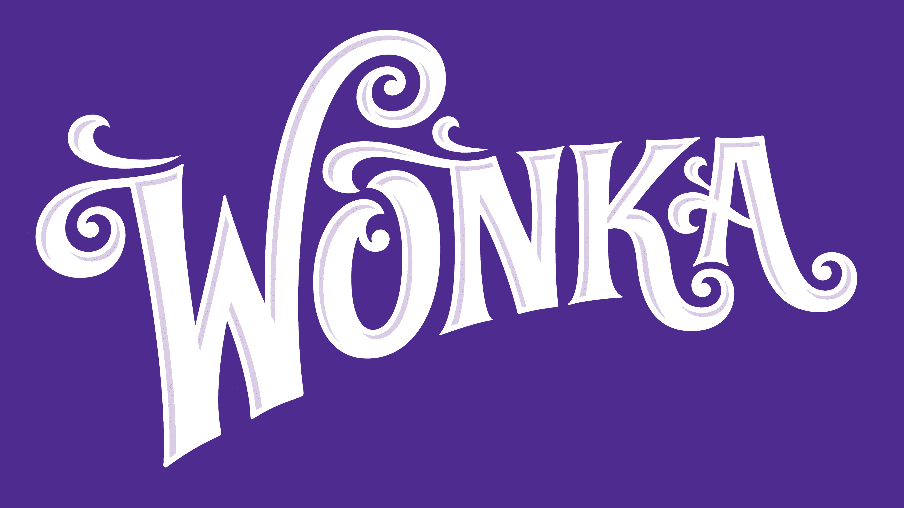
2008 – today
![]()
The updated Willy Wonka brand logo is filled with symbols that reflect the brand’s blend of legend and fantasy. It depicts a world where reality and imagination merge, bringing dreams to life with delicious, unique chocolates.
The logo’s lilac color, symbolizing dreams, talent, and Willy Wonka’s imaginative world, adds a magical and mysterious touch. It highlights the chocolates’ uniqueness and charm and suggests creativity and innovation that set Wonka’s products apart.
The logo features letters with splashes that evoke a wonderfully aromatic blend, greeting anyone who opens a Willy Wonka chocolate bar. These splashes capture each chocolate’s rich flavors and aromas, inviting consumers into a world of taste.
A whimsical font with swirls adds playfulness and elegance to the logo. The swirls and curves enhance the sense of wonder and unpredictability, emphasizing the magical experience of trying Willy Wonka chocolate.
Font and Colors
The logo uses a unique, whimsical font custom-designed to capture the brand’s playful essence. This exclusive font ensures the brand stands out uniquely.
The letters are bold and artistically styled with elongated, curving lines that suggest creativity and imagination. Their vertical strokes are square at the base, lending stability and structure to the playful design.
Decorative swirls in the font reflect the brand’s fantastical, imaginative traits, enhancing memorability and highlighting its commitment to creativity and individuality.
Wonka’s corporate style combined bright colors to create a single color scheme. This evoked pleasant associations with a warm fairy-tale atmosphere, especially appealing to children. The purple-and-white color scheme is eye-catching, tying in with themes of magic and adventure. Purple, symbolizing mystery and luxury, supports the brand’s premium, enchanting image, while white contrasts sharply, ensuring the brand name pops and remains easily recognizable. This thoughtful design aims to spark a sense of wonder and delight, perfectly aligning with the brand’s identity.
FAQ
Why is the Wonka logo purple?
The Wonka logo is purple because purple has long been associated with royalty, luxury, and uniqueness. Long ago, making purple dye was hard and costly, so only the rich or royalty could wear purple. Even in later times, such as when Queen Elizabeth I ruled England, laws were enacted stating that only members of the royal family could wear purple. This kept the color associated with exclusivity and high status.
Nowadays, companies choose purple for their logos and branding to show their products are luxurious and high-quality. For example, Cadbury uses purple to show its chocolate is premium. Wonka, a brand based on Roald Dahl’s stories, uses purple in its logo and packaging. This makes Wonka stand out not just as offering candy but as offering a magical, luxurious experience. For Wonka, purple makes it look unique and imaginative and connects it to a tradition of luxury and exclusivity, making customers feel they’re getting something special.
Who designed the Wonka logo?
Pentagram, a design firm, created the Wonka logo. This logo captures the magic and charm of Willy Wonka and his chocolate factory. Pentagram is known for its creative designs and branding. Their Wonka logo shows the fun, kindness, and endless creativity in Roald Dahl’s story.
When making the Wonka logo, Pentagram wanted to show what Willy Wonka is all about: his cleverness, the wonder he brings, and the magical feel of his factory. The logo isn’t just for identifying the brand. It’s also a door to the imaginative world Wonka stands for. It reaches out to people who already know the story and those who have just met Wonka. The team at Pentagram carefully considered the story’s themes and visuals while designing the logo. They looked at the amazing inventions, bright candy colors, and the factory’s dreamy vibe. The logo they came up with invites people into a world filled with creativity and kindness.
What does the Wonka logo symbolize?
The Wonka logo uses a unique font to show magic and the special way Wonka creates sweets, which seems like real magic, especially to kids. This magic captures everyone’s imagination, making the brand very appealing.
The letters in the Wonka logo are intentionally shaped unusually. They show how different and creative Willy Wonka is, like in Roald Dahl’s “Charlie and the Chocolate Factory.” Willy Wonka is known for being innovative and for not following conventional candy-making methods. The logo’s design shows this uniqueness and creativity, making Wonka stand out to anyone who sees it.
What is the meaning of Wonka?
“Wonka” comes from Roald Dahl’s book “Charlie and the Chocolate Factory.” It’s the name of the character Willy Wonka, who owns a magical chocolate factory. The name has come to mean creativity, wonder, and everything extraordinary. Sometimes it’s used to describe something odd or meaningless, but mostly it captures the creative, magical side of Willy Wonka’s world.
Wonka is also the name of a real candy company, the Willy Wonka Candy Company, inspired by Dahl’s book. The company’s logo and products aim to evoke the magical atmosphere of the chocolate factory from the story. “Wonka” means a lot of things. It’s not just a character from a book but also a real brand that tries to add some magic and creativity to our lives. It reminds us of a world where anything can happen and encourages people to imagine and dream.
What happened to the Wonka brand?
The Wonka brand, known for its association with Roald Dahl’s “Charlie and the Chocolate Factory,” has undergone significant changes. The famous Wonka bars were discontinued, and Nestlé, the company that made Wonka products, chose to change the brand’s direction. They launched a new Nestlé Candy Shop brand, abandoning the playful, imaginative Wonka theme. The Wonka name is barely mentioned, just a small note above the Nestlé Candy Shop logo.
This change marked the end of the magical, creative Wonka world that many people loved. The Wonka brand’s spirit influenced Nestlé’s candy products until 2018, but the focus shifted to a more standard candy brand with the Nestlé Candy Shop. This was a big turn from the innovative and whimsical world Dahl created. Ending the Wonka bars and moving away from the Wonka branding were significant changes, shifting from a world of imagination to a more typical candy-brand identity.
Is a Wonka bar real?
Inspired by Roald Dahl’s “Charlie and the Chocolate Factory,” Wonka bars were once real chocolates you could buy. Starting in 1976, these chocolates leaped from the book’s pages to store shelves, exciting fans with the chance to taste the magic. In Dahl’s story, Wonka bars had golden tickets hidden in some of them, offering winners a tour of the enchanting Wonka Chocolate Factory.
Nestlé, the company that makes these chocolates, captured the book and movie’s imaginative spirit, creating different versions of Wonka bars over the years. But all things come to an end, and so did the production of Wonka bars. Nestlé stopped making them and shifted away from the Wonka brand. This decision marked the end of being able to buy a piece of this magical world. Even though Wonka bars are no longer made, they hold a special place in the hearts of many, reminding us of the joy and wonder in Dahl’s story and the excitement of the possibility of finding a golden ticket.