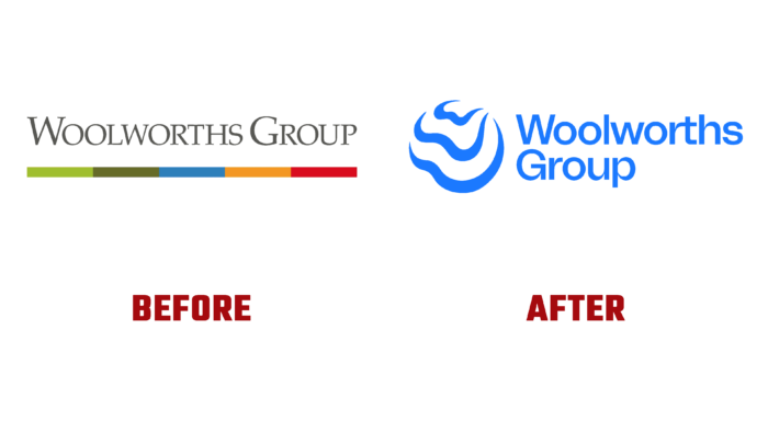
The world’s largest Australian retailer, Woolworths Group Limited, has unveiled its new look. The company has a rich history, having started its activity in 1924 in Sydney; the brand has expanded, covering all of Australia and New Zealand with its sales network. The brand has separated its gambling, alcohol sales, and hotel services to improve the financial climate and expand its capabilities. The company has carried out several activities to form subsidiaries and acquire others for ten years. As a result of the reorganization, the brand underwent a rebranding in early 2022.
The new logo has become an effective reflection of what the company united in the group stands for and what plans it has for the future. The architecture of the entirely new design was based on a key point – demonstrating a commitment to its common goal. The main message of the visualization was the slogan – It all starts with ‘We.’ This idea is reflected in the sign in the form of a blue circle formed by several stylized letters W, uniting both the word “We” and the brand name itself. The flowing shape of the badge speaks of the brand’s agility and adaptability. Its openness confirms the presence of expanded thinking, the desire for effective partnership.
The color palette is distinguished by this color shade’s liveliness and friendliness characteristics. At the same time, the wave-like graphical execution of the sign shows how collective influence is exercised, and their convergence at a common point on the horizon symbolizes the common commitment of the group that makes up the brand to the desire to achieve a better future.
The graphics and execution of the new logo give it a strong personality, sometimes even too much. Dynamics only enhances this effect, making visual perception not always attractive. At the same time, animation and video do not reduce the negative. The Tomato Grotesk font from The Designers Foundry used in the text block looks good. Still, it does not add liveliness and energy to the image, having absolutely no graphic connection with the sign. However, the created original ligature of combining the letters “rt” provides the required attractiveness, drawing the eye to itself. In the complex, the composition does not create any effects that ensure the memorability and recognition of the brand, reflecting its most beneficial aspects. Visualization is easy enough for renowned design company Re, with offices in Sydney, London, Shanghai, and New York.


