The updates carried out by the Work for Good brand demonstrate not only its new achievements. With a new image and in its revised corporate identity, the company is taking important steps to popularize the idea that small businesses can provide effective assistance to others and radically change the current situation, turning it for the better. At its core, the brand sees the opportunity to break down the various barriers that stand in the way of those who wish to give charitable support, opening up untapped and sustainable income for them. It is enough to manage the moment correctly so that the business in which its owner believes can radically change the difficult situation of others. With Work for Good, a strong and sustainable bridge is created between the business representative and the charitable structure, allowing you to easily and naturally begin the process of raising funds for a cause that will be especially significant not only for the one to whom the funds will be sent. To reflect all the features of this process in its new modern form, the brand implemented its idea of a new visual image by inviting Sunhouse, whose work is constantly filled with positive and contagious potential.
The updated Work for Good identity, with its help, has greatly simplified the visual presentation of information the demonstration of the history and features of the brand. This improved the effect on the viewer and simplified the interaction with him. The new visual image is more friendly, warm, and inviting through the use of warm and soft shades in the brand’s color palette, which creates bright, hopeful color compositions. All illustrated materials acquired not only color saturation, clarity, and definition of the boundaries of their placement. All illustrated material was created with one important goal – to create an atmosphere of unity and well-being, which is characteristic of this community.
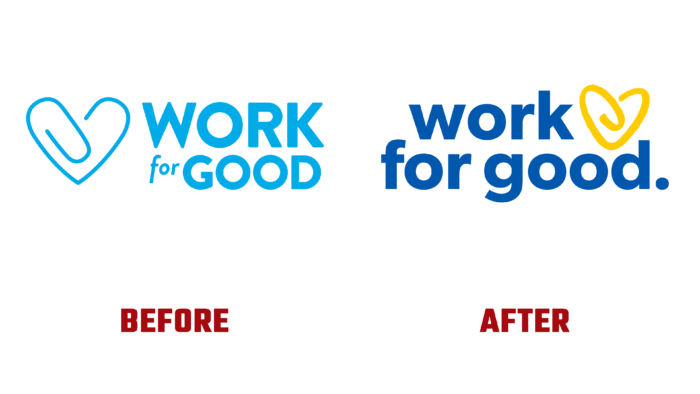
The use of bold but clear in their execution and graphic boundaries of letters in the text material, made with the help of light blue color, ensured the convenience of reading it in any version – both in typographic and digital versions. At the same time, a clear definition of the place of each letter opened up wide opportunities for creating a text emblem, which can be used even in a small format where space is overloaded with various elements. The new logo retains the traditional paperclip, bent in the form of a heart, but created in a bright yellow color tint that gives the element the necessary accent, highlighting it against the background of blue text while forming a harmonious color composition of blue and yellow. The sign makes the logo attractive and symbolically conveys the brand’s main essence – work from the heart with care for others.


