


![]() Workday Logo PNG
Workday Logo PNG
The Workday logo uses related symbols to depict the company’s activities. The emblem hints at cloud computing, with a cloud rising towards the sun. The sign conveys a feeling of lightness, joy, and rising to the top.
Workday is an American company that develops and distributes software products for cloud computing, wealth management, and human resources management. It was founded in the spring of 2005 by two entrepreneurs, Dave Duffield and Aneel Bhusri. They both worked at PeopleSoft before Oracle acquired it, so the ex-CEO and former chief strategist were forced to seek new employment. The result of their creative quest was the Workday project. Its place of foundation is the California City of Walnut Creek. The current location of the head office is Pleasanton, which is in the same state.
Workday’s career did not start in the spring of 2005 but a year later, in November 2006, when the company was officially opened. Dave Duffield, the founder, and Greylock Partners, a venture capital firm, initially funded it. In 2008, the organization moved to Pleasanton (California) and is still located there.
After the move, the software developer did not rebrand or change the logo; he just stepped up his activities. Over a short period, the web service has made several profitable acquisitions, joining competitors. The most recent purchase is Stories.bi, owned by Filip Doušek. In 2018, she became a Workday subordinate. But at the same time, the company never changed its identity, remaining faithful to the debut version.
In parallel with improving the material and technical base, the company expanded the number of product updates. In the spring of 2020, there were 34 software re-releases, the most recent being 2020R1. Also, its logo is widely recognized in several US states where clients use its applications: Virginia (Ashburn), Georgia (Lithia Springs), and Oregon (Portland). Foreign partners are in Ireland (Dublin) and the Netherlands (Amsterdam), as well as other technologically important locations. Soon, a new PaaS product will be released under the corporate logo.
Meaning and History
![]()
What is Workday?
Workday is an American developer and provider of programs that help manage finances and human resources. It appeared in the spring of 2005 and, by 2020, was the second-best company in the Bay, with the best working conditions.
2005 – 2024
![]()
The debut Workday logo combines simplicity, dynamics, and the meaning embedded in each element. The orange arch is the center of attention. It connects the letters “o” and “a” as if creating an invisible support for the whole word. The shape of the arch resembles the rising sun, symbolizing the beginning of a new day, energy, and opportunities. The image resonates well with the name because every working day begins with dawn and new goals. The curved line evokes technological solutions that unite people and processes, as if “covering” them under one roof.
The arch is of medium thickness, which is noticeable even from afar. The company name is located under the arch. All letters are written in lowercase. The grotesque sans serif font is used, and the forms look simple and modern. The inter-letter space is quite wide.
The letter “k” is not made according to classical canons. The right part of the letter resembles the mathematical symbol “<, “which adds a slight technological accent.
Blue is associated with reliability and professionalism, while orange adds energy and positivity. Although these two colors have opposite tones, they complement each other well, creating a balance between business seriousness and openness to new ideas.
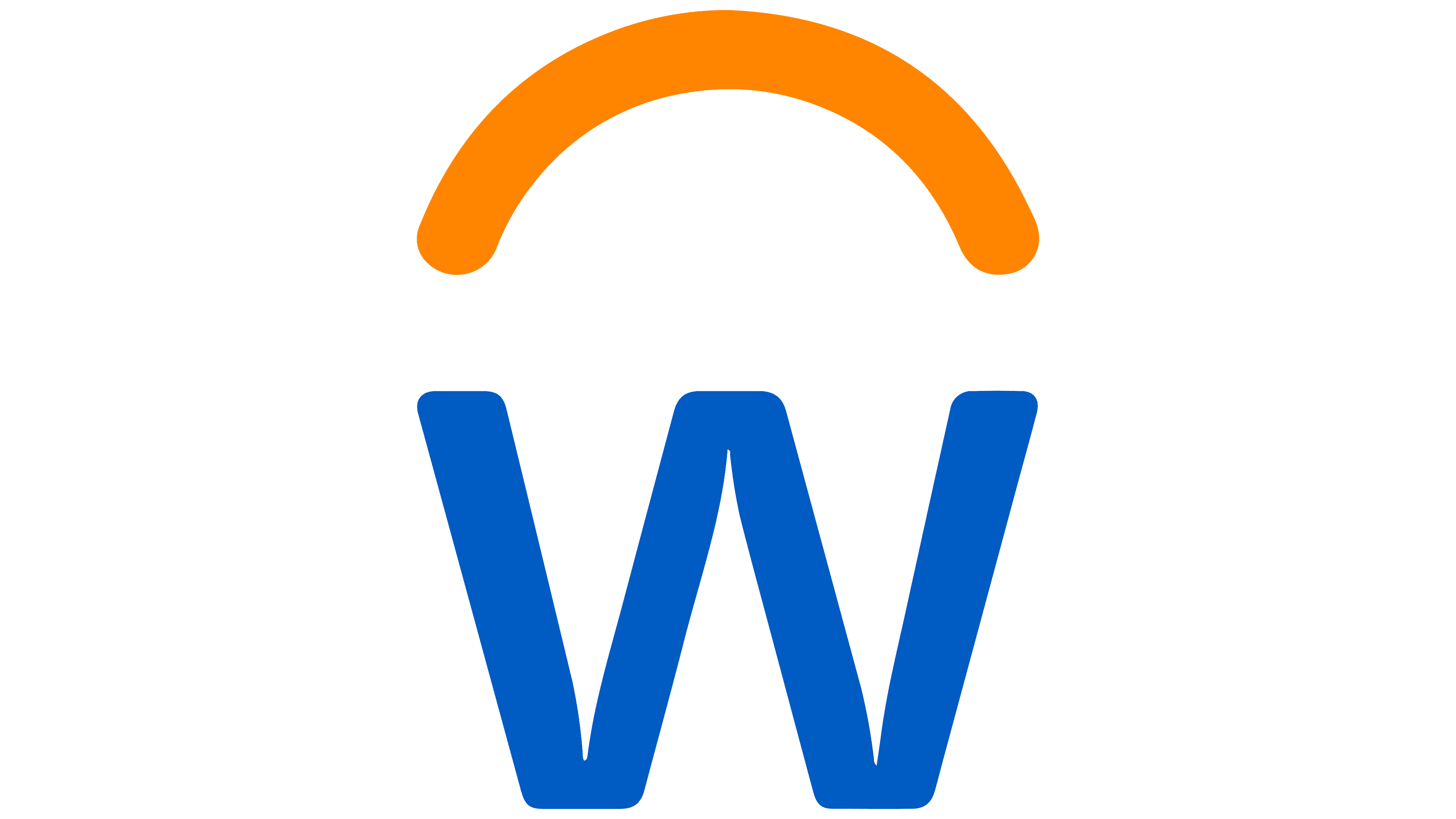
2024 – today
![]()
After Koto’s rebranding, the Workday logo has received new energy and a fresh look. This is a reinterpretation of the brand that emphasizes its connection to people, technology, and the future.
The main symbol is an arch. Unlike the old version, where the orange arc appeared as a separate element, it now emerges from the letter “W,” making it an organic part of the logo. The arch still symbolizes sunrise, a new day, and perspectives, but its shape is softer and more natural.
Koto redesigned the font to make it even cleaner and more modern. The new corporate identity was called Workday Sans. It combined strict geometry with smooth lines.
Features of the letters:
- The “w” now looks more stable, with soft, rounded edges and slightly cut edges.
- The “k” retained its unusual shape, reminiscent of the mathematical sign “<. “
- The “r” has been given a shorter curvature, giving the text a lighter appearance.
The color palette remained classic blue and orange. Blue symbolizes reliability and professionalism, and orange symbolizes energy and friendliness. We made slight changes to the shades, making the colors slightly more saturated.
The rebranding of Workday is a step towards a lighter and warmer visual language.
Font and Colors
A rather complex font distinguishes the logo. The inscription traces the motives of several typefaces since each letter is individual. They echo the individual symbols of the Cambridge Round Regular, Torcao Demi, and Linear FS Bold.
The firm palette is stable. Initially, it consisted of a dark blue shade under code #2c69b6 and an orange color from the #f4990b spectrum. Their background is neutral white, making them visible.
FAQ
What is the workday font?
The company uses the Roboto typeface in its Canvas Type system, which includes fonts like ‘Roboto Bold’ and ‘Roboto Bold Italic.’ Roboto is modern, clean, and easy to read, making it suitable for many uses.
The brand chose Roboto for its clarity and professional look. Roboto works well across digital and print platforms, ensuring consistent visual communication. With different weights and styles, such as Roboto Regular, Roboto Medium, and Roboto Light, the brand can create a flexible design system that meets various needs while maintaining a unified look.
This typeface is designed for legibility and accessibility, making it ideal for clear, efficient information presentation, which is crucial for the brand’s communication goals.
Is Workday a company?
Yes, it is a company. It is publicly traded on the New York Stock Exchange under the WDAY ticker. The company provides cloud-based applications for finance, human resources, and student/faculty lifecycle management. These applications meet the needs of modern organizations and help people work efficiently.
The brand offers a unified platform that helps businesses manage their financial operations and human resources. This includes tools for budgeting, planning, and financial reporting, as well as systems for recruiting, onboarding, and managing employee performance.
What is Workday in HR?
Workday is a cloud-based human resources (HR) software program that simplifies workforce management. It handles payroll, scheduling, employee onboarding, time tracking, learning, talent management, and performance evaluations.
The brand’s software automates payroll payments, reducing errors and saving time. The scheduling tools help manage employee shifts and work hours, making planning easier.
Workday smooths employee onboarding, helping new hires integrate quickly. It streamlines tasks, improving the experience for new employees and HR teams. Time-tracking features let employees log work hours accurately, helping monitor attendance and productivity.
Who founded Workday?
David Duffield and Aneel Bhusri founded the company. David Duffield, the former CEO of PeopleSoft, had extensive experience in enterprise resource planning (ERP) software. He was well-known in the industry for his leadership at PeopleSoft, which offered a comprehensive suite of HR and financial management solutions.
Aneel Bhusri, the former Chief Strategy Officer at PeopleSoft, co-founded Workday with Duffield. Bhusri’s background in strategy and knowledge of the software industry complemented Duffield’s operational expertise. Together, they aimed to create a company that would use cloud-based solutions to change how businesses manage HR and financial operations.
They built a powerful, flexible, and user-friendly platform that meets the evolving needs of modern organizations. The brand quickly gained traction in the market due to its innovative approach and strong leadership.
What is the brand Workday?
It is a company that provides cloud-based software for managing financial and human resources operations. The brand focuses on creating tools to help organizations manage their cash flows and people efficiently.
The financial management software includes budgeting, financial planning, and reporting features. These tools give businesses real-time insights into their financial performance, helping them make informed decisions.
In human resources, the brand offers solutions for managing the entire employee lifecycle, including recruitment, onboarding, payroll, performance management, and talent development. The software simplifies HR processes, making it easier to attract, retain, and develop employees.
The software’s cloud-based nature ensures it is accessible from anywhere with an internet connection. This flexibility allows businesses and employees to access important information and perform tasks remotely.
Is Workday trademarked?
Yes, it is a trademarked brand. The name “Workday” and its logo are registered trademarks of Workday, Inc. This gives the brand exclusive legal rights to use them and helps protect its identity.
A registered trademark prevents other companies from using a similar name or logo, avoiding customer confusion. This protection is important for maintaining the brand’s reputation and ensuring customers connect the name and logo with its high-quality products and services. By securing legal rights, the brand builds customer trust and strengthens its market presence.