World Scouting, representing over 57 million members across 175 National Scout Organizations worldwide, has introduced a new visual identity. This update maintains the Scout Movement’s core values and traditions while modernizing its appearance to improve clarity and recognition across various platforms.
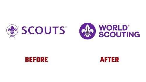
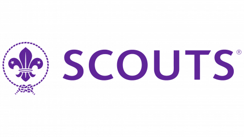
The most prominent change in the new World Scouting logo is the updated fleur-de-lis, a symbol long associated with the Scout Movement. The previous logo featured a fleur-de-lis encircled by a rope knot with two stars. While these elements were rich in symbolism, they made the design complex and sometimes difficult to reproduce across different media.
The new logo simplifies the emblem by placing the fleur-de-lis within a circle, removing the rope and stars. This minimalist approach modernizes the logo and enhances its versatility. The consistent presence of the emblem within a circle makes it more iconic and recognizable, regardless of color or background. The circle creates a strong, unified outline that ensures the logo’s effectiveness at any size.
A new wordmark featuring “World Scouting” accompanies the updated emblem. The typeface chosen for this wordmark complements the simplicity of the emblem and adds a contemporary feel. The smooth curves and clean lines of the typography provide:
- A fresh look.
- Aligning with the organization’s mission to connect with a global audience.
- Particularly the youth participating in scouting activities.
The color palette has been refined, sticking to the signature purple, a key part of the scouting identity. Purple symbolizes leadership, wisdom, and dignity, central to the Scout Movement. Consistency in color helps maintain a sense of tradition, while the updated design elements offer a fresh perspective.
In addition to the logo, the new visual identity includes a series of shapes and “stitches” inspired by knots, patches, and neckerchiefs—iconic elements within scouting. These design elements add texture and playfulness to the brand’s applications, providing flexibility for the organization at all levels to create communications. Using these “stitches” evokes a sense of craftsmanship and attention to detail, qualities integral to the scouting experience.
The overall design strategy leans toward a modern and streamlined aesthetic while retaining the heritage and symbolism important to the Scout Movement. This balance is crucial as World Scouting continues to evolve and expand its global reach.
By simplifying and modernizing its visual identity, World Scouting aims to increase its appeal and accessibility and ensure it remains relevant in a rapidly changing world. The new logo and branding elements are designed to resonate with both long-time members and new participants, reflecting the organization’s commitment to fostering personal growth, leadership, and community service among young people worldwide.
As World Scouting moves forward with this new identity, it is well-positioned to continue its mission of educating young people and helping build a better world. The refreshed branding symbolizes the organization’s commitment to these goals and readiness to meet future challenges and opportunities.


