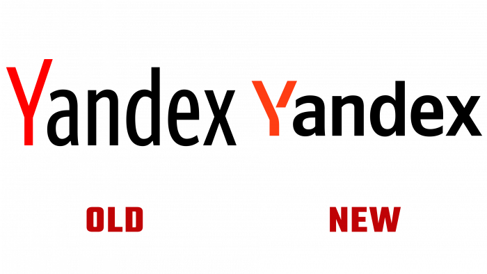
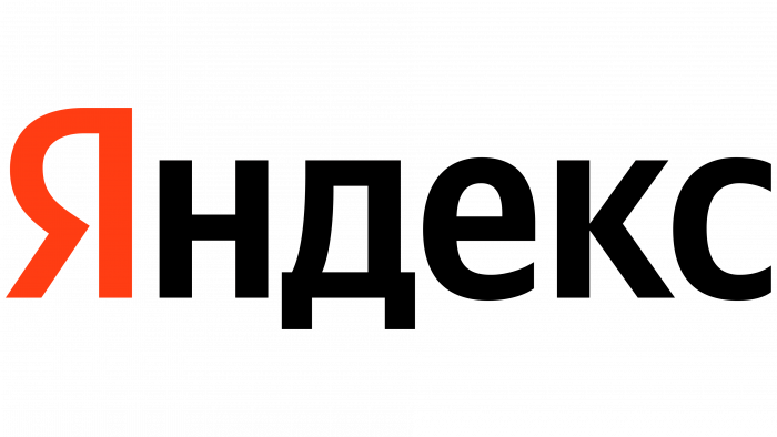
The company presented the user with a new identity, which was created to unite all the company’s products.
Yandex has long ceased to be just an ordinary search engine. The company now specializes in grocery delivery, payment processing, and even self-driving car development. The logo was created by the Yandex design team and Ilya Ruderman, who previously took part in the development of the Yandex Sans corporate font.
The new lettering is presented with flat verticals, pointed corners, and contrasts. The Yandex corporate badge is a white R inside a red circle. It can be seen on online product icons, as well as on courier bags and branded bags. The company also changed the search bar. Now it is presented with straight lines and does not go into an arrow at the end. Also, the designers have added a red sign “Yandex.”
According to the Yandex team, rebranding became necessary after the company launched several services in different areas. The logo blends harmoniously with physical products and online services.
Yandex also presented a Latin version of the logo. An identical font was used with straight lines and clear contrast. Particularly noteworthy is the letter “Y,” which the designers stylized and added unfinishedness.


