The bank is a leader and will confidently lead the client in the right direction, the Yapı Kredi logo says. The emblem exudes a calm and businesslike approach, complemented by a keen interest in the well-being of those who have entrusted their funds to the organization.
Yapı Kredi: Brand overview
| Founded: | 1944 |
| Founder: | Kazım Taşkent |
| Headquarters: | Istanbul, Turkey |
| Website: | yapikredi.com.tr |
Meaning and History
Yapı Kredi Bank has earned an honest name for itself because he first introduced Turkey’s residents to credit cards. Given this fact, the Koç group leaders decided to keep its legendary name as an important and recognizable part of the branding. Instead, they radically changed the corporate style, which caused a storm of resentment among regular customers.
What is Yapı Kredi?
Yapı Kredi is one of the largest banks in Turkey. It was founded in 1944 and is based in Istanbul. Its advantage is a unified network of more than 800 branches, where one can take advantage of a wide range of services – from asset management to insurance. The institution provides loans for housing or car purchases, issues debit cards, and allows opening accounts in various currencies.
1944 – 2006
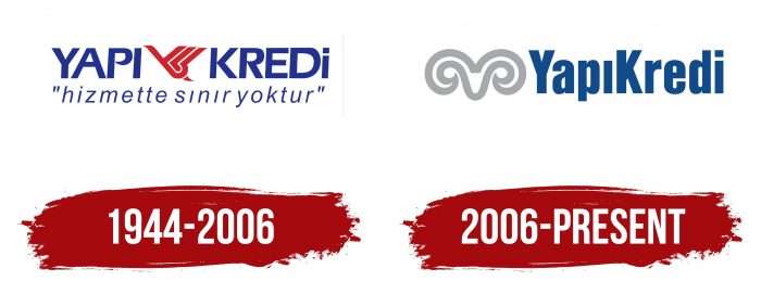
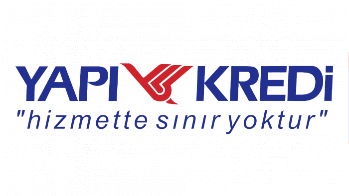
The stork figure has been used on the Yapı Kredi logo since 1944. The choice of the financial institution’s logo was influenced by the results of a study in Anatolia. As shown by a survey of residents of the Asian part of Turkey, people wanted to see this long-legged bird as the bank’s main mascot.
The stork is a symbol of the entire Yapı Kredi era. Previously, it was depicted in a realistic style, and the most common motive was the construction of the nest. And only in 1977, the drawing acquired its modern look. The improved design was closer to abstraction: the bird looked like a complex figure of red stripes. One upwardly protruding line marked the head, three more – the wing, and the small triangle at the bottom was the tail.
Inscriptions surrounded the graphic element. On the left was the first word of the bank’s name; on the right was the second. The slogan “hizmette sınır yoktur” occupied the bottom line. The phrase was written in the letters of the Turkish alphabet and is enclosed in quotation marks. She stressed the responsibility of Yapı Kredi to the country.
2006 – today
At the end of September 2005, Koç Holding acquired more than half of Yapı Kredi’s shares and transferred them to Koçbank. Since then, the logos of the two organizations have started to appear together in television advertisements. The merger process was completed in 2006. As a result, Koçbank lost its name but retained the ancient symbol in the form of a ram’s head with twisted horns.
So the iconic stork “retired.” Its place was taken by a completely different emblem, which is now depicted in gray. The lettering style has also been changed: the designers used the Koç logo’s font as a basis. They also combined the name Yapı Kredi, removing the space between the two words, and changed the case so that all letters except “Y” and “K” were lowercase.
Yapi Kredi: Interesting Facts
Yapı Kredi is a well-known bank in Turkey, famous for its innovation and history.
- Origins: Founded in 1944, it was Turkey’s first private national bank and the fourth oldest, starting with a focus on financing housing and construction.
- Banking Innovations: Yapı Kredi brought credit cards and ATMs to Turkey, changing how people use banking services.
- Wide Network: It has a big network of branches and ATMs throughout Turkey, making banking convenient for its customers.
- Digital Banking: Leading in digital banking, Yapı Kredi has one of Turkey’s most popular mobile banking apps, showing its dedication to using new technologies.
- Supporting Culture and Arts: The bank also supports Turkish culture and arts, hosting events and exhibitions at the Yapı Kredi Cultural Center in Istanbul.
- Going Global: While mainly serving Turkey, Yapı Kredi also works internationally, supporting Turkish businesses abroad and offering global banking services.
- Financial Services: From personal and commercial banking to insurance and investments, Yapı Kredi provides various financial services.
- Sustainability and Responsibility: The bank is committed to being environmentally friendly and socially responsible, backing various initiatives and projects.
- Awards: Yapı Kredi has earned many awards for its services, innovation, and contribution to the banking industry.
- Part of a Big Family: It’s part of the Koç Financial Services Group, a partnership between Koç Holding and UniCredit that combines local expertise with global standards.
These points highlight Yapı Kredi’s significant role in Turkey’s banking scene. It is known for its forward-thinking services, cultural support, and commitment to responsible banking.
Font and Colors
The stork, which has been the bank’s mascot for 62 years, symbolized home and family. These questions worried Kazım Taşkent, whose eldest son tragically died. He wanted Yapı Kredi to help every Turkish citizen to acquire their housing. And the bird bringing children was supposed to be a harbinger of family happiness.
The stork figure on the logo signified development and nesting. In turn, the ram’s head was devoid of dynamics. She has always expressed the values of corporate culture and symbolized only one thing: Koç Holding’s strength. The horned head now connects Yapı Kredi with the parent company on a visual identity level.
After the redesign, not only the drawing changed but also the style of the lettering. The unification of the words “YapıKredi,” using lowercase letters instead of capital letters, and the slogan’s disappearance made the logo as close as possible to the Koçbank brand name. The new font is reminiscent of Balboa Bold, released in 2001 by Parkinson Type Design. It combines elements of old and modern grotesques. Its predecessors were ATF Headline Gothic, Banner, and Newsweek # 9.
The ram’s white head is surrounded by a light gray outline (# C5C4C9). Thus, she is contrasted with the red stork as a symbol of high status. The lettering remains blue, but the shade has changed. Previously, this color was closer to Blue (pigment) (# 2E3092), and now it is much darker (# 174984).
Yapı Kredi color codes
| a7a9ac | Hex color: | #a7a9ac |
|---|---|---|
| RGB: | 167 169 172 | |
| CMYK: | 3 2 0 33 | |
| Pantone: | PMS 429 C |
| Dark Cerulean | Hex color: | #124b8c |
|---|---|---|
| RGB: | 18 75 140 | |
| CMYK: | 87 46 0 46 | |
| Pantone: | PMS 2945 C |

