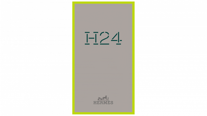
Laconic packaging design with bold accents conveys a sense of masculinity.
The well-known brand hired a studio to design the packaging even before the scent began. As representatives of the studio shared, before starting the development of the visual part, they managed to smell the first versions of the fragrance, which became the inspiration for the design.
The basis of the packaging is typography, namely a strict font with clear lines and spaces inside letters and numbers. The color for the design was chosen gray, making the inscription H24 and the brand logo black. On the sides, you can see the light green-yellow inserts.
One resource for inspiration is the Hermès archives in Paris. The designers also visited a museum in Pantin, where they decided on some packaging elements and a general visual concept. The design work began before the brand launched a men’s perfume, so Yorgo & Co developed a typeface that could convey masculinity regardless of the name.
In addition to packaging design, the Yorgo & Co team was involved in other processes. The studio selected the main colors and created the sales tools. Additionally, the designers have developed digital animation, which was able to play with the unusual shape of the bottle with the H24 logo.
The Yorgo & Co design studio is known for collaborating with global luxury brands such as Louis Vuitton, Emporio Armani, and others. The studio itself is located in Paris – the center of fashion and modern trends. Additionally, designers create a visual identity for various other companies specializing in the production of alcohol, music, or for publishers. The portfolio contains individual fonts, signs, covers, and other works.


