


 YSL Logo PNG
Only when all the elements of the toilet come together does a real, stylish image form; the YSL logo claims. The emblem conveys the fashion house’s ability to create and combine models. The symbols are full of grace.
Meaning and History
Before starting his own fashion house, Yves Saint Laurent was deeply depressed. A year earlier, Dior fired him after he worked as a chief designer for several months, and he was then drafted into the army. Ultimately, he was released from military service, deemed unfit due to a nervous breakdown.
Meanwhile, Pierre Berge looked for investors to found a company. So, in 1961, the iconic fashion house YSL was founded. While Saint Laurent was undergoing treatment, Berge made lucrative agreements and built the business from scratch. The first products to generate income were perfumes. Later, the assortment expanded to include jewelry, footwear, clothing, accessories, and other luxury fashion goods.
But the success was short-lived: in the late 1980s, one investor suffered losses and could no longer finance the fashion house. As a result, Berge and Saint Laurent were forced to sell their development project to the French pharmaceutical company Elf Sanofi Beaute, which acquired Gucci in 1999 along with most of its assets.
Saint Laurent continued to create, leading the haute couture direction. That freedom ended when Gucci executives decided to reimagine the brand completely. In protest, Pierre Berge, together with the eminent designer, tried to create a new business. They opened a high-fashion boutique and took on debt they could not repay. Completely disenchanted with the era of Nike sneakers and monotonous jeans, Saint Laurent gave up the work of his life. Berge resigned as CEO of YSL, and the company itself remained the property of Gucci.
In 2012, the brand underwent a scandalous rebranding. This followed Hedi Slimane taking over as creative director. The new leader removed the Yves name from the fashion house’s name and abandoned the iconic logo, developed in 1962. He pursued simplification, which critics of the iconic brand criticized.
What is YSL?
This brand creates elegant clothing, footwear, accessories, and cosmetics with a bold French style. Its collections blend sophistication and daring, offering iconic eveningwear and practical accessories, including its famous bags. The brand’s symbol is the women’s tuxedo, which redefined women’s fashion. Each item reflects refined and modern aesthetics, making the brand a choice for those who value style and quality.
1962 – 2012
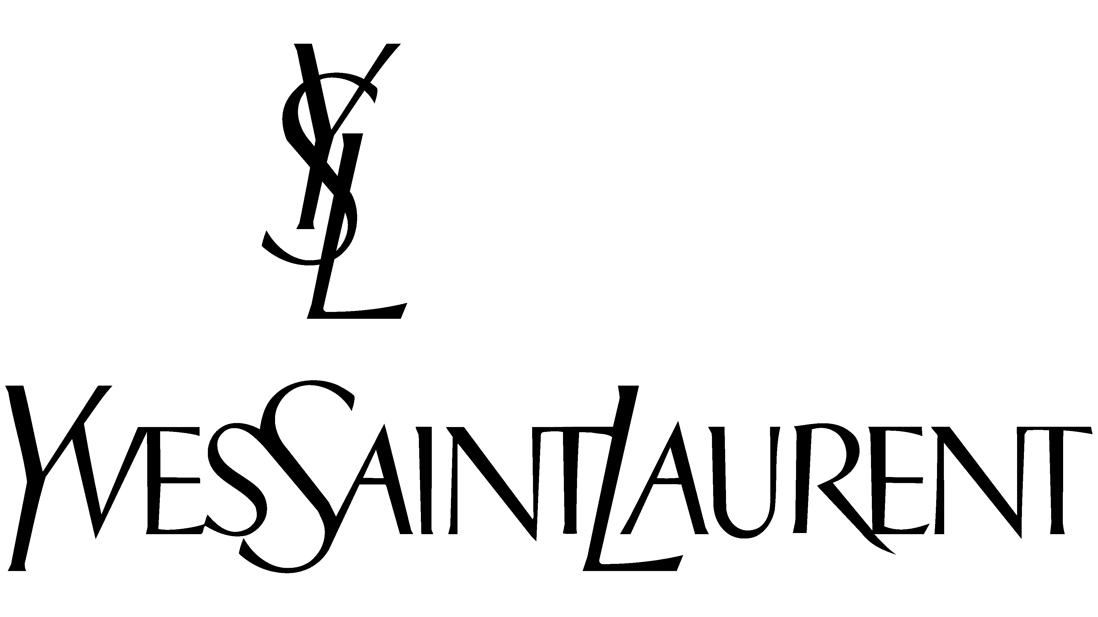
YSL got its first logo about a year after the business started. The designer behind it was Adolphe Jean-Marie Mouron, better known as Adolphe Mouron Cassandre. He was born in Ukraine, then moved to France and studied the arts. The YSL trademark was one of the last works of Cassandre before he took his own life due to depression.
Cubism and Surrealism influenced the artist’s work, which may have shaped his later designs. As a result, the Yves Saint Laurent logo looked extremely unusual. The main symbol was a vertical monogram of stylized letters “Y,” “S,” and “L.” They are exquisitely intertwined, expressing sensuality and a craving for experimentation. In the center was “S,” which was used as a kind of “frame” for “Y” (top) and “L” (bottom). All three letters had short, sharp serifs and lines of varying thickness. This contrast transformed a still drawing into a dynamic image.
Below is the fashion house’s full name. Adolphe Mouron showed amazing creativity by combining the incompatible. An unwritten rule in the world of type designers was not to mix radically different letterforms. But this didn’t stop the Frenchman; he bypassed the restrictions and developed an inscription from an impossible combination of symbols.
The YSL logo combined cursive and Latin styles, as well as sans serif and serif. All characters were in uppercase, but the first “Y,” “S,” and “L” stood out noticeably in size. This size difference was needed to divide the text into three words, with no spaces between them. In addition, the “Y,” “S,” and “L” were oblique, making the lettering feel like it flowed from left to right.
2012 – today
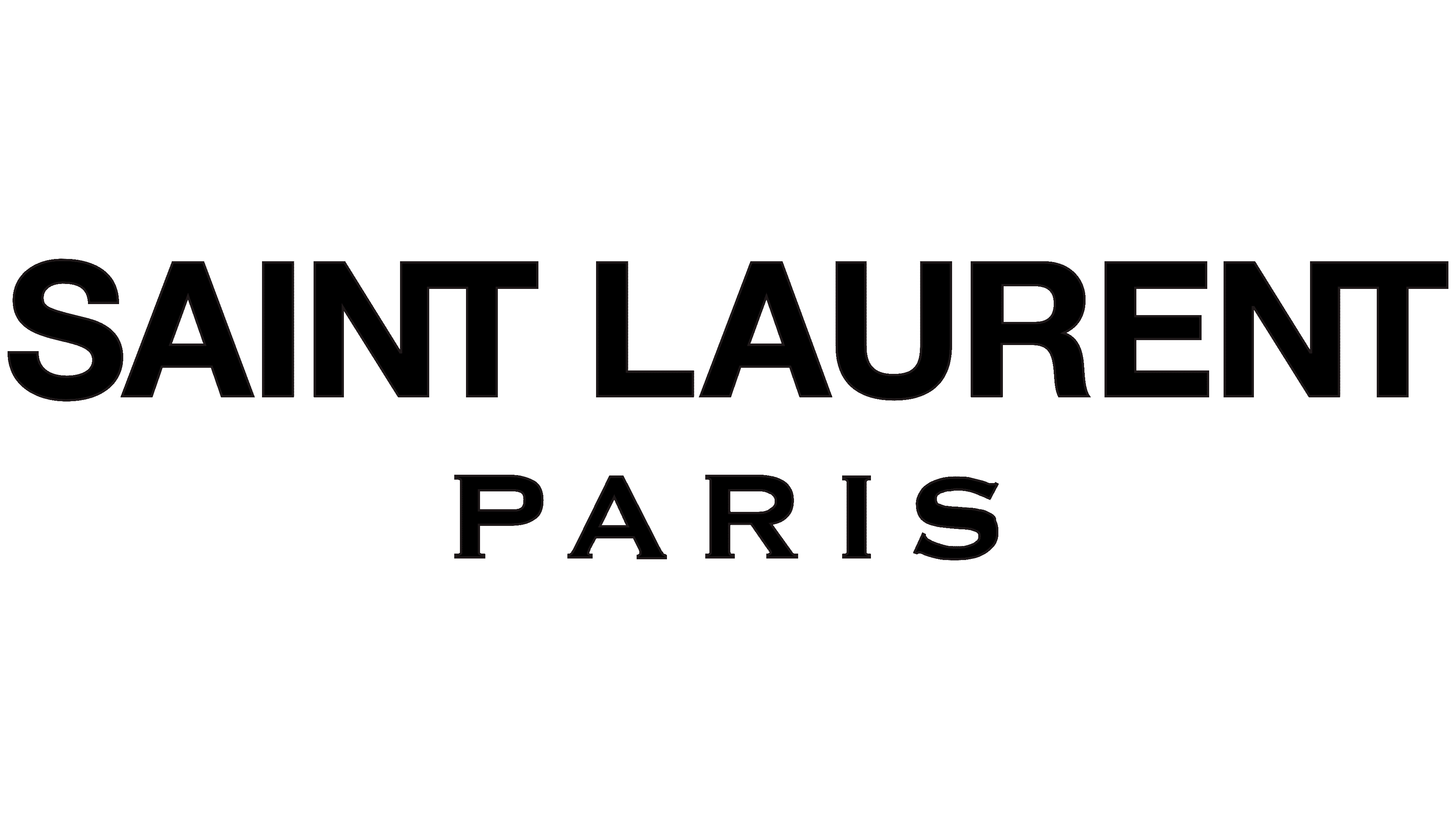
In 2012, new creative director Hedi Slimane decided to break with history and change the brand’s visual identity. For him, it was not a creative experiment but a rejection of the original style in favor of minimalism. The word “Yves” was removed from the logo and the official name of Saint Laurent, leading to high-profile scandals and even the termination of some contracts.
Hedi Slimane also removed the famous monogram and moved its headquarters from Paris to Los Angeles. He managed all this before presenting his first collection. Despite the publicity, Pierre Berge approved the changes. He wanted Slimane to return to the origins of YSL’s fashion style.
The new logo contains none of the original Cassandre design. The modern inscription is based on the sign of the Saint Laurent Rive Gauche brand boutique: laconic, simple, and very restrained. We chose a bold, grotesque font for the company name. A serif appears only in the lower-right corner of the “R.” The letters “NT” merge, meeting at a single point. And under the phrase, “SAINT LAURENT” is the word “PARIS”, a tribute to the city where the fashion house was founded. His font belongs to the classical tradition.
Font and Colors
When the YSL empire first developed, its distinctive symbol was a vertical monogram of three intertwined letters. A deceptively simple, elegant inscription accompanied it. It looked extremely minimalist, with no unnecessary strokes or strange ligatures, because its author, Cassandre, thought through every detail. The artist arranged each letter with geometric precision to create a beautiful rhythm and convey the designer’s sensuality in the lines’ movement.
This is what has set Yves Saint Laurent apart from other luxury brands for decades. But the modern era has changed everything from clothing style to logo design. With the arrival of a new creative director, the company has lost part of its historical heritage. The logo has become much simpler and more compact, and has acquired “heavy,” bold outlines. On the one hand, the changes improved the name’s readability; on the other hand, they deprived the fashion house of its authenticity. The retro symbol is still used only for a few cosmetic and perfume lines.
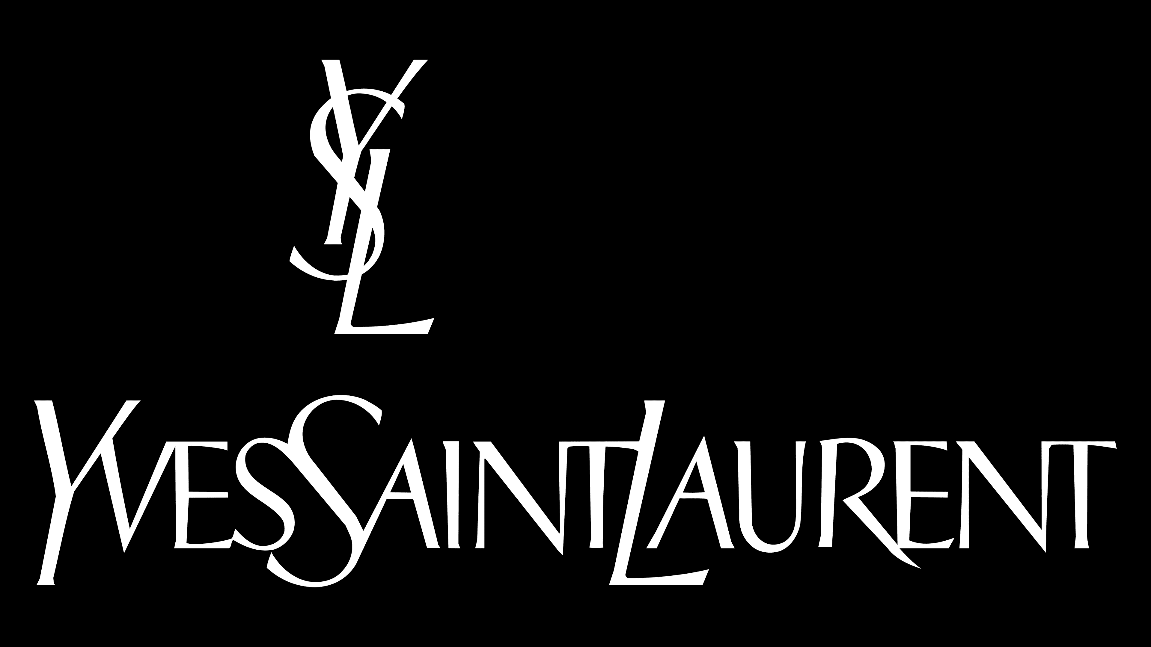
The legendary Cassandre created the first inscription, combining two typefaces in a single line: italic and Roman. The letters had different line thicknesses and short serifs at the ends. In 2012, the phrase “SAINT LAURENT” began appearing in Neue Helvetica. The word “PARIS” appeared at the bottom, highlighted in bold serif – probably Copperplate Gothic Std Bold or its equivalent.
The most popular version of the logo is black and white. It suits labeling any product and follows a minimalist style.