Yubo is a popular social networking site for users between the ages of 12 and 25. The main advantages are the ability to launch streams; moreover, a dozen people can do this simultaneously using the platform. The audience is not limited by the number, how many people have not watched the stream, the quality of the recording or communication at this moment is not lost. Therefore, this service is very popular among young people for its accessibility and technical capabilities for creativity.
It is important to emphasize that the service does not function like the broadcast because the creators do not want to provoke mental problems for young people who lose their creative identity on other platforms in pursuit of grades. By the way, 50 different pronouns can be chosen as a nickname, according to your preferred gender, and all this is also in different languages. During the pandemic, it became very clear that the target audience is Generation Z, which is growing every day worldwide.
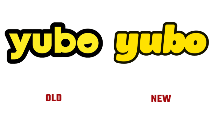
The logo update was timely and very significant. The application has updated the color, making it more perky hot yellow, and the graphic elements are softer, more “rhythmic,” as if in a dynamic dance. The word “Yubo” no longer uses a gap in the letters B and O as a smile symbol. The black outline is leveled, slimmed; all letters are the same size without an accent on the capital letter. It shows equality, personal freedom, positivity, and inspiration. They merged “bo” as if looking at the user with surprised eyes and waiting for his release on the air.
The aforementioned smile icon is now a separate icon. A bright yellow rounded square with a black semicircular fill and a white tongue flirts with the application visitor.
A mascot has also been added – round “Bo,” who is interested in everyone and knows everything about everyone. This is a symbol of a spinning head that cannot ignore interesting things happening around. Also, the blue sky appears in many publications – this gives an impression of cleanliness, openness, and great hope.
For graphic support, the Pangram font Pangram’s Right Grotesk is used. He is playful and visually appealing. Thanks to the agency Koto, which has developed a warm and soulful concept for the rebranding of the youth platform.


