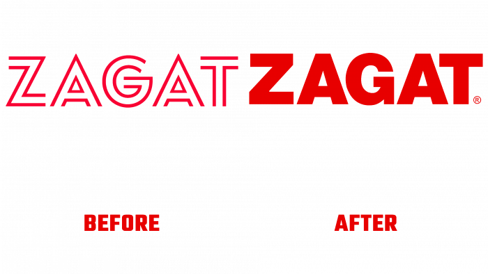
2018 saw the start of a new era for Zagat, the top-rated digital restaurant newsletter. As a new website, it has acquired a different form, external image, and identity. A new identity for one, while only for Miami, was developed by Brooklyn studio, NY-based Franklyn. Ever since 1979, when a family business was launched to form ratings and reviews of restaurants, which visitors created, everything also started from one city. Gradually, the magazine covered more than 70 cities. Moreover, the ratings were not only in the area of restaurants. The ratings expanded to hotels and nightclubs, shops and zoos, movies and theaters, golf and courses, airlines, and music. However, reselling Google’s business in 2011 was the wrong decision. The octopus could not cope with the huge number of tentacles. Having stopped printing the printing magazine Google in 2017, began selling Zagat. And already in 2018, the next owner – The Infatuation – released the magazine in a new digital form.
The idea of ”community voice” was brought back. Custom crowdsourced content and reviews given by the visitors themselves on 30 points are again becoming the main directions. The new app is just being developed for Miami in 2021. Franklyn created a visual identity to form the initial phase of the greatest legacy left after the sale of the brand. The name is very favorably echoed in the Neue Haas Grotesk font with the version of 2015; at the same time, it is better perceived visually and is well remembered. However, by making a gesture towards the old generation, which remembers the brand’s logo, the new emblem loses among the new generation. Possessing more wastefulness, it looks differently at understanding ratings, filling them out.
In a new form of typography, the brand relies on Neue Haas Grotesk, which is “tuned” to the interrupted history of the brand, additional sets of typefaces. The classic modernism of the 70s was chosen for support, characterized by flexibility and a grid system. It was very important to apply a large amount of maroon shade. In addition, bright and light red shades have been added, as well as a white font on a red background – this makes them especially contrasting and unique, memorable, and readable. This palette attracts attention but opens up new horizons and opportunities in the formation of a new identity.


