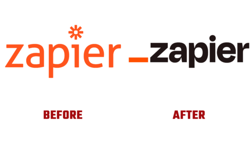
Developed and launched in 2012, Zapier, an application that makes it easy to automate sharing various web applications, introduced a new identity for its tenth anniversary. Developers from Columbia, Missouri, created a prototype as part of Columbia’s Startup Weekend back in 2011, receiving funding for further work. The project’s main objective is to provide simplified communication between different interfaces used in application programming. This saves time and dramatically increases user productivity, freeing them from the hassle of repetitive processes, and has been identified by venture capital firm Bessemer Venture Partners as particularly important. The correctness of this decision was confirmed two years later when Zapier began to make a profit. Today, the brand is constantly evolving and even created a small business relief fund for those in need who face problems due to the pandemic. All these changes, plus the desire to give users a gift for their birthday, led to a change in identity. It reflected the brand’s aspirations for continuous development, using the latest modern achievements, increasing the comfort of use, and expanding its capabilities.
A radically updated visualization better reflects the functionality of the resource and its benefits, concisely and easily conveying the necessary information. It has become an effective framework for creating a unified voice for the entire business, opening up great opportunities for inspiring its users. The eye-catching orange underline in the logo pays homage to the brand’s successful history. Despite its small size, the symbol has become an important starting point in the formation of the entire user-oriented design system. With its help, important information about the capabilities of Zapier is conveyed clearly.
The brand’s positioning as “orange,” adopted as a model since its inception, is now supported by “international orange,” expanding the possibilities of telling about oneself. It is favorably emphasized by several secondary elements of the color palette that enhance the effect created. Among them are such shades as Earth, Moss, Lavender, and Night.
Reimagined typography has led to the use of a combination of multiple fonts. For the brand name, a special Degular was used, which is distinguished by increased expressiveness and pronounced individuality. And GT Alpina with attractive serifs. This performance creates an atmosphere of cheerfulness against the background of readability and maturity.


