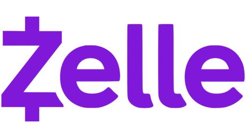
Simplicity and ease of use are visible in the emblem. The Zelle logo demonstrates the immersion of the service inside banking payment systems, which speeds up payment. The sign indicates readiness to serve customers from different countries.
Zelle: Brand overview
| Founded: | 2011 |
| Founder: | Early Warning Services, LLC |
| Headquarters: | Scottsdale, Arizona, United States |
| Website: | zellepay.com |
Meaning and History
The service logo is associated with money because all its services are financially oriented. Zelle operates as a payment network that transfers electronic money directly between bank accounts. In most cases, transactions are free, and there is no commission charged. The main thing is that both the sender and the recipient are registered on a P2P platform and have an open account with one of the partner banks.
Users have repeatedly noted the similarity of the letter “Z” on the Zelle logo with the dollar sign from the table of typographic symbols because “$” is often depicted as “S” with two short lines at the top and bottom. “Z” in this case could represent “$,” turned in the opposite direction. Still, the designers deliberately emphasized the letter’s angularity. They made it different from the smooth and rounded “S.” So the connection between them is not very clear, although it exists at the associations’ level.
The electronic payment service uses a simple logo with a single word, “Zelle.” There are no other elements besides the Registered (Trademark) Sign in a capital “R” in a circle. The ® symbol is usually located in the upper right corner and indicates that the brand has already passed the official registration procedure.
The designers decided on such minimalism to focus on the first letter “Z.” They even detached it from the lettering and placed it in a separate purple square with rounded corners. The short iconic version of the logo is used as the app icon and is often seen on the website, so it is as familiar to users as the full logo with the service name. In this case, in the basic version, the letter “Z” continues to be part of the word and is not separated by anything.
The “Z” has one short vertical bar at the top and bottom, just like a dollar sign. The developers specifically sought such an association so that at first glance, it was clear in which direction Zelle was working and what its services were related to. This emblem is an example of successful marketing when the visual identity does not look like a collection of random elements and can tell more than it seems.
What is Zelle?
Zelle is an online payment system. It allows users to make electronic transfers of funds between bank accounts of registered users. Transaction cancellations are not possible. The service is available to US citizens and is owned by several credit and financial institutions: Wells Fargo, U.S. Bank, Truist, PNC Bank, JPMorgan Chase, Capital One, and Bank of America. Zelle’s main competitor is PayPal’s Venmo.
2011 – 2015
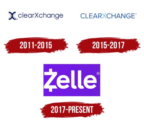
In the first years, the initial name of the online service of instant payments was presented on the Zelle logo, supplemented by the original sign. The most important thing that caught the eye is the unified spelling of the words “clearXchange.” This design made the emblem individual, supported the concept of financial service, and attracted the attention of potential clients. The font was thin, rounded, and grotesque. All letters (except “X”) were in lowercase. Such a structure helped to immediately catch a glimpse of the glyph and understand that it is an electronic money transfer system. To the left of the inscription was a small icon, which also had an “X” on it. It consisted of two dark blue arches, duplicated by smaller light gray arches.
2015 – 2017
During this period, a completely transformed logo was used. As a result of the redesign, only the name of the digital payment network remained on it. It was converted to uppercase and typed in bold. The emphasis on “X” was made with color: the letter was painted in light emerald, so it instantly stood out among the monotonous blue symbols. There was no graphic sign.
2017 – today
After the rebranding, a purple rectangle with the current name of the electronic money transfer system is in progress. White letters are large and bold. Lowercase signs are rounded, but capital signs are not. Designers made it look like the dollar sign ($) but at the same time keeping its individuality. The glyph is written in a standard way – with the characteristic “Z” angles. The vertical line is visible only at the bottom and top: it is absent in the middle of the letter. But even without that, it is clear that the platform it represents is connected with financial issues.
Zelle: Interesting Facts
Zelle stands out in the digital payment world for several reasons and has grown significantly since it started.
- Bank Integration: Zelle works directly with banks, so you can use it through your bank’s app. It’s a smooth part of your online banking.
- Origins: Zelle came from clearXchange, a payment system created by big banks in 2011 to send money easily between people, businesses, and even the government.
- Quick Growth: Since becoming Zelle in 2017, it has become popular because it’s easy to use, and people trust it because it’s connected to their bank.
- Zelle is different from Venmo: Both Zelle and Venmo let you send money to friends, but Zelle’s ties to banks give it an edge in security and trust.
- Fast Money Moves: Zelle can move money almost instantly between accounts at different banks, faster than many others.
- Lots of Banks Use It: Over 1,000 banks and credit unions in the U.S. have Zelle, showing it’s widely accepted.
- No Extra App: If your bank works with Zelle, you don’t need to download anything else. You can use it right in your bank’s app.
- More People Using It: Year after year, Zelle sees more transactions and more money moved, proving people are starting to rely on it.
- Safe to Use: Zelle is as secure as online banking, but it’s best to send money only to people you know because the transfers happen immediately.
- Just in the U.S.: Zelle is made to send money inside the U.S., which keeps things simple and secure for its users.
Zelle combines the safety of traditional banks with the quickness and ease of today’s tech, making it a go-to for digital payments.
Font and Colors
Considering that the logo contains nothing but the service’s name, the designers tried to make the inscription attractive. To do this, they chose a non-standard sans serif font. The bottom edges of the two l’s and both e’s are cut at different angles, making the letters appear disproportionate. The imbalance only balances out the fact that all lines are approximately the same thickness.
Only two colors are used for decoration: white and purple. They can alternate depending on the visual context. If the inscription is dark, then the background is light, and vice versa. In the short iconic version, the “Z” is white, and the rounded square is purple.
Zelle color codes
| Purple Heart | Hex color: | #6c1cd3 |
|---|---|---|
| RGB: | 108 28 211 | |
| CMYK: | 49 87 0 17 | |
| Pantone: | PMS Violet C |
