Often a certain keyword sounds in the company’s names, which designers eagerly play around with within their creative concepts. How many brands with the root -house, -market, -light, -air, and others are on the market now? How many matching logos are there to highlight a roof, chimney, sign, tag, honey, plane, or butterfly?
This is how logos are created on first-order associations. Something that is obvious and comes to mind too quickly. This brand image strategy is not wrong, but it can be unprofitable. Because there is little attractiveness, and the manner of performance leaves much to be desired.
More creative and experienced designers, rebranding agents, analyze a niche and try to distinguish the brand from the rest, make a bright accent, or add a twist that you can’t find anywhere else.
On the example of the Zenbase rebranding, you can see a qualitative update of the identity and the evolution of the image to a new logo.
It is worth noting that Zenbase is committed to offering financial assistance to residents, allowing them to pay rent in smaller installments throughout the month, as well as providing cash advances when families need it during the most critical periods of their lives.
Initially, the brand identity was quite modest and, one might say, mainstream. It’s all about the chosen colors – a delicate light green hue indicated growth and prospects, and black – a company’s solidity, confidence, and firmness. Like many similar organizations that deal with finance, Zenbase did not want to bother with the appearance of Zenbase. After all, the company’s main priority is not to show potential success through a design that throws dust in the eyes of consumers but to present quality services and help make the life of its customers better.
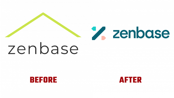
The old logo consisted of a green roof, created with thin lines, and under the roof, the letters of the company name were inscribed in the thin black font: nothing special, just a neat, formal logo.
The new logo features a pleasing variety of colors and shapes. A deep blue, light turquoise, and powdery pink appeared. Geometric shapes directed in different directions create a feeling of lightness, unpretentiousness, movement.
The type part is executed in a rounded sans serif font. The letters A and S look especially graceful.
In general, the logo and its icon look organic and creative. There is a significant difference in style between the old and the new logo. The new one becomes a very effective means of connecting with the target audience because it looks especially beautiful and lively on digital products.
Therefore, we can say that in connection with the rebranding, Zenbase will feel Zen and a sense of integrity, harmony because only with a well-developed identity will the public be able to grasp the values and the very philosophy of the company. The company now has such a harmonious and beautiful logo, which helps create harmony in its clients’ relations with finances.


