The regular customers of this bright and interesting service are always ready to praise the Australian brand Zip. It is a platform that has been offering customers online shopping since 2013. It seems to be nothing new; many companies offer their service.
No matter how it is! Zip is different in that it makes it possible to make purchases in stores without interest as four times within six weeks! This is beneficial for both the service and the customers because it is obvious that the company cares about its target audience and knows its pains well.
The brand’s geography covered both the place of birth, Australia, New Zealand, Great Britain, and then, after a year of vigorous activity, it began to be present in 12 countries, with a workforce of 1000 people and a network of merchants totaling 51 thousand. The company’s service reaches almost 7.5 million customers, which speaks of worldwide recognition and good credit of trust from users.
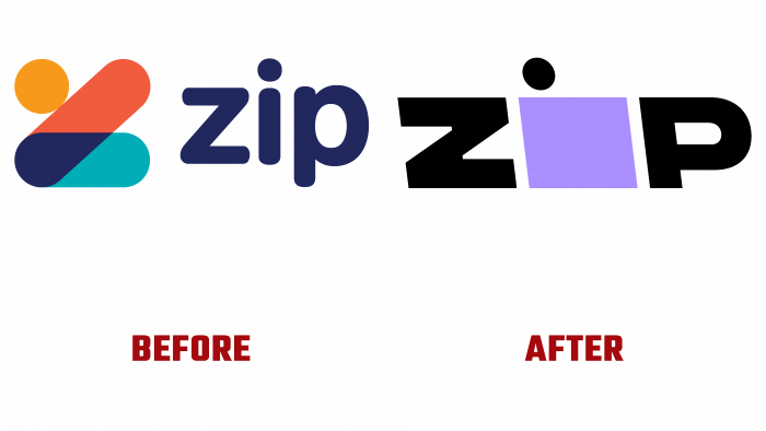
It’s time for Zip to expand and establish itself as a big company. And, as we see from the experience of other brands, the larger the concern, firm, agency, the simpler and more concise their identity looks. The previous logo consisted of a graphic element and a short font inscription. The shades of the man depicted (or so it seems?) It consisted of warm and cold shades – orange, red, which turned dark blue when crossed with dark green. Inscription flush with the symbol in small letters “zip.” Stylish, new, youthful.
But with the growth of the target audience, the possibilities of technological progress, and new traditions in design, the logo began to look more formal. Nevertheless, they left a touch of creativity. Firstly, the pointed geometric font was tilted to the left, so the inscription is slightly beveled. There is a square of lilac shade, above which the black circle is the letter “i,” over which they put a point. From now on, the company’s visual image is less whimsical and perky but dynamic, strong, and, one might say, powerful.
It turns out that the designers of the Koto studio meant speed, acceleration of tempo by beveled letters. And the purple square is the action button. This geometric shape hides the prospect of buying a million fashion items, a space for shopping and inspiration.
The rebranding logo is a sign of Zip’s commitment and commitment to success. This fact is confirmed by the purchase of Quadpay with the subsequent renaming of its business into Zip.


