The Ziraat Bankasi logo represents an organization that specially supports farmers. The bank provides quick loans to those who need help. The emblem demonstrates a sufficient financial reserve, which guarantees reliability.
Ziraat Bankası: Brand overview
| Founded: | 1863 |
| Founder: | Turkey Wealth Fund |
| Headquarters: | Ulus, Altındağ, Ankara |
| Website: | ziraat.com.tr |
Meaning and History
The full name of the monetary institution is Türkiye Cumhuriyeti Ziraat Bankası. The first two words for the Turkish Republic were once abbreviated as “T.C.” in the logo. But then the designers removed the letters with dots and left only the second part of the inscription.
The owners of the company have been planning to do this for a long time. They even wanted to do a complete rebranding to change the bank’s name. The old name did not suit them only because it was not universal and took different linguistic forms abroad. In 2012, leaders seriously thought about this problem and began to look for an option that can be used anywhere in the world. Versions with acronyms like TCZ Bank, Z Bank, ZRT Bank, or ZRTB were considered, but none came up.
The logo also had to change to represent Ziraat Bankası as a world-class financial institution. However, the matter did not go further than talk: the CEO left everything as it is and preserved the old elements of the bank’s identity. The most global change concerned the letters “T.C.,” which used to be in front of the inscription, but now has disappeared.
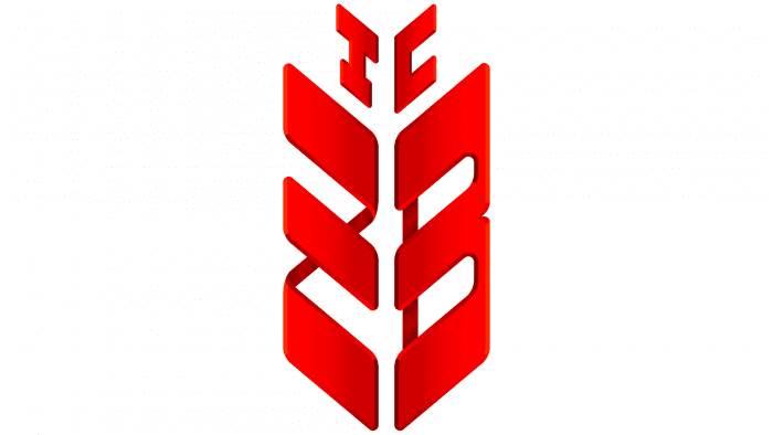
The text on the Ziraat Bankası brand name is supplemented with a stylized image of an ear. This emblem was created in 1867 and has survived unchanged to our times. Its author is the renowned Istanbul artist and designer İhap Hulusi Görey’i. With him, Turkish graphics began: he created most government bodies’ corporate identity, including the Ministry of Finance.
The spikelet of wheat symbolizes the bank’s history, which emerged based on a “farm” fund. By the way, the word “Ziraat” in translation means “agriculture,” which also corresponds to the chosen concept. This is one reason why the executives decided not to change either the logo or the company name.
The financial institution’s initials are encrypted in the ornament: the lower part of the symbol consists of “Z” and “B.” The upper part consists of “T” and “C.” So the abbreviation “T.C.” has not disappeared anywhere: it is still present on the emblem but in encrypted form.
What is Ziraat Bankasi?
Ziraat Bankasi is one of the state-owned Turkish banks founded under the Ottoman Empire. He provides financial services all over the world.
1986 – 2011
The logo of a Turkish bank has two main elements: the name and the individual mark. The icon intentionally repeats the shape of an ear of grain crops. This is a tribute to the farmers with whom the future international financial institution began to work: it issued loans to farmers. The abbreviation “ZB” is stylized under it. The wide parts of the letters are “disguised” as tares with grains: they are large and traced. Connecting lines, on the other hand, are thin and inconspicuous. This item is completely red. To the right of it is the black inscription “T.C. Ziraat BankasI.”
2011 – today
The modern emblem contains the brand name of the bank without any changes. It is still red, spike-shaped, and large, consisting of the first letters of the name. But the inscription located next to it has undergone a radical modification: the font has been completely updated. Now the letters are not sharp and angular but smooth and rounded to inspire high confidence in the financial institution among customers. The word “Ziraat” is in bold, and “Bankası” is in bold. This design technique improved the visual perception of the bank’s name. Supplement “T.C.” disappeared from it.
Ziraat Bankasi: Interesting Facts
Ziraat Bankası, also known as The Agricultural Bank of the Republic of Turkey, is a key player in Turkey’s banking and finance industry.
- Oldest Bank in Turkey: Founded in 1863 during the Ottoman Empire, Ziraat Bankası started as “Country Chests” to support the agricultural sector and rural development.
- Growth and Transformation: Over the years, it has transformed from a state-funded entity into a full-service commercial bank, still focusing on agriculture.
- Government Ownership: Ziraat Bankası is owned by the government and has been part of the Turkey Wealth Fund since 2017. This lets it play a big role in state economic policies, particularly agriculture.
- Wide Reach: It has many branches in Turkey and abroad, serving millions of customers, including Turkish people living outside Turkey and international banking services.
- Diverse Services: The bank offers more than just agricultural financing; it provides retail and corporate banking, investment services, and insurance.
- Embracing Technology: Ziraat Bankası uses digital banking tools like online banking and mobile apps to make banking easier for its customers.
- Support for SMEs: It offers financial products and advice to help small and medium-sized businesses grow, recognizing their importance to Turkey’s economy.
- Community Involvement: The bank supports education, culture, health, and sports through scholarships, sponsorships, and donations, contributing to Turkish society and cultural heritage.
- A Leading Bank: As one of Turkey’s largest banks, Ziraat Bankası is influential in the banking sector and crucial to economic development.
Ziraat Bankası stands out for its long history, broad services, and commitment to Turkey’s development. It has also adapted to changes and challenges over the years.
Font and Colors
The current logo is a mix of uppercase and lowercase letters. The bank’s name is written in Turkish, so there is no dot above the last “ı.” Both words are in sans serif, but the typography is slightly different: “Ziraat” is bold.
The black text is supplemented with a red emblem. Until recently, it was monochrome and two-dimensional, but the latest redesign has added a 3D effect to it. The unusual monogram in the form of an ear of wheat shimmers in many shades, with a linear gradient from the middle to the edges. The combination of red and black is the classic combination by which you can recognize Ziraat Bankası.
FAQ
When did the Ziraat Bank logo change?
2012, the brand changed its logo as part of a major update. This redesign focused on modernizing and simplifying the brand’s image.
- Removal of “TC”: The letters “TC” were removed from the logo to simplify it and highlight the bank’s core name, “Ziraat.”
- Font Update: The font was changed to a modern style, refreshing the logo’s appearance to match current design trends.
- The bold word “Ziraat” emphasized the bank’s name and enhanced brand recognition.
- Modern Look: The logo was modern to appeal to a contemporary audience and keep the brand relevant.
- Current Form: The new logo, with its bold “Ziraat” and updated font, represents the bank’s commitment to innovation and progress while maintaining its heritage.
This change aimed to refresh the bank’s image and reinforce its presence in the financial sector.
What is Ziraat Bank’s bank code?
Ziraat Bank’s Bank Identification Code (BIC) for SWIFT transactions is TCZBTR2AXXX. The code is 409993 for USD transfers using the CHIPS system. When making money transfers, provide these codes to your bank to ensure the process goes smoothly.
These codes are essential for international transactions. The BIC (SWIFT code) standardizes and simplifies global payments, while the CHIPS code specifically handles USD transfers within the US banking system. Using these codes helps your funds reach the intended recipient efficiently and securely.
Who made the Ziraat Bank logo?
The spike-shaped emblem was created by the artist İhap Hulusi Görey. He pioneered Turkish graphic design and designed logos for many government organizations.
This aligns with the bank’s mission and values. His work has significantly impacted Turkish graphic design, shaping the visual identity of various institutions. The emblem is a prime example of his talent and influence in the field.
What does the Ziraat Bank logo mean?
The ear of wheat on the logo symbolizes the bank’s historical roots and connection to agriculture. Established to support the agricultural sector, the bank provided financial assistance to farmers and those working in agriculture. The wheat ear represents growth, abundance, and prosperity, highlighting the bank’s commitment to supporting the agricultural community.
This design element underscores the bank’s mission to promote economic stability and development in agriculture. The logo serves as a reminder of the bank’s heritage and its role in fostering financial well-being and productivity in agriculture.
What is Ziraat Bank BH Mobile?
Ziraat Bankası BH Mobile is a mobile app for bank customers. It lets users access their accounts and perform various banking transactions from their mobile devices.
The mobile app allows customers to check account balances, transfer money, pay bills, and manage their finances. The app has a secure and user-friendly interface, making it simple to handle banking needs anytime, anywhere.
