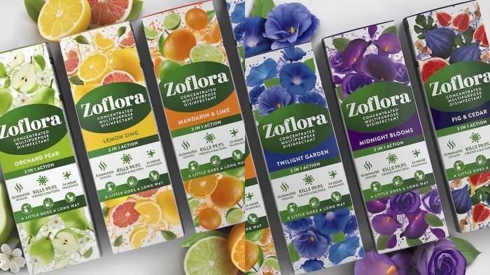
The PB Creative agency took up the development of new designs.
Zoflora is the UK’s leading disinfectant brand. The experts use ingredients that help create a product that is associated with nature. All products of the company are flavored and of high quality.
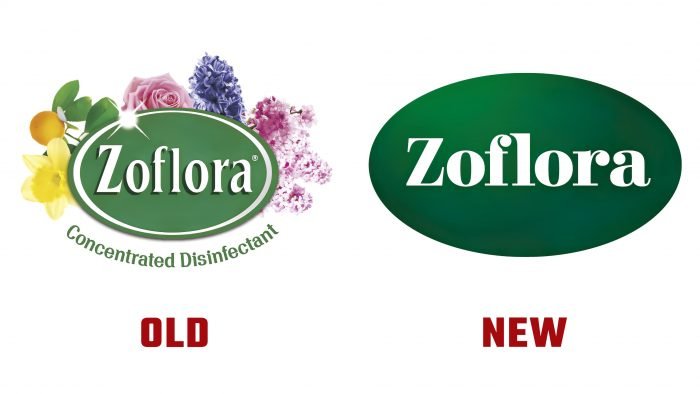
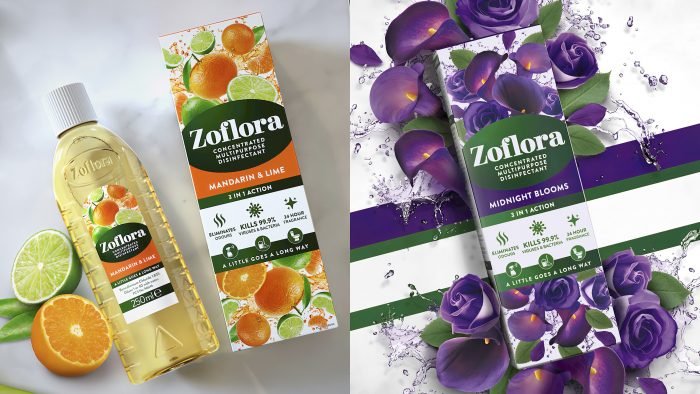
The main task that the agency faced was to create a design that can help attract new customers but will not alienate loyal customers. The design team has created striking packaging that stands out on store shelves. Each box matches the scent of the product. The agency also worked on the logo, making it terse. The designers used green (a direct association with nature) and a stylized font.
PB Creative uses unique designs to tell the story of each product. The firm must remain competitive in a market where competitors are constantly appearing. The company has added new scents to the line, and a rich assortment has allowed designers to create an explosive combination of colors and elements.
The packaging reveals the primary flavors and allows the company to expand its audience segment. In addition to changing the boxes and logo, Zoflora ran a massive marketing campaign. The brand has used advertisements on television and social media. The firm has spent several million pounds, but the product can already be seen on store shelves. It is reported that the brand will launch products in other markets throughout 2021. Available product formats: 120 ml, 250 ml, and 500 ml.
