We created a new logo, font, selected colors, and made an animation for the brand.
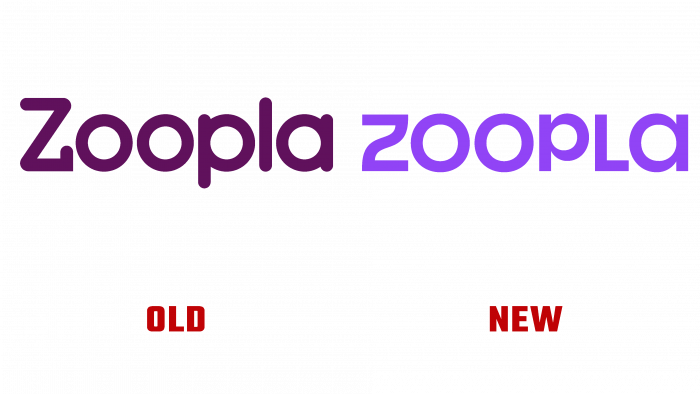
The company’s design team worked on the rebranding of Zoopla together with Zag. The brand was founded in 2007, and for the first time, the team has completely changed its visual identity. The main goal of the rebranding is to reflect the complexity of the real estate buying process.
Before starting the design, Zag conducted a consumer survey to determine the main brand benefits for customers. The results that served as the basis for the design showed that most clients often use rational and emotional thinking when buying a home.
Armed with accurate data, the creative team created a style using lines associated with buying real estate. As Zoopla representatives explained, the home buying process is very complex and stressful. Clients often change their minds, face unexpected difficulties, or succumb to emotions. The turning line is designed to represent all the unexpected moments of the client. Bright colors and laconic elements should add playfulness, fun, and warmth, which competitors often do not pay attention to.
The logo consists of the Zoopla lettering in a unique font designed specifically for the company. It is worth paying attention to the “Z” with an unusual line, which acts as an independent element, such as a sticker for a laptop. Even the font reflects the purpose of the rebranding – flowing lines, turns, and connections indicate the difficulties of home buying.
Zoopla is known for its signature purple color. The designers decided not to remove the color but supplemented the palette with bright and dark shades to cover most of the audience. Zoopla is a platform not only for buyers but also for sellers and landlords. Dark shades need to connect with the business.


