Zurich Logo

Zurich LogoZurich Logo PNG

The Zurich logo represents a large company operating in asset protection and capital growth. The emblem’s elements convey the corporation’s security and reliability, as well as the global presence of the brand’s offices. Beneath the compact symbol lie hundreds of branches and subsidiaries.

Zurich: Brand overview

The Transport—und Unfall-Versicherungs-Aktiengesellschaft was founded in 1872 in Zurich, Switzerland, marking the beginning of Zurich Insurance Group’s history. Initially, the company specialized in maritime and accident insurance, vital during rapid industrial and global trade growth.

Although the company originally focused on the Swiss market, it began expanding internationally in the 1880s. In 1884, it established its first overseas representative office in Germany, marking the start of its global journey.

The 1890s were a period of significant growth. In 1894, the company opened an office in New York to enter the U.S. market, recognizing the country’s rising prominence as a global economic leader. During this time, it also introduced liability insurance, which was a groundbreaking service at the time.

Further diversification in insurance offerings occurred in the early 20th century. In 1912, the company began providing industrial accident insurance, addressing the needs of a rapidly industrializing world. Thanks to its prudent approach to risk management, the firm remained financially stable through World War I.

The 1920s and 1930s brought a major expansion of the company’s global presence. New offices were established across Europe and the Americas, solidifying its position as an international insurer. During this era, the company also introduced auto insurance, responding to the growing demand for automobile-related coverage.

Following World War II, the company actively contributed to Europe’s economic recovery by providing insurance for reconstruction projects. In the 1950s, its operations expanded significantly in North America, becoming a crucial growth driver.

The 1970s marked a period of structural changes and modernization. 1976, the company officially adopted Zurich Insurance Company to reflect its evolution into a multifaceted insurer. This decade also saw the introduction of computer technology to streamline operations.

During the 1980s and 1990s, the company pursued several key acquisitions. Notably, the 1998 purchase of BAT Financial Services, the financial arm of British American Tobacco, significantly bolstered its position in financial services.

The 2000s focused on developing innovative insurance products and adopting advanced technologies. In 2000, the company merged with Allied Zurich, forming Zurich Financial Services, which enhanced its capabilities in financial services.

Between 2010 and 2020, the company underwent a major digital transformation, integrating advanced technologies into claims processing and underwriting operations. In 2012, it was rebranded as Zurich Insurance Group to emphasize its commitment to core insurance services.

From 2021 to 2023, the focus shifted to advancing digital capabilities and expanding into new markets. Investments in artificial intelligence and data analytics enhanced risk assessment and customer service, strengthening its competitive edge.

By 2024, Zurich Insurance Group will remain one of the largest global insurers, continually adapting to market demands and introducing innovative solutions to the industry. While honoring its legacy of reliability and professionalism, the company continues to explore new opportunities and technological advancements to meet its clients’ evolving needs.

Meaning and History

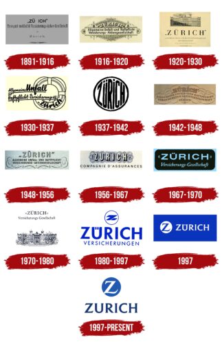
Zurich Logo History

What is Zurich?

This insurance giant offers individuals, small businesses, and large enterprises a wide range of insurance products and services, including general and life insurance. The company operates in over 170 countries and provides comprehensive solutions for various risk management needs through its life, farm, property, and accident insurance expertise.

1891 – 1916

Zurich Logo 1891

The emblem dates back to when the company, originally founded by Versicherungs-Verein, was renamed Transport—und Unfall-Versicherungs-Actiengesellschaft. It is minimalist and designed in the format of a business card. The core of the design includes the company name, its field of activity, and information about the office’s location. The organization’s primary focus was vehicle insurance and accident protection.

The central element was the name “Zürich,” reflecting the company’s location. It was stylized in German and stood out due to the absence of the letter “R.” Two reasons explained this:

  1. A desire to avoid similarity to the name of the capital city.
  2. This is a subtle reference to eliminating shortcomings and losses, symbolizing the company’s role in insurance.

The lower part of the emblem featured an artistic element, completing the composition and giving it a polished look. This addition added sophistication while maintaining its professional and concise appearance.

1916 – 1920

Zurich Logo 1916

The company expanded its operations by obtaining licenses to work in Europe and the U.S., shifting its primary focus away from transport insurance. These changes led to an updated emblem reflecting the new development strategy.

The redesigned logo is more vibrant and expressive. The yellow background conveys the joy and peace clients experience when securing insurance services. Plant motifs and ornaments in the Spanish style enhance the background, highlighting the significance of acquiring Hispania Compañia General de Seguros, a major insurance company in Spain.

The company name is displayed at the top in an arched curve. The letters are three-dimensional and slightly bent, reminiscent of the design on dollar bills. They evoke associations with financial stability, protection, and client benefits.

The central section is highlighted by a band featuring an ornament that includes the company’s new area of expertise: Zürcher Unfall—und Haftpflichtversicherungs-Actiengesellschaft. This element emphasizes the company’s shift in specialization and its transition to offering insurance services in personal and property liability.

1920 – 1930

Zurich Logo 1920

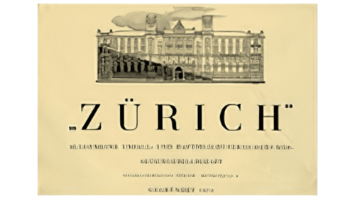
The company’s logo was redesigned in a more classic style in four years. The new design features an image of the company’s headquarters in Zurich at the top. This lends the entire look a sense of formality and prestige, highlighting the brand’s success through the architectural details and the scale of the multi-story building.

At its completion, none of the existing buildings in Zurich could rival it in size and expressiveness. The design emphasized the business’s confidence and stability, particularly when it opened a subsidiary and several branches abroad. The headquarters became a symbol of reliability and solidity.

At the bottom, the company’s name is displayed in large, thin, tall letters, emphasizing its renown and high status. Quotation marks around the name highlight it, emphasizing the brand’s connection to the city where its headquarters is located. The logo combines visual elements that convey confidence, stability, and the company’s international ambitions.

1930 – 1937

Zurich Logo 1930

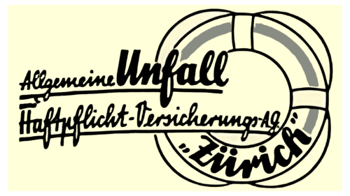
The new logo is based on the image of a lifebuoy, conveying the company’s assistance and support in challenging situations. The circle serves as the central element of the design, representing reliability, like a hand extending a flotation device to those in need. Around the lifebuoy is a cursive inscription indicating key areas of insurance, emphasizing the breadth of services offered.

The brand name “Zürich” stands out in the center, directly on the lifebuoy. The word “Unfall,” rendered in bold, large font, creates a visual emphasis that harmonizes with the brand name. This underscores the company’s specialization in accident insurance, making the logo more informative.

The design combines the symbolism of rescue with clear brand identification, reflecting its key role in providing client protection and support.

1937 – 1942

Zurich Logo 1937

The brand name is placed inside a sphere, with each letter adjusting in size to follow the contours of the shape. This reinforces the association with a lifebuoy and gives it a new interpretation: now, it represents a protective “bubble” that evokes a sense of safety.

The emblem reflects the company’s core idea of reliable protection. The design symbolized the brand’s preparation for launching its reinsurance company, Turegum, emphasizing its focus on further development and improving service levels.

1942 – 1948

Zurich Logo 1942

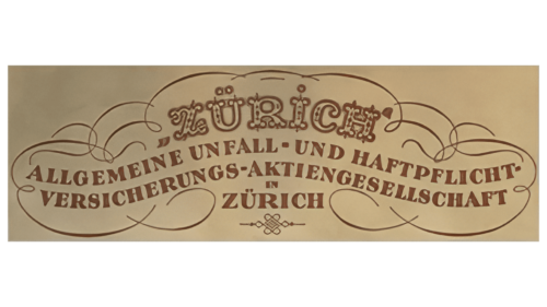
This logo is designed in a style reminiscent of dollar bill artwork. Arched inscriptions, wavy text lines, and semi-circular shapes create a unique structure that echoes the company’s original emblem. The top section features the name, a description of the business type is below, and the headquarters is located at the bottom.

The symbol’s lower part is detailed, and the lettering style evokes associations with the era of knights, tournaments, and fairy tales. This emphasizes the protective role of insurance, which served as a reliable shield for clients against destructive events and instability during wartime.

The logo reflects the launch of the “Safety Zone” program, which is aimed at defense industry enterprises. The design visually reinforces the sense of reliability and confidence the company provides to its clients, supporting and protecting their interests during challenging times.

1948 – 1956

Zurich Logo 1948

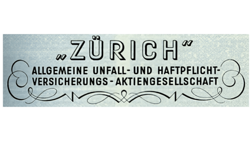
The logo is set against a background reminiscent of an official certificate. This choice highlights the company’s status, creating an image of reliability and formality. The company name is rendered in black font, making the text visually light and easy to read.

Ornamental flourishes placed on the sides and below the text add sophistication and completeness to the overall design. These decorative elements enhance the association with refined business documents, emphasizing the company’s respectability and professionalism.

1956 – 1967

Zurich Logo 1956

The logo has intricate symmetrical patterns and decorative motifs reminiscent of banknote designs. These elements evoke associations with reliability, protection, and financial stability. Geometric patterns convey precision and technological sophistication, visually representing a high level of counterfeit protection.

On an elegant interwoven pattern background, the first part of the company’s name, “Zürich,” is displayed in bold capital letters. Beneath it is the continuation of the new name in French: “Compagnie d’Assurance.” This change reflects the company’s international growth. It has expanded its range of insurance products by adding new lines to the original two and is now positioning itself as a universal insurer.

The choice of French emphasizes the company’s close connection with the rapidly developing French market for employee insurance. The French segment ranks third in volume and importance within Zürich’s portfolio, confirming the company’s successful strengthening of its position on the global stage.

1967 – 1970

Zurich Logo 1967

The company’s emblem has been updated to reflect its global presence across all continents except Africa. The new symbol is designed as a license plate, emphasizing movement and international expansion.

A black background with a blue border provides the base, with the company name written in blue letters. The first part is highlighted in large capital letters, emphasizing solidity and stability. The second part is written in smaller italics, conveying growth and the ambition to reach new markets.

The logo design combines the ideas of stability and aspiration. Insurance is a tool that helps protect and support clients in achieving their goals. The blue color alludes to the revival of the marine insurance sector, which was connected to the acquisition of Alpina Insurance Company.

1970 – 1980

Zurich Logo 1970

The company’s logo is designed in a classic style, reflecting its century-long history. Its black-and-white color palette enhances the sense of the past and emphasizes the connection to its heritage. The centerpiece is an image of the brand’s headquarters in Zurich, depicted with precise, formal lines.

Above the building is a concise black inscription that includes the company name and its area of operation. This adds a formal touch to the emblem and highlights the organization’s long-standing experience. It conveys the ideas of reliability and stability, which have been the foundation of the company’s work, attracting clients through its history and impeccable reputation.

1980 – 1997

Zurich Logo 1980

A decade later, the company’s emblem adopted a modern style, reflecting a new stage in its development. At the top, enclosed in a circle, is the first letter of the name, evoking an association with the Sun. The closed lines emphasize reliability and stability. The overall appearance of the emblem resembles a seal, serving as a symbol of assurance.

Below the circle, the name “Zürich” is prominently displayed in large font, without quotation marks. The addition is limited to “insurance,” which indicates the company’s primary business area. The bright blue color chosen for the design creates a sense of stability and confidence, highlighting mutually beneficial and secure cooperation with the brand.

1997

Zurich Logo 1997

The logo is designed in a blue color scheme and features a minimalist layout. On the left, a white circle is set against the background, with the letter “Z” at its center. To the right, the name “Zürich” is displayed in white, creating a visually harmonious composition highlighting the company’s status and international presence.

The blue color represents professionalism, the financial sector, and expertise, reflecting the acquisition of the American company Scudder Kemper Investments. The logo’s similar color palette reinforces the brand’s connection to global financial markets and underscores its confident growth on the international stage.

1997 – today

Zurich Logo

The modern logo is designed concisely and reflects the company’s new areas of activity, including insurance services and asset management. The composition features a single word, “Zürich,” conveying the brand’s confidence and stability.

The visual element is a circle, reminiscent of the Sun and a lifebuoy, emphasizing the importance of protection and support. At the center of the circle is the letter “Z,” rendered in white. It resembles a light cloud, harmoniously contrasting with the surrounding blue, creating a sense of reliability and balance.