


![]() 007 Logo PNG
007 Logo PNG
Bondiana is one of the greatest movie series of our time, thanks to which the 007 logo is well known among action movie fans. It is as accurate as a shot, digging into a person’s memory like a steel bullet striking the cerebellum. The subconscious easily assimilates the emblem because it contains iconic elements of the cinematic masterpiece. It is both a key to the mystery and a weapon of retribution.
The 007 brand began with Ian Fleming, who had served in British naval intelligence during World War II. His first James Bond novel, Casino Royale, was published in 1953 and launched a series of twelve novels and short-story collections, all written before he died in 1964. Fleming took the name James Bond from an American ornithologist whose book on Caribbean birds was near him while he was writing.
The film franchise started after producers Albert Broccoli and Harry Saltzman acquired screen rights in 1961. They created Eon Productions in London, while Danjaq was formed in 1962 as the rights-holding company. United Artists financed Dr. No, released in 1962 with Sean Connery as the first screen Bond. Later official Eon films included From Russia with Love, Goldfinger, and Thunderball.
The rights history was complicated by Kevin McClory’s claim to Thunderball, which led to his producer credit on the 1965 film and, later, to Never Say Never Again in 1983, made outside Eon. Casino Royale also had separate rights, leading to the 1967 parody film, before those rights returned to Eon in 1999 following a dispute between Metro-Goldwyn-Mayer and Sony Pictures.
Harry Saltzman sold his Danjaq stake to United Artists in 1975. MGM bought United Artists in 1981, and distribution stayed tied to MGM/UA. Michael Wilson joined production in 1984, while Barbara Broccoli became producer in 1995. The Eon Bond actors later included George Lazenby, Roger Moore, Timothy Dalton, Pierce Brosnan, and Daniel Craig, whose final film was No Time to Die in 2021. In February 2025, Amazon MGM Studios reached a joint-venture deal with Broccoli and Wilson, gaining creative control. The franchise long competed with Mission: Impossible and Jason Bourne.
Meaning and History
![]()
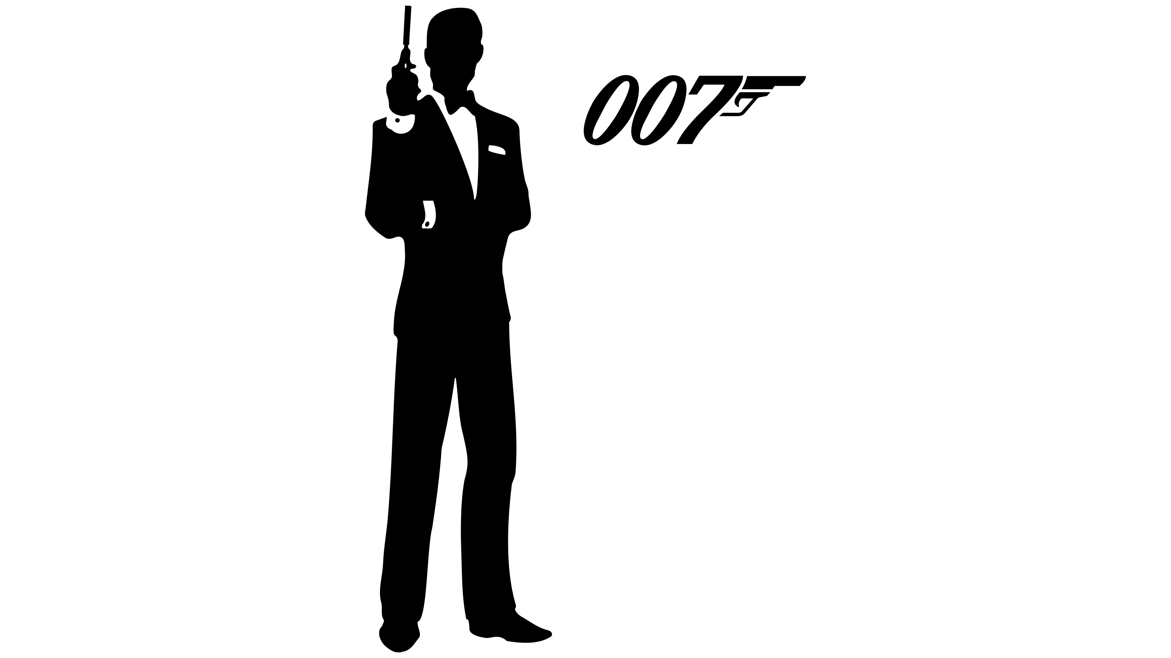
Although it all began long before 1961, when Harry Saltzman and Albert Broccoli acquired the screen rights to adapt Fleming’s James Bond books, it was this period that was crucial. It was then that the partnership between the two producers led to the creation of the film company Eon Productions, which focused on producing the “Bondiana.” After the work was completed, the iconic logo appeared on the screens: a black gun. Joe Caroff of United Artists designed it.
The long evolution of the 007 emblems was due to changes in movie poster design. Different artists were hired for the job, each with their own style, so the gun and the agent’s code number were customized for them, not the other way around. The result was a string of variations of the same symbol that were not included in the official list.
Special attention is paid to the iconic logo in the inside corners, the ratio of number thickness to grip, dynamics, italics, and other small details. On posters and advertisements, the symbol looked different, harmonizing with the text. Many more drawn variants take into account the movie’s theme, the country of distribution, and the year of release.
What is 007?
007 is the code designation of James Bond, a British intelligence agent working undercover. This secretive character appeared in the novels of Ian Fleming, who turned him into an iconic figure who went from book to book and then from movie to movie. This resulted in a series of movies with a similar title featuring the same main character. Over time, the role has been played by a variety of actors, from Sean Connery to Daniel Craig.
1962 – 1969
![]()
The logo of this period typically features the numbers “0”, “0”, and “7”, along with a firearm. Judging by the thin, elongated barrel and rounded trigger, it is a revolver. However, the sight is diagonal and located far from the edge. The author creatively combined the weapon with the secret agent’s code name, turning the last digit into a grip. Such simplicity pleased the viewers and critics, as it hit the target precisely.
1969 – 1973
![]()
After the finalization, the logo took on a different style, heavy and rough. The italicized glyphs remained, as they play a key role in keeping the dynamic, as if the protagonist is dodging bullets, as in “The Matrix,” by tilting his body backward. This touch alludes to James Bond’s invulnerability, high professionalism, and resilience. In this case, the numbers have become wider and bolder, reducing the internal gap between the zeros and the bend at the sevens. The improvised pistol changed as well. The trigger area became smaller, the trigger shorter, and the sights straighter. At the same time, the hammer acquired a diagonal extension and a rectangular shape.
1973 – 1985
![]()
Although the “7” regained its deep inner curve and the glyphs grew larger, this logo is considered the least successful. The reason is a lack of dynamism, as the designers aligned the numbers vertically. A slight tilt remained only at the foot of the seven, imitating a pistol grip. The hammer returned to its rounded shape. The sight became lower and wider, hinting at a change in the weapon’s brand.
1985 – 1987
![]()
Significant changes characterize this period. The artists once again italicized the numbers in the logo. Secondly, they depicted the zeros as ovals to avoid making them appear bulky. Third, the sight became multistructured, with multiple levels. Fourth, the triggering zone was widened.
1987 – 1995
![]()
The 007 logo style search yielded taller, narrower glyphs and a thicker gun. The sights became semicircular, and the barrel became two-tiered. This is another change from one type of firearm to another, a short-barreled firearm.
1995 – today
![]()
The main emphasis in the period’s emblem is on lightness and dynamism. The developers narrowed the figures but retained a wide inner space. This approach gave the logo airiness, inspiring viewers with a life-affirming idea: for the main character, everything comes easily and simply. This is the movie’s theme because it is not only a classic Western but also a cult detective story in which the protagonist needs to be “saved” for the next episode of the franchise. The designers removed the scope and artistically curved the hammer so that its contours resemble a bullet at the top.
Font and Colors
The logo is in a typeface called 007 GoldenEye, created by Film Himmel (Jens R. Ziehn). The glyphs are bold, italicized, and wide, with large internal gaps. The emblem’s color palette is restrained: black. Other colors may be used in poster lettering (at least in early versions).
007 Logo Color Codes:
- The main 007 logo color is black (#000000).
There are some variations of the logo that use other colors:
- Blue (#007dc5) is used in some versions.
- Light blue (#007fc8) is used on posters and promotional materials.
- Dark blue (#000077) has been used on some older posters.
FAQ
What is the 007 logo?
The 007 logo is synonymous with James Bond, a character in the famous James Bond literary and movie franchise.
What does the number 7 in the word 007 stand for?
In the 007 identifier, the “00” part indicates the agent’s authority to eliminate threats. The “7” distinguishes him as the seventh operative in MI6, the British intelligence organization.
What does 007 mean in real life?
As part of the plot, the number “7” signifies that James Bond is the seventh agent to receive the “00” classification, which authorizes him to use deadly force.
Why 007 and not 001?
In the James Bond universe, the number “00” signifies an agent authorized to kill. James Bond is given the number “7”, making him the seventh operative to hold this prestigious title. The story of how he achieved this status is told in the movie Casino Royale.
Is 007 a real-life code name?
In the fictional world of James Bond, his birth name is James Bond, not an alias. The 007 identifier is a codename assigned when Bond leaves MI6 for any reason, such as retirement or death.