As you can see from the 20th Century Fox logo, the studio is at the center of the world’s attention. Fame, universal recognition, and love convey the emblem. The film company creates iconic films that are sold out in theaters and on TV screens.
20th Century Fox: Brand overview
American movie studio 20th Century Fox is famous for its animated series Family Guy, The Simpsons, Futurama, and other comedy TV shows aimed at a wide audience. It also owns many iconic films, such as Titanic, Avatar, and Star Wars, which have broken world box office records.
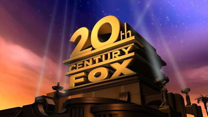
The foundation of the Television Corporation was laid in 1935 when the bankrupt Fox movie studio was forced to merge with the powerful Twentieth Century Pictures. Together they founded 20th Century Fox. Everything that was released under this trademark became a real cinematic sensation. In addition, the belonging of the films was easily recognized by the opening fanfare, upward pointing spotlights, and a three-tiered logo. The movie studio inherited it from one of its “forebears” – 20th Century Pictures.
Meaning and History
The iconic emblem was repeatedly changed until it included the spotlights from the opening credits. It remained even after The Walt Disney Company bought 20th Century Fox and got rid of the famous television brand, giving it another name. Thus, the movie studio lost the word “Fox” and became known as 20th Century Studios. The reorganization, which took place in early 2020, was part of a major rebranding. Picturemill’s design team redesigned 20th Century Studios while maintaining the aesthetics of the old. The specialists redesigned the lettering using a modified version of the Proxima Nova font.
The changes prior to this were also very noticeable. Global experiments with style accompanied them as the corporation sought to create a positive image.
What is 20th Century Fox?
20th Century Fox was the name of the American film company known today as 20th Century Studios from 1935 to 2020. It is owned by media conglomerate Walt Disney and specializes in film production.
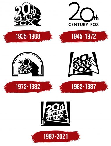
1935 – 1968
The company’s first printed logo did not have spotlights, although they appeared (on-screen) in the animated version. Immediately after its debut, the studio was called Twentieth Century-Fox, but its name in the logo was written without a hyphen: the first line had the word “20th”, the second line had “CENTURY,” and the third line had “FOX.” In addition, all letters and numbers were three-dimensional and strongly elongated backward. Wide diagonal lines separated the three parts of the lettering. The signature intro had the word “Presents” in italics. It is known that the first design was developed by Emil Kosa Jr. He can be considered the “progenitor” of the modern emblem.
1945 – 1972
The 1945 version rightfully earned the status of the most minimalist logo of the studio. The designers kept the 20th CENTURY FOX lettering but simplified it to no cross lines or three-dimensional effects. The most noticeable element they did was the number “20”: the numbers were enlarged and lined up in a staircase. The perfectly round zero resembled the letter “O” in shape and thickness, as in the word “FOX.” The lowercase “t” (from “th”) lacked a horizontal stroke on the left side, so it merged with the adjacent zero. The last two words of the company name were on the second line and were written in bold black font with rounded ends.
1972 – 1982
In 1972, the studio attempted to merge the two old logos into one new one. It kept the font from the second version but straightened the numbers slightly, removed half of the horizontal stroke from the letter “t,” and stretched the letters in words to create a three-dimensional effect. The structure was borrowed from the very first logo. At the same time, the back of the text became black, and a kind of “pedestal” appeared at the bottom. Another new element is a semicircular arch consisting of two dark lines of different thicknesses.
1982 – 1987
After a redesign by Landor Associates, the 20th Century Fox logo featured spotlights illuminating the studio’s name on both sides for the first time. Previously, they had only been used in intros to movies and cartoons. Two beams of light replaced the arch. The inscription remained, but the font became bolder. At the same time, the number “0” and the letter “O” took the form of squares with rounded sides. The long shadows behind the words disappeared, and the separating diagonal lines curled down on the right side. This time, all elements were black, unlike the previous version of the emblem.
1987 – 2021
The artists detailed the spotlights, showing them pointing upwards. The emblem was inside a rectangular frame. The old font was replaced with a new one – similar to the one used since 1972. The line spacing was reduced, so the tops of the words “CENTURY” and “FOX” were crossed out with diagonal bars. Each number and letter in the top row has one thin line pointing to the right and slightly downward.
20th Century Fox: Interesting Facts
20th Century Fox, now called 20th Century Studios after Disney bought it, is a legendary film studio with a rich history in Hollywood.
- How It Started: The studio was created in 1935 from the merger of Twentieth Century Pictures and Fox Film Corporation, thanks to Darryl F. Zanuck and William Fox.
- Famous Logo and Music: This opening is one of the film industry’s most famous symbols. It is known for its iconic logo, which features a searchlight-lit tower and a memorable fanfare by Alfred Newman.
- Big Movies: 20th Century Fox has given us classics like “The Sound of Music,” “Star Wars,” “Avatar,” and “Titanic.” “Titanic” and “Avatar” by James Cameron are among the highest earners ever.
- Tech Innovations: The studio was a leader in film technology, introducing CinemaScope in 1953 for widescreen movies, starting with “The Robe.”
- Animation Hits: Through Blue Sky Studios (later closed by Disney), it had hits like the “Ice Age” series, one of the top animated franchises.
- TV Success: It also made popular TV shows like “The Simpsons,” “The X-Files,” and “24” through its TV production arm.
- Awards: Its films have won many Oscars over the years. “Titanic” holds the record for the most Oscars won by a single film, tied with “Ben-Hur” and “The Lord of the Rings: The Return of the King,” each winning 11.
- The Studio Lot: Its Century City lot in Los Angeles is famous for movie and TV production, featuring well-known sets like the New York Street backlot.
- Becoming Disney’s: In 2019, Disney finalized its purchase of 21st Century Fox, including this studio, for $71.3 billion, renaming it 20th Century Studios in 2020.
- Cultural Legacy: From “Star Wars” to “X-Men,” the studio’s films and characters have become a big part of global culture.
20th Century Fox has been a major force in film, from leading in technology to making beloved films that have left a lasting mark on the world.
Font and Colors
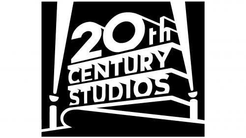
20th Century Fox is now 20th Century Studios, which is little reflected in the logo. Spotlights on the right and left create a frame, illuminating the lettering on both sides. These devices are a traditional attribute of filmmaking. They are used during filming to illuminate the stage space and reproduce dynamic effects.
Sans-serif fonts have always been used for the name of the TV studio. Recent variants include a modified Franklin Gothic Heavy and a customized version of Proxima Nova. The designers adapted them to the jagged, as if receding lines. The color scheme of the printed logo is also unchanged: it was and remains black and white.
20th Century Fox Logo Color Codes:
- Original: Black (#000000); White (#FFFFFF)
- Modern: Deep Violet (#27076E); Spanish Gray (#96979B)
FAQ
Is the 20th Century Fox logo real?
Yes, the 20th Century Fox logo is real. After the renaming of the film company to 20th Century Studios, its owner (Walt Disney Company) did not replace the old symbol with a new one but simply wrote the word Studios instead of Fox and changed the logo to a monochrome format.
Does 20th Century Fox still exist today?
No, neither the name nor the movie company 20th Century Fox exists anymore. It has been replaced by a new entity, 20th Century Studios.
What is the 20th Century Fox logo?
It represents a three-tiered sign. In the top row, it says “20th”, in the middle – “Century,” and in the bottom – “Fox.” There are spotlights and ramps on the sides of the tall design.
How old is the 20th Century Fox logo?
The 20th Century Fox logo is over 85 years old and was created in 1935 by designer Emil Kosoy, Jr.
Why is 21st Century Fox called Fox?
The corporation was originally called Fox Group, and on April 16, 2013, it adopted its subsequent name as a tribute to the legacy of 20th Century Fox, marking an evolution rather than the company’s passing into the past.
Who is 20th Century Fox named after?
The original name, 20th Century Fox, pays homage to William Fox, the founder of the predecessor Fox Film Corporation, who created the venture in collaboration with Joseph M. Schenck and Darryl F. Zanuck.
What is 20th Century Fox famous for?
In the late 1930s and into the 1940s, Twentieth Century Fox Studios became known for its contributions to genres such as westerns, musicals, biographies, and religious stories. The studio was particularly famous for films directed by John Ford, such as The Grapes of Wrath (1940), as well as musicals featuring stars such as Shirley Temple and Betty Grable.


