


![]() 2Kmovie Logo PNG
2Kmovie Logo PNG
The online movie streaming platform chose a simple logo. The 2Kmovie logo immediately makes it clear to visitors of the virtual “movie theater” what resource they are on, so they can choose what they like. To make the identity easier and faster to perceive, the designers simplified it.
2Kmovie is one of the best online resources for watching TV series and movies in high-quality (Full HD) for free. The site offers various media file categories, including new releases, popular, TOP, etc. TV shows are also available for viewing. Convenient filters will help you navigate the variety on offer.
The tools allow you to select a file by genre and country. The site’s identity is based on an expressive design, a bright color palette, and a combination of fonts of varying sizes. Each logo element carries a specific semantic load, but together they form a balanced composition.
Meaning and History
![]()
2Kmovie is an optimized website that offers movie and TV show lovers a wide range of options. Here, you can watch video content without paying, registering, or downloading files, with no restrictions. In this format, the online platform has been operating for more than a year and has become quite popular across countries.
The very idea of creating such a site was to allow users to watch almost any movie, show, or series. Thanks to the developers’ rich experience and knowledge, this goal was achieved. A platform emerged on the market, becoming a profitable alternative to popular movie sites that require users to subscribe or purchase individual files.
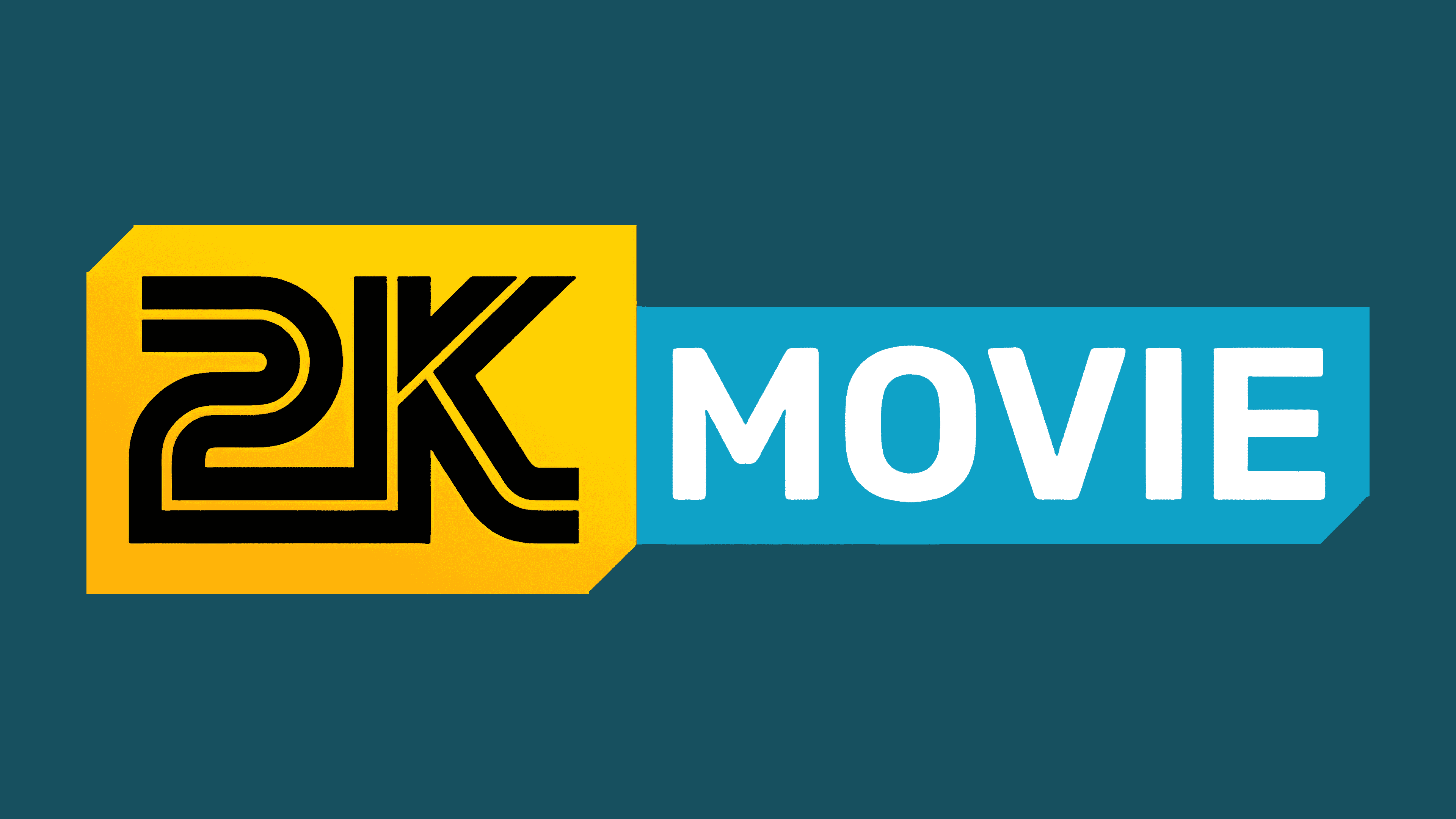
For the new resource, a very modern and stylish design caused associations directly with video clips and high-quality broadcasting. This was evidenced by bright colors: yellow, black, blue, and white, as well as original word marks. The logo begins with a massive 2K sign, followed by the characteristic word “movie”. At a glance, such an emblem makes it clear what kind of product the platform offers.
Currently, the online resource provides stable access to free high-definition streaming. User-friendly interface, high-quality video content, and no viewing restrictions make the platform one of the best in its category. Considering the huge number of similar sites, such a position is a high achievement.
The current state of affairs in 2Kmovie fully reflects the corporate style. It has not changed throughout the company’s entire existence without losing its relevance. Since its launch, the site has aimed to improve users’ leisure time by making it easy to view their favorite content.
In the visual design, this goal was emphasized by a bright yellow color that demonstrated optimism, fun, and joy. This theme was directly reflected in the lettering. The prominent solid 2K lettering and the word “movie” in white emphasize the professional approach.
Font and Colors
The website logo is a rather complex figure consisting of two parts connected. The first part is a banner with corners that have two diagonal cuts (in the lower-right and upper-left corners). The background color is yellow, symbolizing positivity, reliability, and confidence.
In the center of the banner are the letters 2K. They are made in the original style using a bold, massive font. They are also given a special volume by the internal white stripes separating the total space. The chosen design demonstrates the site’s quality and functionality, as well as the popularity of the video-broadcasting format. 2K is a recognizable symbol that almost everyone associates with video content.
The second part of the icon is a rectangular banner with the inscription “movie”. It is a conceptual continuation of the 2K letters, making the logo a complete image. A simple, laconic sans-serif font with confident outlines was chosen for the design. Despite the letters’ white color, the inscription looks as expressive as the first part. A special “zest” is given by the game of contrasts – the white inscription is placed on a blue background. The chosen color combination symbolizes reliability and professionalism.
2Kmovie Logo Color Codes:
- yellow banner: Hex color: #ffd101; RGB: 255 209 1; CMYK: 0 18 100 0; Pantone: PMS 109 C
- blue banner: Hex color: #10a2c7; RGB: 16 152 199; CMYK: 92 19 0 22; Pantone: PMS 312 C
- black: Hex color: #000000; RGB: 0 0 0; CMYK: 0 0 0 100; Pantone: PMS Process Black C
FAQ
What does the 2kmovie logo symbolize?
2Kmovie is an online service that offers free access to high-definition movies, TV shows, and series. It allows users not only to view but also to download content to various devices.
What services are comparable to 2kmovie CC?
Platforms such as movies2k. pro and videograbber. net are some of the strongest alternatives to 2kmovie.cc.