Only through its activity, constant development, and dedication has the company been able to reach such heights, states the 3M emblem. The emblem symbolizes the high position, lucrative deals, and power of the conglomerate.
3M: Brand overview
3M is a multi-structured conglomerate from the United States, covering a wide range of activities. Apart from consumer products, it is involved in manufacturing industrial products, products for maintaining safety in the workplace, and healthcare products. The product range comprises about 60 thousand items offered under several brand names. For example, the company specializes in adhesives, fireproofing, window films, insulation, orthodontic and dental materials, automotive cosmetics, laminates, abrasives, electronic circuits, medical software, and others. The company is headquartered in Maplewood, Minnesota (near St. Paul). Production sites are located in more than 70 countries around the world. The year of the company’s foundation is 1902.
Meaning and History
In the early 20th century, five businessmen came together to create a mining company in Two Harbors. They were Hermon Cable, John Duane, William McGonagle, Henry Bryan, and Danley Budd. They decided to specialize in corundum, but the deposit turned out to be anorthosite, which had no commercial value. Dwan immediately withdrew from the founders and took his share. In 1905, the company was taken over by Edgar Ober and Lucius Ordway. It also moved several times to other cities.
The company is very diversified, so it is divided into four business groups: producing products for industrial and safety, transportation and electronics, consumer products, and health care. It covers so many different areas that it has outgrown its old name, turning it into a “cypher.” The brand was originally called Minnesota Mining and Manufacturing Corporation, then MMM. It was then shortened to 3M by the number of letters M. This was reflected in the corporate identity.
1906 – 1938
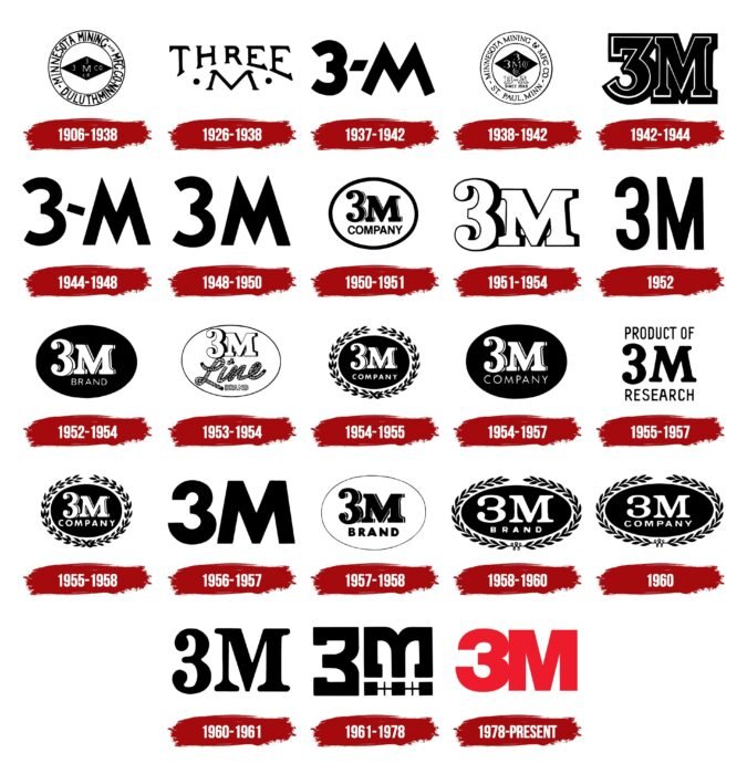
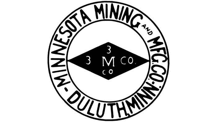
The debut logo shows a black diamond arranged horizontally. On it, “3M CO” is written twice in white letters in different configurations. The geometric figure is enclosed in a double frame, forming a wide band, which contains the full name of the company. It is placed within a circle.
1926 – 1938
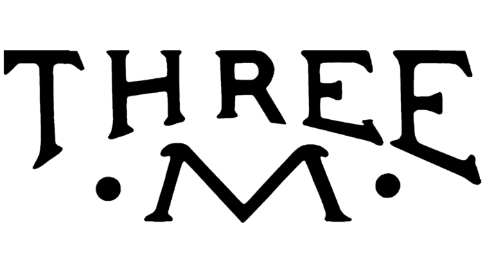
A simple emblem consisting of text was used in parallel for some time, as the designers replaced the number 3 with its verbal designation. Therefore, the individual emblem had the word “Three M’s” written on it. The letter “M” has two large dots on the sides, and the letter “Three” has serifs on each stroke.
1937 – 1942
The desire for brevity was particularly evident in 1937 when a logo of one letter and one number was approved. The letters “3” and “M” are typed in bold type. Between them, there is a diamond-shaped hyphen with a diagonal slope. The main color is black and white.
1938 – 1942
The emblem is multi-part: it consists of several parts with a large number of elements. In the center, as before, a horizontal black rhombus with a white inscription. Below it are the letters “B” and “A,” as well as the designation “SINCE 1828”. Around it is the updated company name, “Minnesota Mining & MFC CO.” Below it are the city and state in which the company operates – “St. Paul Minn.” The wordmark is separated on both sides by wavy strokes.
1942 – 1944
After experimenting with graphic elements, the firm got the simplest possible emblem. It has only two details: the number “3” and the letter “M.” They are wide, with serifs and a thin white border.
1944 – 1948
A short hyphen reappeared between the numeral “3” and the letter “M.” The style of this logo is similar to the 1937-1942 version. They have the same bold letters with pointed ends. The difference lies in the separating hyphen: it is beveled to the other side.
1948 – 1950
The redesign brought minor changes: the separator between the number and the letter disappeared.
1950 – 1951
This period is notable for the appearance of the oval, which the developers later used repeatedly. They also updated the writing style of the name, choosing a serif font with thin side strokes on the right side. Underneath the “3M” lettering is the word “COMPANY” in thin letters.
1951 – 1954
The designers removed the oval border, leaving only the corporation’s name. In addition, they colored the lettering white and added shadows to it, making it three-dimensional. The developers kept the serifs.
1952
A similar version with elongated black characters existed at the same time.
1952 – 1954
The oval on the logo has a black fill. On its background, there is the company name written in white font in upper case. The letter “M” has wide serifs. At the bottom is the word “BREND” in a delicately grotesque style.
1953 – 1954
The logo is complemented by a black border. A thin line surrounds the outline lettering “3M” with shadows on the right side. At the bottom, the designers placed the word “Line” created from three pieces of rope. The first piece is used for the letter “L,” the second for the dot over the “i,” and the third for the letter “ine.” The miniature inscription “BREND” can also be seen here, which is also made as an outline.
1954 – 1955
The designers returned to the 1952 version, surrounding the black oval with two laurel branches. In addition, the word “BREND” was replaced by “COMPANY”.
1954 – 1957
This emblem differs from the previous one in only two details. It does not have a laurel wreath, and the word “COMPANY” is typed in a larger font.
1955 – 1958
The company management returned to the 1954 emblem.
1955 – 1957
The letter “M” has smooth serifs, and the letter “3” has dots on the ends. “PRODUCT OF” is inscribed at the top and “RESEARCH” at the bottom. Both words are in the same style as the abbreviated brand name.
1956 – 1957
The design became strict and geometric. Classic letters and numbers were used on the emblem.
1957 – 1958
The company chose an old mark dating back to the 1950s to signify its identity. The only difference between the two was the frame. It was now thinner.
1958 – 1960
In this case, the designers returned to the 1954 emblem with a wreath of laurel branches.
1960
Using the previous emblem, they removed the word “BREND” and replaced it with the word “COMPANY.”
1960 – 1961
After another update, the emblem looked like the 1951 version, only now it was black instead of white. One more thing: the letter “M” was higher than in the old logo, so it became equal to the number “3”.
1961 – 1978
To modernize the graphic symbol, the company management approved a very original modification of the logo, created by the firm of Gerald Stahl & Associates. Alphabetic and numeric serifs are present, but they are located “backward” – not outside, but inside. At the bottom of the letter “M,” there is a white line and two pluses (+).
1978 – today
A themed sign was proposed by the studio of Siegel & Gale. Consists of a large “3M” lettering painted in red. The letter and number are close together and merge at two points. They are flat, smooth, and chopped.
3M: Interesting Facts
3M started in 1902 in Minnesota, aiming to mine minerals for abrasives. This didn’t work out, so they shifted their focus and eventually became known for their innovation.
- Beginning and Shift in Focus: 3M, which stands for Minnesota Mining and Manufacturing Company, began with a failed mining venture in 1902. Realizing the mineral quality was poor, they decided to try something different, which laid the groundwork for their future success in creating new products.
- Scotch Tape Creation: In 1930, a 3M engineer, Richard Drew, invented Scotch Tape. This invention responded to car painters’ need for tape that wouldn’t ruin their paint jobs. Scotch Tape has become a household name, widely used across the globe.
- Post-it Notes Invention: The Post-it Note came about in 1977, thanks to 3M scientists Spencer Silver and Art Fry. The idea was born from the need for bookmarks that wouldn’t slip out of a hymnbook, using a unique adhesive that allowed them to stick and re-stick.
- Wide Range of Industries: 3M has expanded into various sectors, such as healthcare, consumer products, automotive, and electronics. This strategy has helped it stay strong, even when some markets drop.
- Focus on New Ideas: Around 6% of their sales go back into research and development, showing 3M’s dedication to innovation. They own over 100,000 patents and work on technologies ranging from adhesives to nanotech.
- Going Green: 3M aims to cut water use by 25% by 2030 and reach carbon neutrality by 2050. They’re taking steps to be more environmentally friendly.
- Global Scale: What started in Minnesota has expanded worldwide, with operations in over 70 countries and sales in nearly 200. They employ more than 90,000 people globally.
3M’s history shows how adapting to change and focusing on innovation can lead to long-term success.
Font and Colors
Despite the abundance of logos, they are monotonous and include two basic elements: a letter and a number. Occasionally, an oval, rhombus, laurel wreath, and clarifying lettering appear.
The 3M logo now uses Helvetica Black, a font designed by Eduard Hoffman and Max Miedinger. The color palette is the same: it has always consisted of black and white. But the modern version of the logo is colored red.
3M Logo Color Codes:
- Red color: Hex: #F11523; RGB: (241, 21, 35); CMYK: (0, 0.912, 0.854, 0.054); Pantone: PMS 185C
FAQ
What is the 3M logo?
Designed in 1978, the 3M logo has a strikingly bold Helvetica-style font. The numbers and letters are linked together to form a single design element. The main color is scarlet red, changing to black in printed versions.
What is the 3M font?
Helvetica and Times fonts were chosen for 3M’s branding materials. Given that Helvetica was already used for the Scotchgard logo and its tagline, it is also recommended for headlines and subheadings.
What does 3M produce?
3M manufactures and markets a wide range of products, from industrial safety products to healthcare and household chemicals. The Safety & Industry division generates the highest revenue and profit margins among the various business segments.
