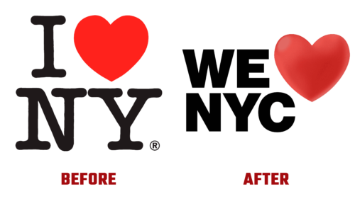
On Monday, March 20, 2023, New York City Mayor Eric Adams and State Governor Kathleen Courtney Hochul unveiled the city’s new visual identity. The project took $20 million and a year of work, but Americans didn’t like the result. They called the logo a cheap imitation and urged not to tamper with the classic.
The well-known love declaration emblem for one of the most significant cities in the United States was created in 1977 by Milton Glaser and brought to life in the design by Richard Indiana. It emerged during a turbulent time to boost the prestige of local tourism and elevate it to a respectable level. This composition marked the beginning of a parade of various installations with a heart and the names of settlements scattered around the globe.
The new logo’s author is Graham Clifford. He also wanted to raise the prestige of the famous city and overcome disagreements and negativity caused by the current global situation (the pandemic). However, locals believe he failed because the emblem lost its appeal due to excessive sexualization. The attempt to change the classic resulted in a fiasco. So, what’s so unusual about it?
- First, the author ventured into the 3D format and turned the two-dimensional symbol into a three-dimensional one, depriving it of its simplicity and visual smoothness. He added light highlights, darkened areas, and gradients to the heart, which replaces the word “Love.” This alone makes it difficult to implement the logo in reality.
- Second, the designer removed the letter “I” and replaced it with “We” to add inclusiveness to the symbol. However, this move caused a categorical debate among the population.
- Third, the developer added a “C” at the end of the city’s abbreviated name, which is unusual for such an abbreviation. In the original version, the short form was justified: “N” stood for “New” and “Y” for “York.”
- Fourth, the emblem’s inscription is now in an ultra-bold sans-serif font. The massive glyphs introduced coarseness to the emblem, causing it to lose its visual lightness and romanticism.
The result of the redesign is a modernist and unwelcoming logo We Love NYC instead of the familiar and charming I Love NY.


