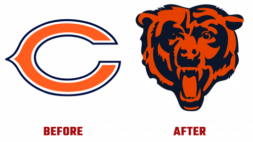
The Chicago Bears, a storied franchise in the National Football League (NFL), have announced a subtle but significant update to their visual identity. The new guidelines highlight the bear head mark as the team’s primary logo, replacing the former wishbone “C.” While it may seem like a minor alteration, this shift in the branding represents a thoughtful refinement in the representation of the team. The phrase Chicago Bears logo new fits perfectly within the context of the updated guidelines, emphasizing a fresh approach to the team’s imagery.
The bear-head logo, featuring a white outline that provides a clear outline against a dark background, now takes center stage. The design’s versatility and clarity are apparent, Offered in various formats, including CMYK, RGB, Pantone, one-color, and grayscale variations.
Key to the guidelines is the insistence that the bear head logo is surrounded by a clear space equal to 25% of its height. This clear space, not to be confused with whitespace, isolates the mark, enhancing its visual impact and making it a standout feature. Furthermore, the guidelines specify the logo’s sizing across different applications. It must be large enough to remain legible, with a minimum width of 1/2 inch or 35 pixels digitally.
Interestingly, the Chicago Bears logo’s new guidelines do not completely abandon the old “C” mark. It retains importance, especially in smaller print, digital applications, and embroidery, where the logo must be reproduced within specific dimensions. The wise use of the “C” mark, where necessary, demonstrates a considered approach to maintaining consistency and legibility.
Fans may not witness a drastic change in the visual presence of the team, however. For example, at least shortly, the Soldier Field’s 50-yard line and the team’s helmets will continue to showcase the secondary “C” mark.
The Chicago Bears’ decision to redefine the bear head mark as the primary logo underscores their visual identity’s dedication to clarity, consistency, and coherence. Though the shift is nuanced, it reaffirms the team’s brand values and reflects an understanding that even subtle changes can contribute to a powerful and unified representation.
By embracing the Chicago Bears logo’s new guidelines, the team modernizes its image and pays homage to its rich history and tradition. This change, though understated, resonates with the legacy of a franchise that continues to symbolize strength and endurance in professional football.


