Established in 1977, Aagrah is a well-known family-run food business in the UK, offering Indian restaurants, banqueting suites, catering services, and a range of retail sauces. Founded by Mohammed Sabir in Shipley, West Yorkshire, the company has grown significantly. Recently, Aagrah introduced a new brand identity and packaging design by London-based Red Dot Studio to enhance its market presence and appeal.
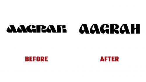
The new logo is a refined version of the original design from the 1970s, retaining its unique character while improving functionality and readability. The letter spacing has been adjusted for a balanced and contemporary look. The exaggerated strokes of the “A” s and vertical stems of the “G” have been softened, resulting in smoother and more appealing strokes. The “H” has been revised to improve legibility, making it more conventional and recognizable.
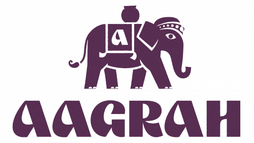
Accompanying the new logo is Lulu, an elephant mascot designed to embed Aagrah within Indian cultural imagery. Lulu is depicted in a minimalist style, with essential gestures defining its shape and face. Despite its simplicity, the mascot features detailed elements such as a rugged silhouette texture, an ornate headpiece, and a saddle blanket, adding authenticity and charm.
The mascot’s design includes gritty textures, enhancing its visual impact, especially in packaging. These textures are applied sparingly, ensuring they do not overwhelm the design but provide a tactile feel that complements the overall aesthetic. In animations, the textures are more challenging to animate, resulting in a slightly less fluid appearance.
The new branding uses vibrant colors that evoke Indian cuisine. Deep reds, bright yellows, and earthy tones dominate the packaging, creating an eye-catching and culturally resonant visual identity. These colors highlight different packaging elements, ensuring each product stands out while maintaining a cohesive look.
The typography combines an extended sans-serif font with a trendy monospace typeface, bringing a modern edge to the design. This mix aligns with current trends while paying homage to the brand’s heritage. The typography is clean and legible, making it easy for customers to read product information and brand messages.
A key feature of the new packaging design is its functionality. Each element is carefully considered to ensure customers’ ease of use. Clear labeling, easy-to-read nutritional information, and user-friendly packaging formats reflect Aagrah’s commitment to customer convenience.
The new branding emphasizes Aagrah’s role as a provider of authentic Indian cuisine. The packaging design incorporates subtle references to Indian cultures, such as traditional patterns and motifs, woven into the background graphics. These details add depth and richness to the design, enhancing the brand’s cultural authenticity.
The new logo and packaging design marks a significant step forward for Aagrah. By modernizing its visual identity while retaining its heritage, the company can appeal to loyal customers and new audiences. The updated branding enhances the aesthetic appeal of Aagrah’s products and reinforces the company’s commitment to quality and authenticity in Indian cuisine.


