


With its impending merger with Skydance, Paramount Global aims to transform the entertainment landscape completely. As part of this major development, the company unveiled a new logo prominently featured in its latest investor presentation. Incorporating elements from both Skydance and Paramount, this logo symbolizes the unification of these two formidable companies.
The iconic stars and mountains from Paramount, long associated with the corporation, remain in the new logo. However, instead of the classic, soft curve of the Paramount name, the new design uses all-caps, arched text reminiscent of the Skydance identity. This bold new design aims to combine both companies’ visual identities into a single, unified symbol.
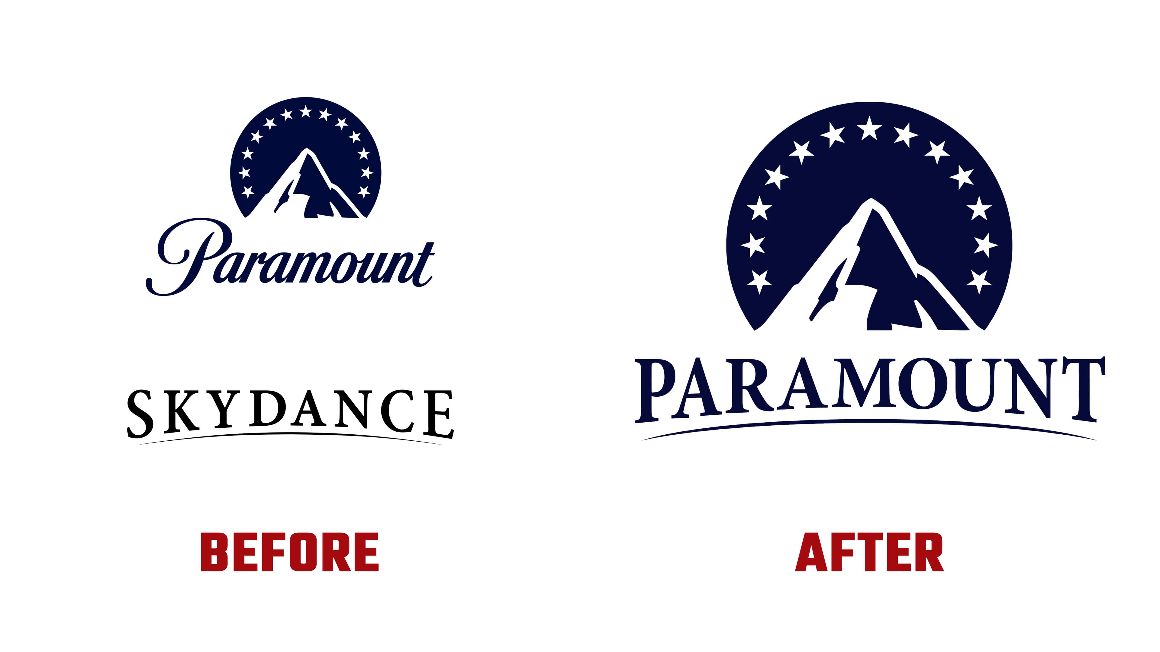
The transition to this new logo marks a significant departure from the familiar and comforting branding. The angled, all-caps text gives it a more authoritative, contemporary look that conveys strength and cohesion. However, the new logo has received mixed reviews, with some critics finding it less appealing than the classic emblem.
Despite the initial response, this logo might not be the final version. The combined logo may undergo further refinement, similar to the Warner Bros. Discovery design, which was first revealed in 2021 and revised before its final version was announced in 2022. This progression is typical of mergers, as initial designs often serve as temporary placeholders.

The logo evokes strong feelings of nostalgia for many people. Its consistent presence in the entertainment industry has led to numerous well-known movies. The stars and mountains bring back fond memories of time spent with loved ones or solitary trips into imaginary realms from movies. Longtime admirers have a deep emotional attachment to this emblem, so any changes must be handled delicately.
The merger of Paramount Global and Skydance is anticipated to yield many advantages. The new organization hopes to enhance its production capabilities and expand its market reach by combining resources, expertise, and creative talent. It’s lending Skydance’s innovative approach to its legendary history, which is expected to create a powerful force in the entertainment sector.
Regarding the logo’s design details, the bold, sans-serif typeface selected for the new lettering ensures excellent visibility and a contemporary look. The text is aligned in a soft arch that subtly references Skydance’s trademark. The iconic mountain remains in the center, symbolizing consistency and stability, while the stars continue to form a semicircle, representing the company’s unwavering dedication to producing high-quality films.
The color scheme, primarily blue and white, aligns with the classic palette. While the updated typeface and text positioning indicate a forward-looking strategy, this choice preserves a visual connection to the company’s history. Together, these elements balance Skydance’s newfound vitality with its longstanding tradition.