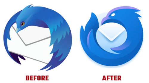
Thunderbird, the popular email client, has recently launched a refreshed visual identity, led by a modernized logo, that aligns more with the contemporary design aesthetic of Mozilla Firefox. The last logo redesign took place in 2018 with the release of Thunderbird 60. The reinvented emblem still depicts a bird clutching a letter this time, but the design clearly resonates with the Firefox logo’s style.
John Hicks, the creative mind who also designed the original logos for Firefox and Thunderbird, spearheaded this striking transformation. Given his involvement, it is no surprise that the new design aligns with the Mozilla aesthetic.
The revamped logo, which many did not initially anticipate to leave a profound impression, was an unexpected triumph. Its clever, streamlined design and appealing color palette have made it a source of logo design inspiration. The logo is an ingenious interpretation of the Firefox design and impeccably aligns with the Mozilla brand.
The Thunderbird of the past rested on an envelope with its textured wings folded downwards. The new design, however, features the bird tightly coiled around an envelope, ingeniously shaped like a speech bubble.
The bird, which gazed passively into the distance, now displays a determined gaze with oval eyes, conveying a sense of authority. The refined curved lines contribute to an elegant and professional appearance, but a subtle edge suggests a “video game villain” vibe.
The unveiling of the new logo is an intentional move by Thunderbird to signal the onset of significant changes in the email client. This updated visual identity is the starting point for a series of transformations, a strategic plan the team has been subtly hinting at and progressively implementing over recent months.


