


 Mozilla Thunderbird Logo PNG
The Mozilla Thunderbird logo reflects the evolution of the email client, which was once considered outdated. The new symbol shows that the brand is ready to make changes that will provide worthy competition to Gmail and other email services. It has the same dynamism as the Mozilla Firefox emblem, with which it is closely associated.
Mozilla Thunderbird began as part of Mozilla Suite. This single package combined a browser and mail client in the open-source environment around Netscape, AOL, and Mozilla. In April 2003, Mozilla changed its roadmap and split the suite into separate applications: the Phoenix browser and the Minotaur mail client. Phoenix gained attention quickly, while Minotaur had a smaller team and limited user interest.
In July 2003, AOL closed the Netscape browser division, and the Mozilla Foundation was created with $2 million in support from AOL, IBM, Sun Microsystems, and Red Hat. The mail project survived under the leadership of engineer Scott MacGregor, who led its development and renamed it Thunderbird. Version 0.1 appeared in summer 2003. The client used the Gecko engine and supported extensions and themes, giving users an open-source alternative to Microsoft Outlook.
Thunderbird 1.0 was released on December 7, 2004, with adaptive spam filters, RSS support, and virtual folders based on saved searches. In July 2007, the Mozilla Foundation moved the project away from direct control by Mozilla Corporation, as the corporation was focused on Firefox. In February 2008, Mozilla Messaging was created under David Ascher from ActiveState to develop Thunderbird and related communication tools. Thunderbird 3 was built under the codename Shredder.
Mozilla Messaging was absorbed into Mozilla Labs in April 2011. In 2012, Mozilla reduced investment and shifted Thunderbird toward community-led development, while active funding ended by 2015. Donations and contributors kept the client alive. On January 28, 2020, Thunderbird moved to MZLA Technologies Corporation, which could hire staff and build partnerships. In June 2022, MZLA acquired K-9 Mail for Android, and on October 30, 2024, Thunderbird for Android 8.0 was released.
Meaning and History
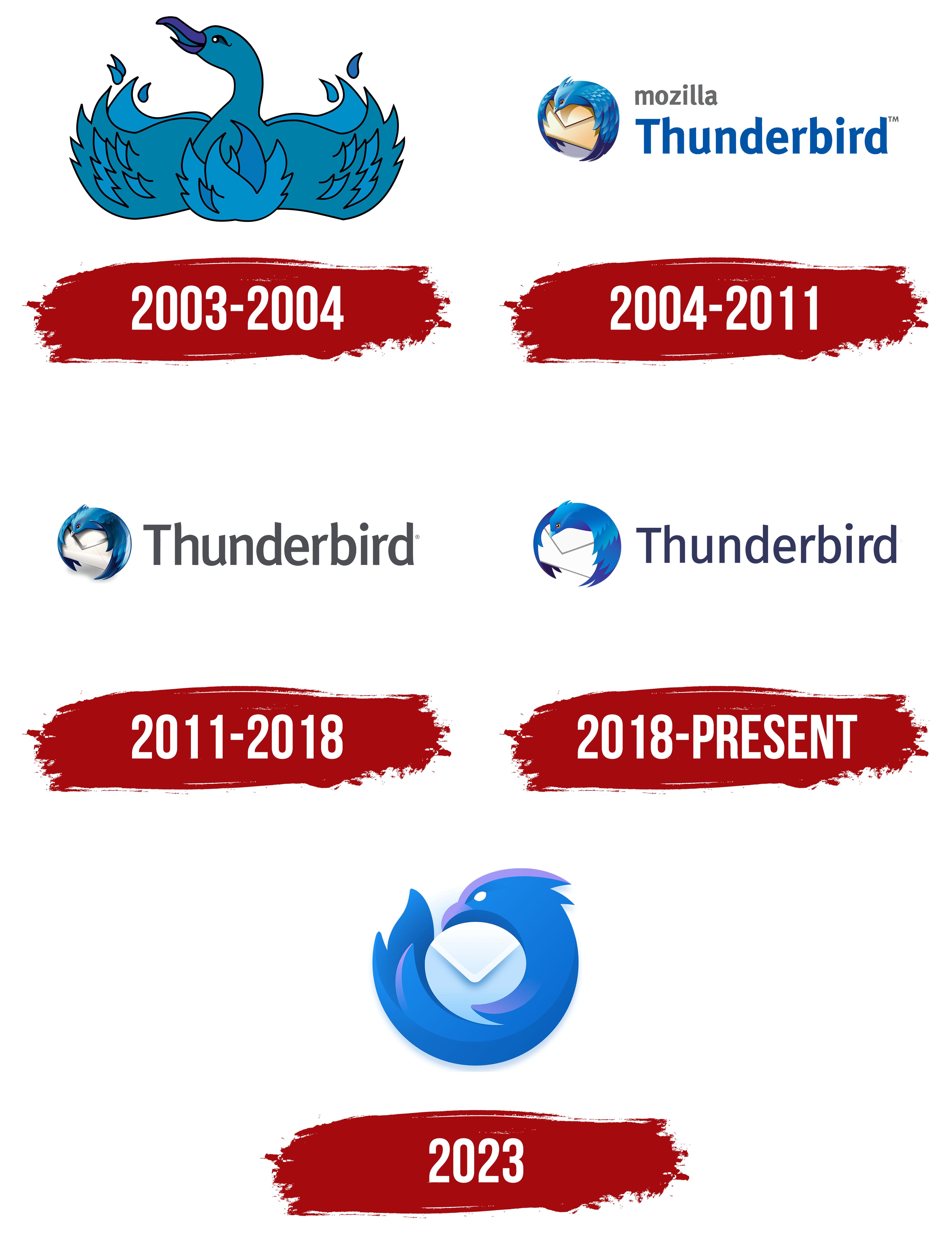
The name Mozilla Thunderbird originates from Native American legends of the people who once inhabited the territories of British Columbia, Oregon, and Washington. The locals believed in a winged creature capable of throwing lightning from its eyes and causing thunder with the flaps of its wings. This spirit was incredibly powerful, and its depiction was found on the coats of arms of the most influential chiefs.
The developers chose the name Thunderbird for the mail client because it symbolizes strength, protection, and power. The Native Americans placed it at the top of totem poles to express gratitude for assistance during droughts. The creators of the email-sending application used the image of this mythical bird as the logo’s central element. The legends describe the thunder-holding spirit as a giant horned eagle. Contemporary artists slightly altered their appearance, drawing two protruding feathers instead of horns. Overall, the emblem is adapted to Mozilla’s corporate style.
What is Mozilla Thunderbird?
Mozilla Thunderbird is a program designed to manage emails. It also has a built-in chat for instant messaging, a news feed, and other add-ons. The email client was developed in 2003 by the Mozilla Foundation and has been under the control of MZLA Technologies Corporation since 2020. It has versions for various operating systems, including Linux, FreeBSD, macOS, and Windows.
2003 – 2004

Contrary to expectations, the original Thunderbird logo does not feature this creature but another fictional character, the Phoenix. The reason is that Mozilla Firefox was previously called Phoenix and used a red bird emblem. The creators of the email client simply copied the existing image and recolored it in bright blue. In this way, they demonstrated the new project’s connection to the web browser.
The bird looks like a swan sitting on the ground, with its wings spread to the sides. Flames embrace its chest, and the feathers resemble tongues of fire streaming upward. The head, with a large purple beak, is turned to the left, and the neck is elegantly curved.
2004 – 2011

When it became clear that Firefox’s popularity was increasing, the developers decided to resume development of the email client. The project received an emblem featuring a bluebird perched on a beige envelope, gently embracing it with its wings. Now the feathers no longer associate with fire but look like shiny scales. The lower ends of the wings are a bit frayed. There is a crest with three notches on the head. In general, Thunderbird looks friendly because the artists made the gaze expressive and created the illusion of a smile using visual transitions.
The small gray word “mozilla” is written in the brand’s proprietary font used at the time. The second part of the name is on the next line and is colored blue. It is set in the same typeface as ITC Officina Sans Std Bold. The curved, trimmed ends of the letters create a sense of dynamism. Jon Hicks designed the logo.
2011 – 2018

The envelope was repainted white and given a silver edge. The rows of feathers on the bird’s wings are neatly arranged. There is a steeper gradient because the transitions between shades are smooth rather than sharp. This adds volume and realism to the image. Additional notches have appeared on the crest. The inscription has been shortened to the word “Thunderbird,” which has now turned gray.
2018 – 2023

The emblem has lost its detail, so it looks smooth, soft, and friendly. But the sharp corners, which represent feathers and maintain visual dynamics, have been preserved. The envelope no longer has a gradient; it is completely white, outlined with monotone gray lines along the edges. The bird’s blue palette has taken on bright, saturated shades. The inscription is repainted in graphite color and set in even letters with barely noticeable cuts at the ends.
2023 – today
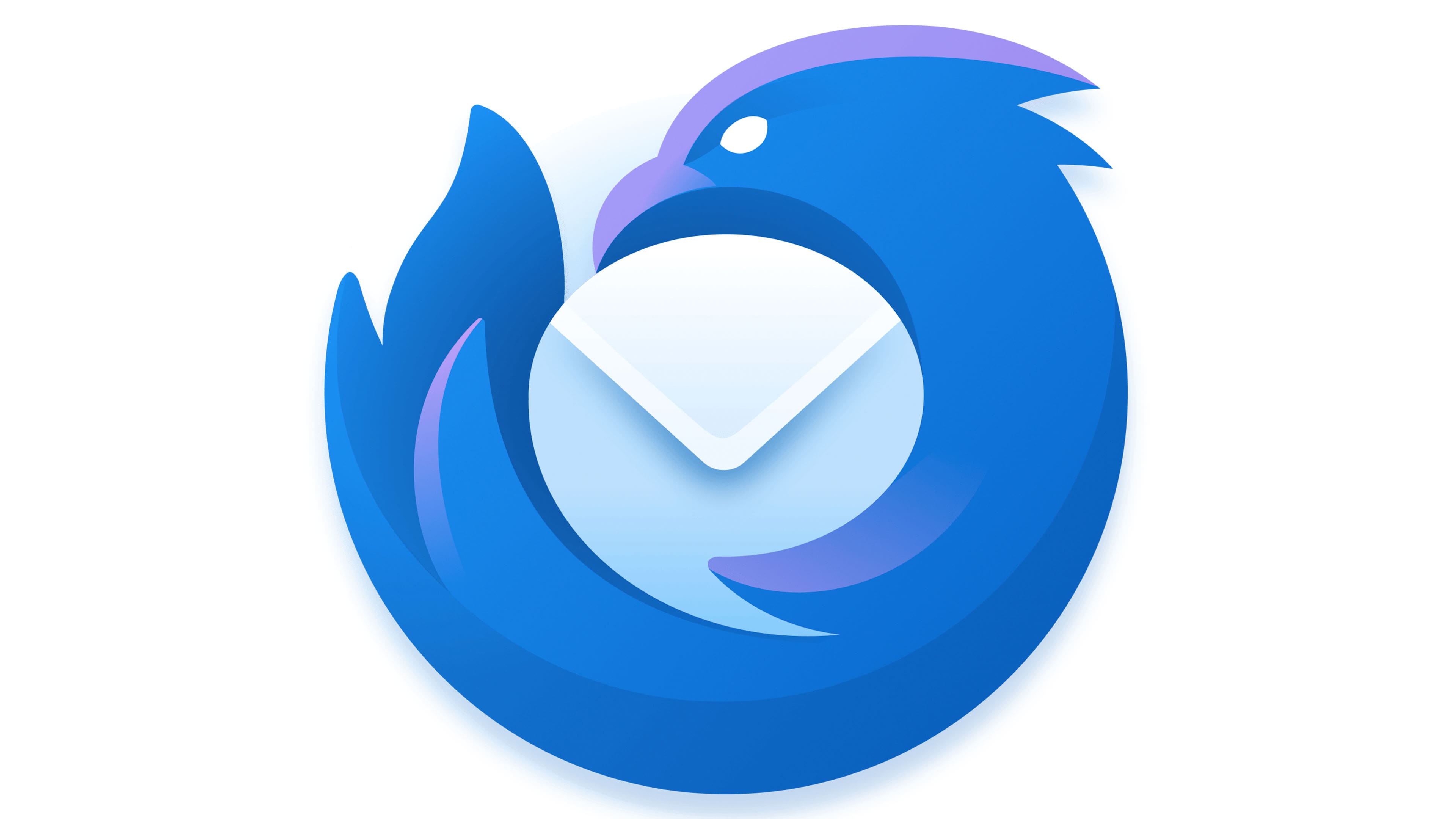
In 2022, Mozilla announced the relaunch of its mail client under a revamped brand. A year later, manager Ryan Sipes introduced a modernized Thunderbird logo, which marked the project’s revival. It’s still the same bluebird on the same envelope, but now they look completely different. The envelope is a speech bubble that symbolizes communication between users. The bird no longer has lush wings; it looks like a single large wing, mimicking the Firefox emblem. Sharp lines form a predatory profile, while white oval eyes give it a “villainous” look. The logo was designed by designer Jon Hicks and presented on May 24, 2023.
Fonts and Colors
In the early versions of the emblem, a font similar to ITC Officina Sans Std Bold was used. Then the developers simplified the letter shapes, bringing them closer to the Dylan Condensed Normal typeface from Wiescher-Design, but cutting off the tops of “h,” “d,” and “b.” After the 2023 update, the logo no longer has any inscriptions. Now it only shows the bird embracing the envelope. The predominant palette is white, purple, and blue with a gradient.