 Paramount Global Logo PNG
Movies, TV series, television programs, and streaming services form a unified media stream that accompanies everyday life. Content production includes filming, distributing, and managing the platforms viewers use to access the material. The Paramount Global logo represents a media company that creates and distributes films, TV programs, and digital content through movie theaters, television, and online services.
Paramount Global’s history began in May 1912. At that time, Adolph Zukor founded the Famous Players Film Company. In 1914, Paramount Pictures was established. It became the first national film distribution network in the United States. The block booking system helped the company achieve a leading position in the market. However, it caused antitrust disputes that lasted more than twenty years.
By the 1960s, the studio faced a crisis. In 1966, the conglomerate Gulf and Western Industries acquired it under Charles Bluhdorn. The appointment of producer Robert Evans brought the studio new success. The films “Rosemary’s Baby,” “Love Story,” and “Chinatown” returned Paramount to the ranks of Hollywood’s leading studios. In 1967, the company acquired Desilu Productions.
In the 1980s, Gulf and Western adopted the new name Paramount Communications. In the 1990s, media magnate Sumner Redstone took control of the studio. In 2000, Viacom Corporation acquired CBS, creating one of the largest media companies in the United States. After Viacom was split in 2005, both structures remained under the control of the Redstone family.
In December 2005, Paramount bought DreamWorks for $ 1.6 billion. In 2019, CBS and Viacom merged again. As a result, ViacomCBS was formed. The company’s market value reached about $30 billion. Its share of the American television market reached twenty-two percent.
In 2022, the company changed its name to Paramount Global. The company focused on developing the Paramount brand and the streaming service Paramount+. In July 2024, the merger with Skydance Media was completed. The deal was valued at $8 billion. The new structure was named Paramount, A Skydance Corporation. David Ellison became the company’s head. The Redstone family left the board of directors.
The company’s leadership presented a strategy to revive key franchises. These include “Star Trek,” “Transformers,” and “World War Z.” The company plans to focus on producing films for theatrical release. The annual production volume is expected to reach twenty films. It intends to apply new technological solutions that combine the film industry with Silicon Valley innovations.
Meaning and History
What is Paramount Global?
An American media group based in New York, it was formed following the merger of CBS Corporation and Viacom. It includes Paramount Pictures, CBS, MTV, Nickelodeon, BET, Comedy Central, Showtime, and the platforms Paramount+ and Pluto TV. It operates about 170 television channels with an audience of 700 million people in 160 countries. Among the company’s international assets are Channel 5, Network 10, Colors, and Telefe. Following an 8-billion-dollar deal with Skydance Media, the company led by David Ellison announced the relaunch of the Star Trek and Transformers franchises and a return to theatrical releases.
2006 – 2009
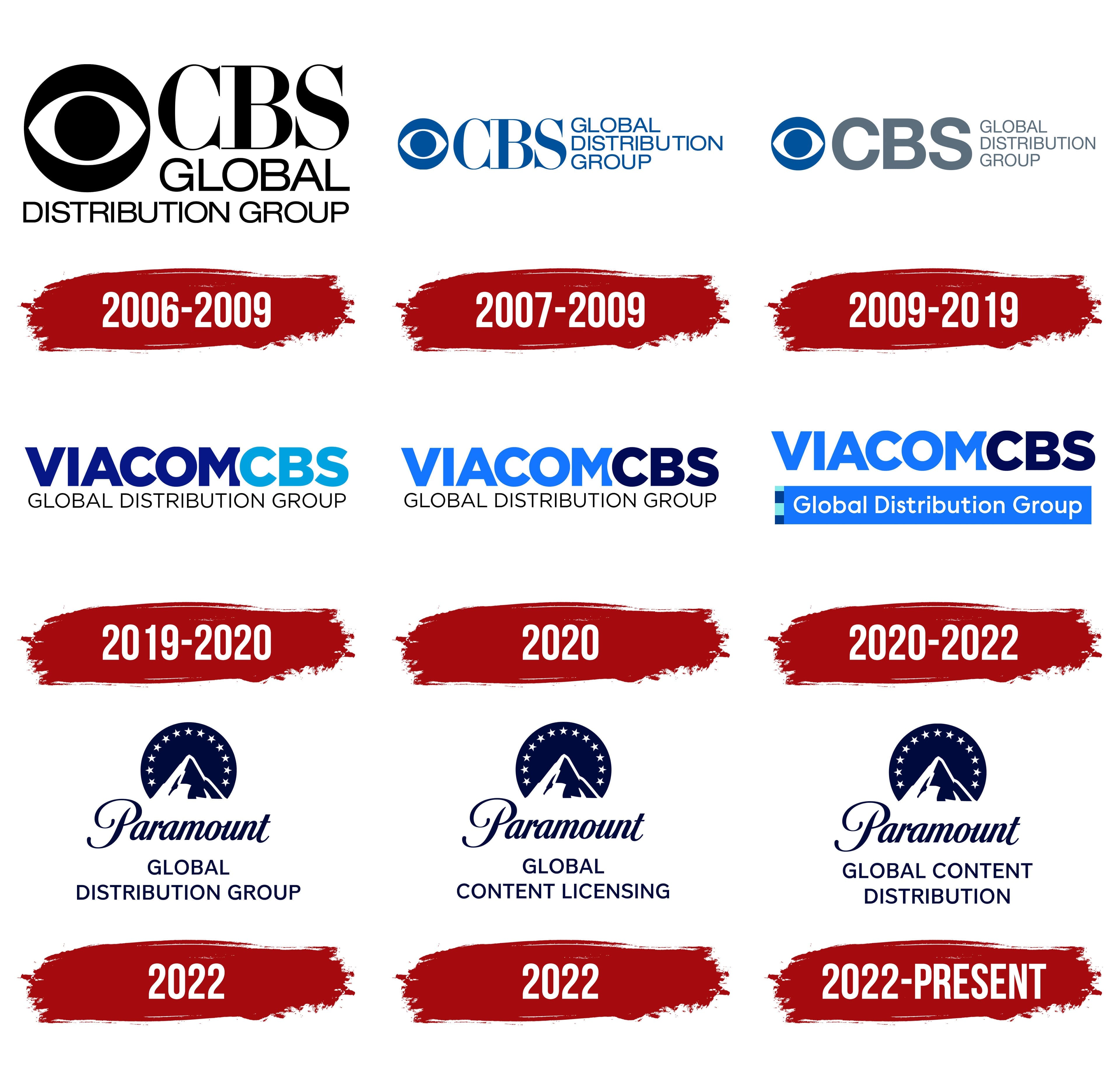
CBS Global Distribution Group handled the international licensing and distribution of films and television programs. The division later became Paramount Global Content Distribution. The names CBS Global Distribution Group, ViacomCBS Global Distribution Group, and interim versions used in 2022 accompanied changes in the business structure. Some identity versions were used concurrently, so the division’s history should be considered separately from changes to the parent media group’s logos.
The early identity followed the 2006 restructuring. CBS Corporation combined CBS Paramount Domestic Television, King World Productions, and CBS Paramount International Television into CBS Television Distribution Group. The international business used the CBS Eye emblem beside its name. The large CBS abbreviation indicated its connection to the company, while “Global Distribution Group” explained the division’s function.
On the left was a black circle containing a white horizontal eye silhouette with a small black pupil in the center. Heavy uppercase serif “CBS” lettering appeared on the right. Thick main strokes combined with thin connecting strokes. “GLOBAL” appeared beneath the abbreviation, followed by a smaller “DISTRIBUTION GROUP” below. These descriptors used upright uppercase sans-serif letters. The black treatment on a white background continued CBS’s visual tradition.
The eye’s history began long before the division was established. Television viewers first saw the emblem on October 20, 1951. Art director William Golden developed it with artist Kurt Weiss, drawing on an image from a publication about Shaker art. After the first season, Golden planned a replacement, but CBS President Frank Stanton kept the eye. The lettering accompanying the emblem was based on a modified Didot. CBS staff adapted the typeface, and typographer Freeman Craw later joined the work.
The next chapter in the corporate history involved the merger of CBS Corporation and Viacom, completed on December 4, 2019. The group became ViacomCBS. Its Hollywood business traced its origins in part to Famous Players Film Company, founded by Adolph Zukor in 1912, and the distribution company Paramount Pictures Corporation, established by William Wadsworth Hodkinson in 1914. The date 1912 marks the studio’s founding, while 2019 marks the formation of the combined media company.
On February 15, 2022, the group introduced the Paramount name. The English word “paramount” means “highest in rank” or “of foremost importance.” Board Chair Shari Redstone connected the name to a promise to be the best. The name was intended to unite the media business under a brand already familiar to global audiences through Paramount Pictures and Paramount+. The legal name became Paramount Global on February 16, while the shortened Paramount was used in public-facing branding.
On August 7, 2025, the merger with Skydance Media ended the parent company’s period under the Paramount Global name. The new group became Paramount Skydance Corporation. The Paramount Global Content Distribution division continued operating under its existing name.
2007 – 2009
From 2007 to 2009, CBS Global Distribution Group used a compact horizontal logo. The eye emblem and name appeared in a single row, and blue replaced the previous black. The update concerned the size and placement of the components. The CBS Eye shape and the CBS lettering, with its mix of thick and thin strokes, remained.
The eye appeared on the left, followed by large “CBS” letters. A narrow block of 3 lines sat on the right. “GLOBAL” occupied the upper line, “DISTRIBUTION” the middle, and “GROUP” the lower line. Moving the descriptors to the right extended the wordmark horizontally.
The division used other logo versions during the same period. They differed in eye size, line arrangement, and color. Their periods of use partially overlapped, and the blue horizontal version served as one variation of the shared identity.
2009 – 2019
After separating from Viacom, CBS’s right to use the Paramount name neared expiration. In May 2009, the international business became CBS Studios International. The logo still included the words “Global Distribution Group.” CBS used this wording until CBS and Viacom reunited in 2019.
The main revision concerned the large “CBS” lettering. The abbreviation was set in heavy uppercase sans-serif letters and colored gray-blue. The eye emblem on the left retained its blue shade. The color difference separated the symbol from the name.
A three-line descriptor appeared on the right. “Global” occupied the top line, “Distribution” the middle, and “Group” the bottom. All the components remained in a shared horizontal arrangement. Large “CBS” lettering represented the company, while the smaller text on the right identified the division’s content distribution work.
2019 – 2020
After the transaction closed on December 4, 2019, the international television content licensing teams of CBS Studios International and Paramount became part of the shared ViacomCBS Global Distribution Group structure. The combined ViacomCBS name brought together the names of the companies that had split in 2005.
In the first logo versions, “VIACOMCBS” was written as a single unit, with color distinguishing its parts. “VIACOM” appeared in a rich dark blue, while “CBS” was bright light blue. The large uppercase letters were equal in height and set in a heavy sans-serif typeface. The shared lettering united the name on a single line, while the 2 shades preserved the boundary between its components.
Black “GLOBAL DISTRIBUTION GROUP” lettering appeared below. The lower line explained the division’s international content distribution work. It used elongated uppercase sans-serif letters with thin strokes. The descriptor’s smaller size left the media group’s name in the leading position.
2020
In the 2020 logo version, the Viacom and CBS names continued to form the shared “VIACOMCBS” wordmark. The identity relied entirely on lettering, replacing the separate CBS Eye and Paramount mountain images.
The changes focused on color distribution. Bright blue replaced the previous dark blue for “VIACOM,” while “CBS” changed from bright light blue to dark blue. The letter arrangement and typeface remained unchanged. The 2 shades continued to distinguish the components of the combined name.
2020 – 2022
By May 2020, CBS and Paramount’s international content licensing and distribution teams came under shared management. The integration included a new version of the ViacomCBS Global Distribution Group logo. The division’s name received a separate colored band.
A bright blue rectangular field with white “Global Distribution Group” lettering appeared beneath the large “VIACOMCBS.” The lower line used thin letters. The initial “G,” “D,” and “G” were uppercase, while the remaining letters were lowercase. The upper wordmark retained its previous typeface, and its larger size gave the media group’s name prominence.
A vertical strip of 4 small rectangles ran along the blue field’s left edge. Light turquoise sections alternated with dark blue ones, forming a segmented side border. The colored background united the descriptors in a separate block beneath the corporate name.
2022
Paramount Global Distribution Group was among the first names used in the division’s identity after ViacomCBS was renamed in February 2022. The logo appeared on Paramount’s website for several days. It reintroduced the mountain emblem, connecting the owner’s new name to the studio’s history.
The upper portion of the logo featured an angular peak with a snowy section inside a semicircle. Above the mountain, 13 evenly spaced stars formed an arc. Right-slanting calligraphic “Paramount” lettering appeared below. Beneath the name were 2 lines of uppercase sans-serif lettering, “GLOBAL” and “DISTRIBUTION GROUP.” The image and text were centered and rendered in dark blue.
The mountain, stars, and handwritten name trace back to William Wadsworth Hodkinson’s 1914 emblem. He drew on memories of the Utah mountains where he had spent his youth. The design is often associated with Ben Lomond Peak near Ogden. The original painterly illustration was redesigned many times, retaining the peak, arc of stars, and calligraphic name.
The studio loyalkaspar developed the flat mountain version for Paramount+’s 2021 launch. The team studied divisional emblems, identified design differences, and created a shared form. The team simplified the silhouette for digital applications and enlarged the stars. The service’s logo used 13 stars, corresponding to the number of letters in “Paramount Plus.” The project also standardized the blue shades.
The 2022 corporate identity adopted the flat peak and white stars on a dark blue field. The previous Paramount Global Distribution Group wordmark used a single-color dark blue treatment.
2022

In 2022, the Paramount division used the name Paramount Global Content Licensing. It followed Paramount Global Distribution Group and became the second wordmark form.
In the logo, “CONTENT LICENSING” replaced the descriptor “DISTRIBUTION GROUP.” “Paramount,” “Global,” and the rest of the identity remained unchanged. The new wording identified licensing, the granting of rights to use content, shifting the emphasis away from distribution.
2022 – today
Replacing “Licensing” with “Distribution” completed the update to the Paramount division’s wordmark in June 2022. The name Paramount Global Content Distribution followed ViacomCBS’s renaming as Paramount Global. “Content” clarified the division’s work licensing films, series, and formats from the libraries of Paramount Pictures, CBS Studios, Showtime, and other group studios.
A two-line descriptor appeared beneath the historic Paramount lettering, mountain, and stars. “Global Content” occupied the upper line, with “Distribution” below. The revision concerned the text, while the emblem and the rest of the identity remained unchanged.
After Paramount Skydance Corporation was formed, the division continued operating as Paramount Global Content Distribution. The mountain, stars, and handwritten Paramount remained part of its logo.