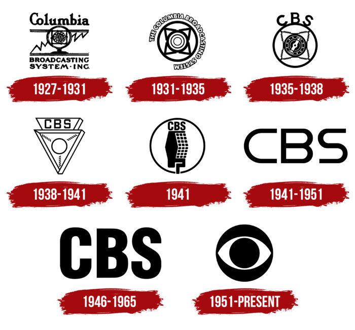
The CBS logo is a concise, mystical demonstration of the essence and philosophy of the brand, a sign of the transition to visual content. The CBS abbreviation and symbol on the company’s logo are recognizable and indicate to users the owners of the brand.
CBS: Brand overview
| Founded: | September 18, 1927 |
| Founder: | Arthur Judson |
| Headquarters: | United States |
| Website: | cbs.com |
Meaning and History
William Golden is considered the author of the famous CBS emblem. But few know that the designer borrowed the idea from Belgian artist René Magritte. This refers to the surrealist painting “The False Mirror,” which depicts an eye with clouds instead of the iris. The original CBS logo also featured a blue sky with clouds inside the eye. Kurt Weiss drew it under William’s direction. But this version has not survived to the present day: the head of the radio and television company, Frank Stanton, personally removed the sky landscape, and since then, the icon has been black and white. At the same time, officials claim that the emblem was inspired by the symbols on Amish barns, which were supposed to ward off evil spirits.
The unofficial nickname Eye Network was given to the company thanks to its logo, which depicts a human eye. It appeared in 1951, replacing the old brand names with inscriptions.
What is CBS?
CBS is the abbreviated name for Columbia Broadcasting System, an American radio and television network that is part of the namesake corporation. It is also one of the three largest broadcasting stations in the United States.
1927 – 1931
The beginning of the history of the Columbia Broadcasting System is considered to be 1927. But in fact, the radio network under this name appeared in 1929. Before that, there was the Columbia Phonograph Broadcasting Company, which was renamed and relaunched after bankruptcy. So, the logo presented here dates not to 1927 but to the time when the network was rebranded after it went on air again. It depicts a classic vintage radio microphone inside a massive structure designed to improve sound quality. It stands on an improvised table in the form of a double horizontal line. For symmetry, another such double strip is drawn at the top. Between them stretches a zigzag line, resembling a growing linear graph.
Above the image is the word “Columbia,” and below is the phrase “BROADCASTING SYSTEM INC.,” divided into two lines. All elements, including the letters, are black. A Serif font is used for the inscription. The spacing between the glyphs is so narrow that the letters “C” and “o” are connected, as in handwriting.
1931 – 1935
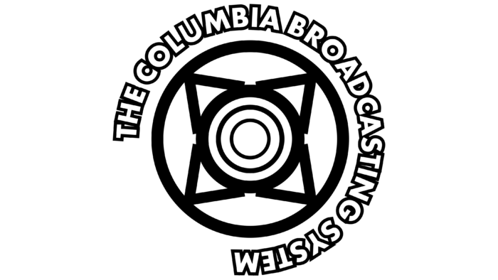
The number of stations in the network grew rapidly, so its owners thought about rebranding. Thus, a new CBS logo appeared. It also features a round retro microphone for voice recording, but now only its top part is visible without the stem. The design consists of white concentric circles with black outlines of different widths and four triangles in the shape of a star. Geometric shapes are placed inside a black ring, on which the phrase “THE COLUMBIA BROADCASTING SYSTEM” is written in bold grotesque. The spacing between the letters has become even smaller, so now closely spaced glyphs are separated only by black outlines. The letters themselves are white.
1935 – 1938
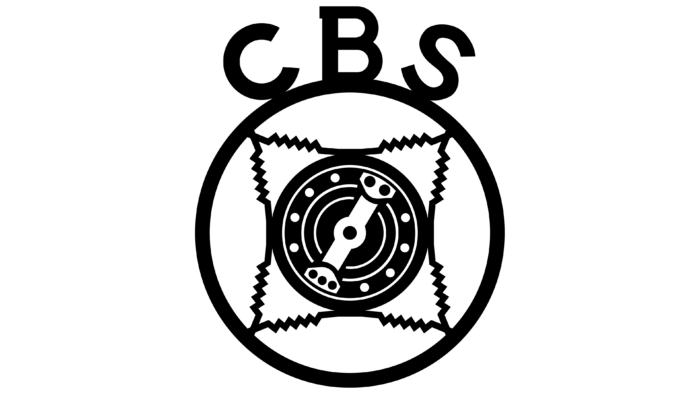
In 1935, the radio network adopted a logo with the abbreviation “CBS” instead of long letters. Three black letters are attached to the top of a black ring, so they are arranged with an arc-shaped tilt. The font looks asymmetrical because the letter “B” has only one small rectangular serif, and the letters “C” and “S” have no serifs at all. Artists have detailed the interior of the old radio microphone and serrated the triangular lines to make it clear that these are springs.
1938 – 1941
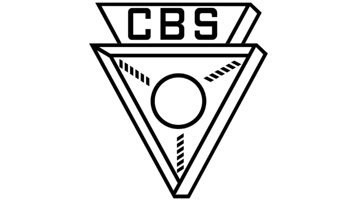
In 1938, CBS bought a recording company and changed its logo on the way. Instead of a round microphone, designers depicted an abstract triangular design with a circle in the middle. The frame around the perimeter of the triangle creates an optical illusion. Due to the distortion of depth perception, it is unclear which edges protrude and which are on the side. At the top is an inverted trapezoid with black “CBS” letters written in a print font.
1941
In 1941, the artists changed the appearance of the microphone. It still has a retro design, but its shape is now not round but vertically elongated. Only a black frame ring, in which the logo is placed, reminds of a circle. The right side of the microphone consists of 24 square dots arranged in 3 rows of 8 each. The left side looks like a deformed diamond. Above is a thin horizontal line emphasizing the black “CBS” abbreviation. The inscription font is bold, grotesque Helvetica Condensed. Below is the microphone’s leg in the form of a wide hook-shaped line.
1941 – 1951
One of the radio and television network emblems contains the letters “CBS” – an abbreviation for Columbia Broadcasting System. Designers used a winding semi-circular font and a simple black-and-white palette.
1946 – 1965
In 1946, the company introduced another logo with the abbreviation “CBS.” Light falls from the upper right corner from a spotlight, illuminating the inscription. Thanks to the artistic combination of light and shadow, it appears three-dimensional.
1951 – today
The modern version of the logo was introduced on October 20, 1951, by CBS creative director William Golden. The idea to draw an eye came to him quite accidentally when he was driving through southeastern Pennsylvania and saw unique polygonal barns of the Shaker religious community. The buildings depicted hexagonal signs that were supposed to protect against evil spirits.
The artist combined occult drawings with a Pennsylvanian hexadecimal symbol to create a new CBS logo. In 1952, he suggested replacing the mystical eye with another “identifier,” but the company president was categorically against the redesign.
CBS: Interesting Facts
CBS, also known as the Columbia Broadcasting System, is a big TV network in the United States that started long ago, first as a radio network.
- How It Started: CBS began in 1927 as a bunch of 16 radio stations by Arthur Judson. Later, it became one of the biggest radio networks and moved into TV in the late 1940s.
- The Eye Logo: CBS has had a logo that looks like an eye since 1951. It was made by William Golden and is meant to invite people to watch CBS. It’s very famous now.
- Big Moments: CBS has shown some important events on TV, like the first big presidential debate in 1960 between John F. Kennedy and Richard Nixon. This debate showed how TV could influence politics.
- News Shows: CBS News has made some very well-known news programs, like “60 Minutes,” which has been on the longest and watched by many people since 1968.
- Sports: CBS Sports covers major sports events, such as football games, college basketball, and golf. It was one of the first to use instant replay in its broadcasts.
- Famous Shows: CBS has many popular TV shows, like “I Love Lucy,” “MAS*H,” and “The Big Bang Theory,” which many people love and still remember.
- New Tech: CBS was the first to show live TV in color in 1953 and has always used new technology to improve TV, like high-definition broadcasts.
- Around the World: CBS doesn’t just show TV in America; its shows are watched in other countries too. They have a special part of the company to handle shows going international.
- Big Changes: CBS has undergone many changes, joining other companies and splitting up over the years. Recently, it joined Viacom again to form a big company called Paramount Global.
- Online Streaming: CBS started a streaming service called CBS All Access, now Paramount+. This service lets you watch live CBS and other special shows and movies online.
CBS has been a big part of TV in America for almost 100 years, showing how TV can change over time and still be a big part of how people get news, watch sports, and enjoy shows.
Font and Colors
The current CBS logo is known as Eyemark. It depicts an object resembling a human eye. The figure consists of three geometric elements: a large black circle, which acts as the background; a pointed white ellipse; and a small black circle with a pupil. This is a symbol of television broadcasting and modern media technologies, a sign of the transition from audio to visual content.
The graphic logo is often supplemented with the abbreviation “CBS” and the name of a specific division. Moreover, each version has its own font. For example, “CBS News” has long, thin serifs, “CBS Sports” is grotesque, and the word “Radio” is written in an unusual designer font.
The color palette also varies. Monochrome combinations of white with black or shades of blue mainly predominate. Sometimes, there are emblems with a gradient and a combination of several bright colors.
CBS color codes
| Black | Hex color: | #000000 |
|---|---|---|
| RGB: | 0 0 0 | |
| CMYK: | 0 0 0 100 | |
| Pantone: | PMS Process Black C |
FAQ
What is the CBS Logo?
The logo consists of three geometric elements in the shape of an eye: two black circles (a small central one and a large outer one) and a white oval with pointed ends. The sign is called Eyemark. It was created in 1951 by William Golden.
Who Founded CBS?
William S. Paley founded CBS after receiving it from his wife’s brothers, Isaac and Leon Levy. He also became the head of the company, buying another 16 radio stations. This event occurred in 1928.
What Does CBS Mean?
CBS stands for Columbia Broadcasting System. The abbreviated name of the American radio and television network has been used since 1974.
Who Founded CBS in 1927?
In 1927, the CBS company was founded by Arthur Leon Judson. About three months later, he sold the radio station to the Levy brothers – Isaac and Leon. They, in turn, handed it over to William S. Paley, who expanded and developed the broadcasting network.

