


 Afterlife Logo PNG
The Afterlife logo resembles a rich, smooth cocktail of life, intertwining moments of joy and loss to create a complex, multifaceted image. The emblem symbolizes the ongoing search for the meaning of existence, reflecting the hero’s desire to learn to accept life as it is, with its bright and dark sides. The symbol conveys gradual forward movement, step by step, despite challenges, emphasizing that embracing life fully helps to find harmony and meaning.
After Life began in 2018, when British comedian, actor, and writer Ricky Gervais started developing a new series for Netflix. After his earlier project Derek, the idea grew from his reflections on life, death, grief, and the search for meaning. Gervais built the story around Tony, a local newspaper journalist whose life changes after his wife dies of cancer.
The first season took several months to write. Gervais wrote every episode, created and produced the series, and played the lead role, which gave him control over the tone, structure, and emotional direction of the show. Filming began in 2018, mainly in Hampshire, England, with other British locations used for the fictional town and its surroundings.
The first season premiered on March 8, 2019. The series drew attention for combining black humor with a direct look at mourning, loneliness, anger, and everyday attempts to keep living after loss. On April 3, 2019, the show was renewed for a second season. Gervais continued as writer, director, and lead actor. At the same time, the story gave more space to Tony’s colleagues, friends, and people around him.
The second season premiered on April 24, 2020, continuing the themes of recovery and human connection. A third and final season was approved after its success, with production starting in late 2020 and filming completed in early 2021 under health precautions. The final season was released on January 14, 2022, closing Tony’s story. By 2023, the series remained popular with new viewers and received award attention, including BAFTA nominations.
Meaning and History
What is Afterlife?
This poignant and darkly comedic British television series delves deeply into themes of grief, loss, and the human condition. The main character, Tony, a man dealing with the unbearable loss of his wife, struggles to cope with a new reality that seems meaningless to him. The story is set in the small village of Tambury, where various characters confront their personal problems and existential dilemmas. The show stands out for its raw exploration of Tony’s despair and self-destructive thoughts while unexpectedly incorporating moments of kindness and humor. The series emphasizes the importance of compassion and the power of human connections, showing that even in the darkest moments, there is always room for hope and change.
2019 – today

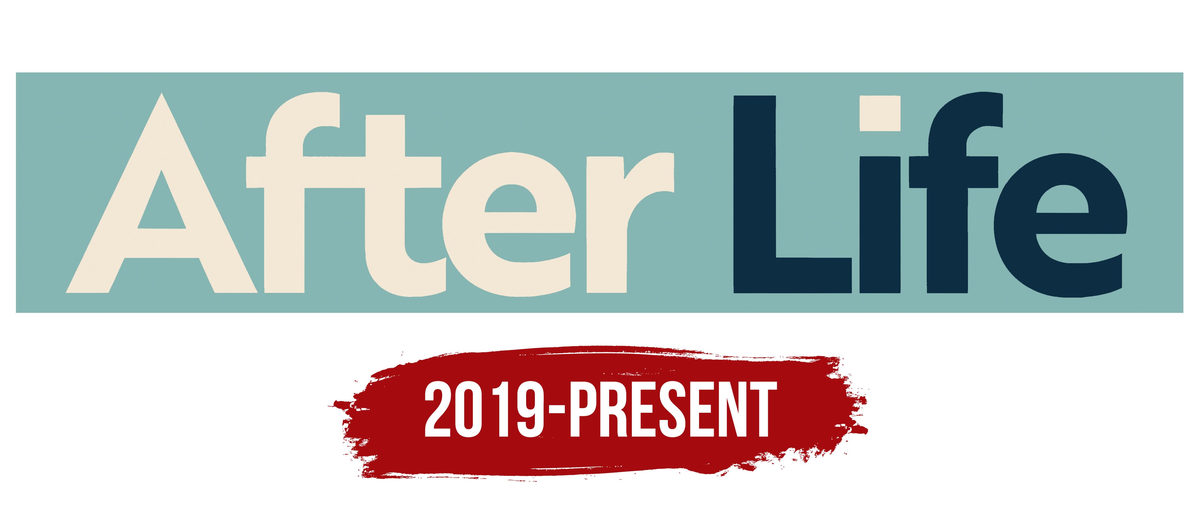
The series “After Life” logo is minimalist and conveys its central theme. The title is set against a rectangular background in muted olive, which emphasizes the protagonist’s complex emotions and inner struggles. The olive shade can be seen as a symbol of a fading life, an intermediate state between hope and loss.
The font is simple and concise, highlighting the story’s openness and sincerity. It consists of two colors: beige and deep blue. This color choice is a metaphor for the contrast between light and darkness, life and death. The beige represents the protagonist’s past, brighter moments, while the blue reflects his loss and descent into grief after his wife’s death.
Of particular interest is the small beige “dot” above the letter “I” in the word “Life.” This element can be interpreted as a ray of light in the darkness, a small but significant spark of hope that remains with the protagonist during the darkest period of his life. The closed shape of the letters suggests the isolated state in which the main character exists, trapped in his pain and losses.
The emblem reflects the plot’s deep emotional dynamics: from despair to gradual acceptance, from darkness to light, and from the past to the present, making it a perfect visual representation of the series’ content.