The emblem of the American television network is both simple and complex, reflecting the modern name of the brand in the form of an acronym of the first letters of three words. The fame of the company Home Box Office was ensured by the HBO logo, which, with its conciseness, reflects the constant changes and continuous improvement of the brand as a product.
HBO: Brand overview
| Founded: | 1972 |
| Founder: | Warner Bros. Discovery |
| Headquarters: | New York, U.S. |
| Website: | hbo.com |
Meaning and History
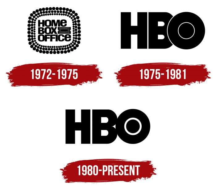
In the history of Home Box Office, there were three notable dates, each marked by a change of logo.
What is HBO?
HBO is an acronym for the oldest American premium television network, Home Box Office. Warner Bros. Discovery owns it and has been broadcasting continuously since its launch in 1972. Its programs include various films (feature, educational, short, and documentary) and concerts. Charles Dolan founded the network.
1972 – 1975
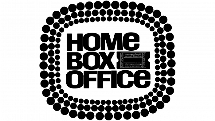
The main HBO channel began broadcasting in 1972 when the first emblem appeared with the inscription “HOME BOX OFFICE” and a picture of a ticket check. They were made in a three-layer frame consisting of many circles of different diameters.
1975 – 1980
In 1975, Home Box Office became the first satellite TV channel. The logo also changed: Betty Brugger, the lead artist at Time-Life, proposed a version with a minimalist black-and-white inscription “HBO.” Inside the last letter was a large circle, in which the letter “O” partially overlapped the letter “B.” There were versions with three lines – blue, yellow, and red.
1980 – today
In 1980, the Home Box Office network appeared. To mark this event, Betty Brugger made minor changes to the brand name, separating the letters “B” and “O.” In addition, she reduced the diameter of the circle inside the letter “O” for better readability.
HBO: Interesting Facts
HBO, short for Home Box Office, is a big name for TV because it produces good shows and movies.
- Starting Out: HBO began in 1972, making it the oldest subscription TV service in the U.S. It was the first to send its shows to cable systems via satellite, which helped make cable TV popular.
- Leading the Way: HBO was the first to broadcast with satellite technology, reaching viewers all over the country. It also invented the idea of showing what’s next in a little box on the screen.
- Making Its Own Shows: In the beginning, HBO showed movies, sports, and comedy shows. But in the 1980s, it started making its series, like “Fraggle Rock.” Later, it made famous shows like “The Sopranos” and “Game of Thrones.”
- The Sopranos: This show started in 1999 and changed TV by showing that TV shows could be good, just like movies. It led the way for more great shows on HBO.
- Game of Thrones: This show, based on George R.R. Martin’s books, was watched by people worldwide. Its last episode in 2019 was super popular, even though not everyone liked how it ended.
- Movies on HBO: HBO is known for showing a new big movie every Saturday night. These movies come from big movie companies and are shown not long after they’re in theaters.
- Streaming: HBO has been ahead in streaming, too, with HBO Go and HBO Now. And in 2020, it started HBO Max, which has even more shows and movies.
- Talking About Tough Topics: HBO doesn’t avoid hard topics. It shows real-life stuff, political issues, and stories about LGBTQ+ people, things other networks might not show.
- Winning Awards: HBO’s shows have won many awards, including Emmys and Golden Globes. It’s known for winning many of these awards.
- Documentaries and Comedy: In addition to dramas and movies, HBO has great documentaries on different topics and comedy shows with famous comedians.
HBO has changed TV by making shows that are like good movies, talking about important issues, and always trying new things. It’s a big part of why TV is so good these days.
Font and Colors
The logos of the HBO television network reflect changes in its status. At the same time, the design is quite stable: it has remained classic for over 50 years. Attention is focused on the brand name, which is executed in an original but minimalist style.
The acronym consists of bold letters with serifs. The typeface resembles avant-garde gothic. The color palette has always been black and white.
HBO color codes
| Black | Hex color: | #000000 |
|---|---|---|
| RGB: | 0 0 0 | |
| CMYK: | 0 0 0 100 | |
| Pantone: | PMS Process Black C |
