


![]() Star Trek Logo PNG
Star Trek Logo PNG
The road to the stars lies behind the symbols of the Star Trek logo. Sharp elements soaring upwards convey movement in space and time. The logo has a scientific overtone that is easy for users to understand.
Meaning and History
![]()
Modern Star Trek is the most profitable franchise in history. In addition to the original series, there are nine additional TV series, one feature film, and six additional 22-episode cartoons. Several sequels and prequels were released later, detailing the emergence of the spaceship, the crew, and the new generation. In 2009, the franchise was rebooted, resulting in three more films.
Starting in 2017, more films, including those available on digital platforms, have been released to support the newest Star Trek series. At least two television series are in development. All this proves how cool and endless the space epic turned out to be, and its original symbol, “A”, in the form of a starship. Today, it can be seen in games, figurines, T-shirts, museum props, rides, and comics, which are also significant sources of income.
What is Star Trek?
This is a legendary sci-fi media franchise centered on space adventure, the discovery of uncharted civilizations, and the struggle for survival. She appeared in 1966. Screenwriter Eugene Wesley Roddenberry wrote it.
However, the emblem’s history is long and complex, as it has undergone numerous logo changes since the creators of the debut film offered the audience a fantastic world. Almost all of them had a stylized “A,” resembling the tip of an upward arrow. It happened that a complex star or a simple stroke took its place. The composite logo incorporates nearly all listed elements, denoting a persistent movement forward.
![]()
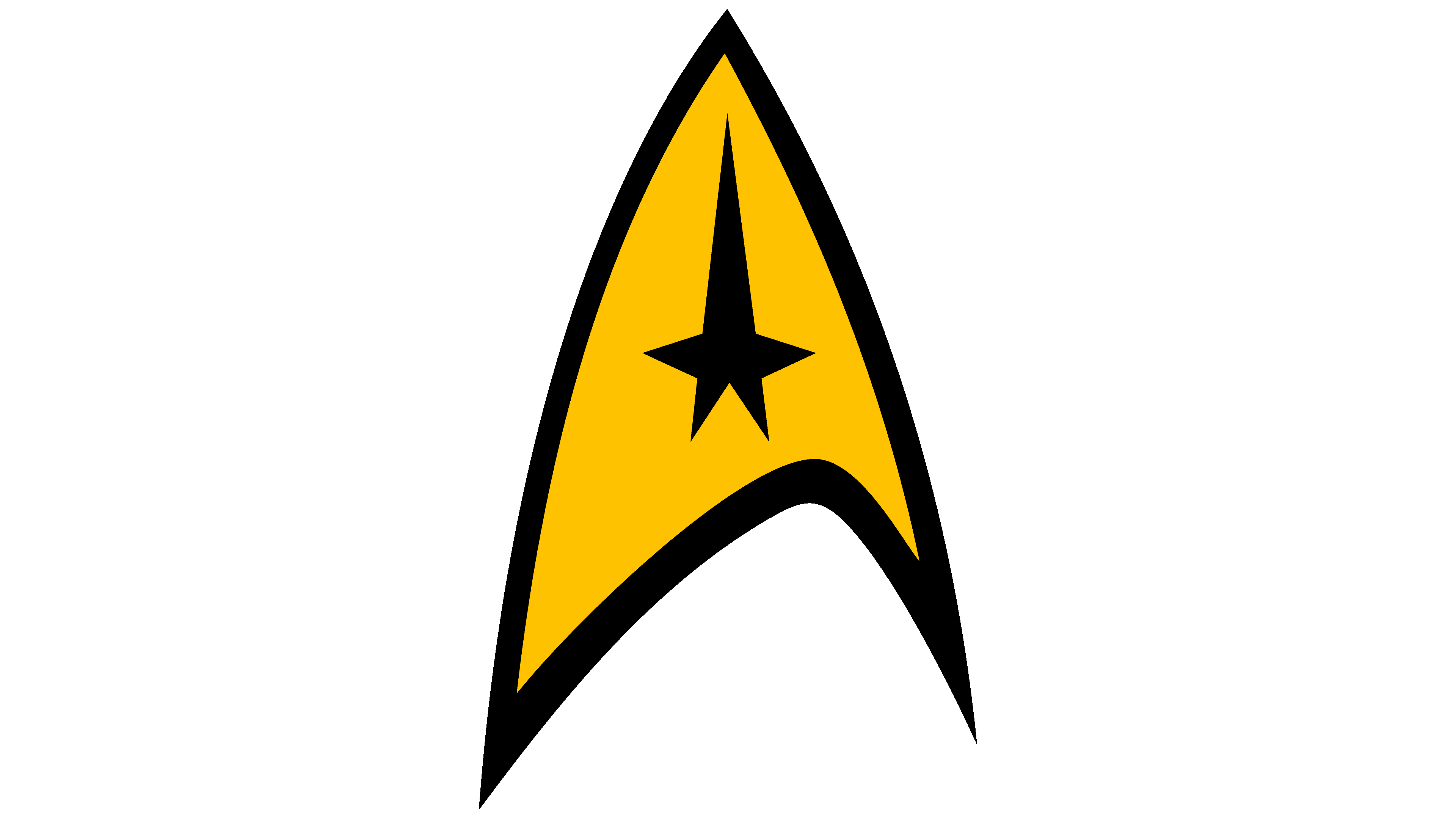
The original symbol depicts a spaceship. It consists of a geometric figure of irregular shape, in which the left side is lower and wider than the right. There are three sharp corners, reminiscent of the top and two legs of the letter “A” to a slight extent.
The entire inner space of the icon is yellow, with a five-pointed star in the middle and an extended ray (upper). It is black, like the border around the figure. Another version of the logo is known without edging but in a mirrored design. One sign is yellow with a white star, and the other, on the contrary, is white with a yellow symbol in the center.
Font and Colors
The text part exists separately and is used as titles; therefore, several typefaces are used. Each is presented in a specific film, game, or TV series, accompanied by a corporate logo. In The Original Series and The Animated Series, the font is called Final Frontier Old Style. Designer Allen R. Walden created it. In The Next Generation, the choice fell on the proprietary typeface StarNext, Deep Space Nine on Kiwi Media’s Bajoran, and Voyager the Final Frontier typeface, designed by legendary Allen R. Walden.
The latest version is called Enterprise. He is involved in a TV series of the same name. Some letters are curly. For example, “S,” “A,” “R,” and “E” are complemented by diagonal lines with an acute angle. The corporate colors are always yellow, white, and black. Sometimes, blue is used.