


![]() Transformers Logo PNG
Transformers Logo PNG
A single whole, created from separate parts, represents the Transformers logo. Perfectly fitted parts allow you to transform the robot into other mechanisms. A “live” transformer looks at the user from the emblem as if inviting them to play.
Transformers grew out of Japanese toy engineering rather than an original American robot concept. In the early 1980s, Takara was selling Diaclone and Micro Change figures that could transform into robots, as well as cars, cassette tapes, guns, and household objects. In 1983, Hasbro representatives saw the lines at a Tokyo toy fair, and Henry Orenstein pushed the company to license them.
Hasbro and Takara then rebranded the figures for the Western market under a single brand. Hasbro used a model already tested with G.I. Joe, linking toys with Marvel Comics and animation. Jim Shooter created the basic conflict between the Autobots and the Decepticons, Dennis O’Neil named Optimus Prime, and Bob Budiansky developed the first stories for the characters. Shoji Kawamori, known for Macross, contributed to the mechanical design.
Transformers launched in the United States in 1984. The animated series The Transformers debuted on September 17 and was produced by Marvel Productions, Sunbow Productions, and Toei Animation. Marvel also released a four-issue comic. The first 28 toys sold out quickly, and Hasbro expanded the line in 1985 with Dinobots, Insecticons, and Constructicons while the brand moved into Europe, Japan, Mexico, Brazil, and Argentina.
The 1986 film “The Transformers Movie” shocked young viewers with the deaths of major characters, including Optimus Prime. The TV series ended in 1987, while Marvel’s comic ran until 1990. Later eras included Beast Wars in 1996, Michael Bay’s 2007 Paramount film, Bumblebee in 2018, and the animated Transformers One in 2024.
Meaning and History
![]()
Transformers is an example of a non-standard path to fame because the first characters appeared as toys, and only later did comics and anime featuring them appear. The line was initiated by mecha – fantastic creatures, giant robots, and machines that can transform from one form to another. The basis was taken from Diaclone and Microman: living, intelligent, autonomous robots called Autobots and Decepticons.
The first toys were humanoid fantasy figures. The concept of the second generation has expanded a lot – these were robots that can transform into weapons, electronic objects, and vehicles. During this period, Hasbro, which manufactured products using Microman technology, bought Diaclone toys and became a business partner of Takara. She hired writers Jim Shooter and Dennis O’Neil to create a comic strip about robots.
Most of the characters were written by Bob Budiansky. Shōji Kawamori designs the mecha robots. He also came up with ways to transform them from one form to another. In 1984, the media franchise’s logo also appeared across all projects.
1984 – 1989
![]()
The debut logo features blue-and-red gradient lettering with a metallic sheen. It has highlights and shadows along the outline of the letters, making the text appear three-dimensional. The name is divided into parts and placed on two levels: on the left, in the top line, the word “Trans,” to the right, under it, “Formers.” The first row also contains an abstract icon, the mask of one of the characters. It is decorated with the same design as the rest of the elements: metalized, gradient, blue-red. Moreover, in the inscription, the combination of uppercase characters with lowercase “n” and “m” is played originally. The “A” lacks a middle bar, so it looks like a delta, the fourth letter of the ancient Greek alphabet.
1989 – 1991
![]()
After the redesign, the graphic icon was removed from the logo, and other components became flat yet bright. The designers kept the media franchise name divided into two parts but moved the inscriptions together, so “Trans” is directly above “Formers.” The text is in italic sans serif. The “N” has been moved to uppercase, and the “m” has remained lowercase but taken on a more elongated shape. The left leg “A” goes behind “R.” All letters have a double-black border and a three-color palette of horizontal stripes: red, white, and blue.
1991 – 1993
![]()
In 1991, the emblem acquired volume and a slightly different color. The developers removed the blue horizontal line from the name, keeping only the red and white. They added black shadows to the letters on the right and bottom, making them bulge as if floating above the surface. Although the edging strip has become thinner and lighter (blue), it remains visible because of the adjacent dark lines.
1993 – 1999
![]()
The logo is now brighter: large red letters are outlined in yellow. Italics are reinforced, so characters are slanted to the right more than usual. Also, the designers have returned the icon as a mask. Unlike the inscriptions, it is colored yellow and outlined with a red stripe. The shadows remain, but the black has now been replaced with a dark crimson.
1999 – 2001
![]()
After a long period with the word “Transformers” split in two, it finally got a solid spelling. The developers removed italics and painted the inscription lemon yellow. They modified some of the letters by connecting their legs: “RAN,” “ORM,” and “ERS.” “T” added an arrow to the bar on the right.
2001 – 2007
![]()
The 2001 redesign significantly updated the media franchise’s identity and introduced a blue-and-black badge. The emblem remained textual but acquired curly elements on some letters. For example, the letters “T” and “F” are shown larger than the others and have pointed legs, and the “R” and “S” are connected at the bottom by a long tape in the form of a sound wave. The gradient blue “Transformers” is set against a black background and outlined in blue. Moreover, some signs are supplemented with cuts.
2007 – 2014
![]()
During this period, the brand regained its old name: it was split into two parts and placed on different lines. Rough serif characters do not have serifs. They are outlined in black and decorated with metal plates. But their surface is matte, not shiny. Also, a non-standard configuration of some letters appeared: the capital “A” again looks like a pyramid or delta, and “n” and “m” are converted to lowercase.
2014 – today
![]()
The changes to the logo brought brightness: the developers returned it to red and its standard appearance, except for the “A,” which remained a triangle with an open bottom. The rest of the characters are written in a different font, smooth, even, elongated.
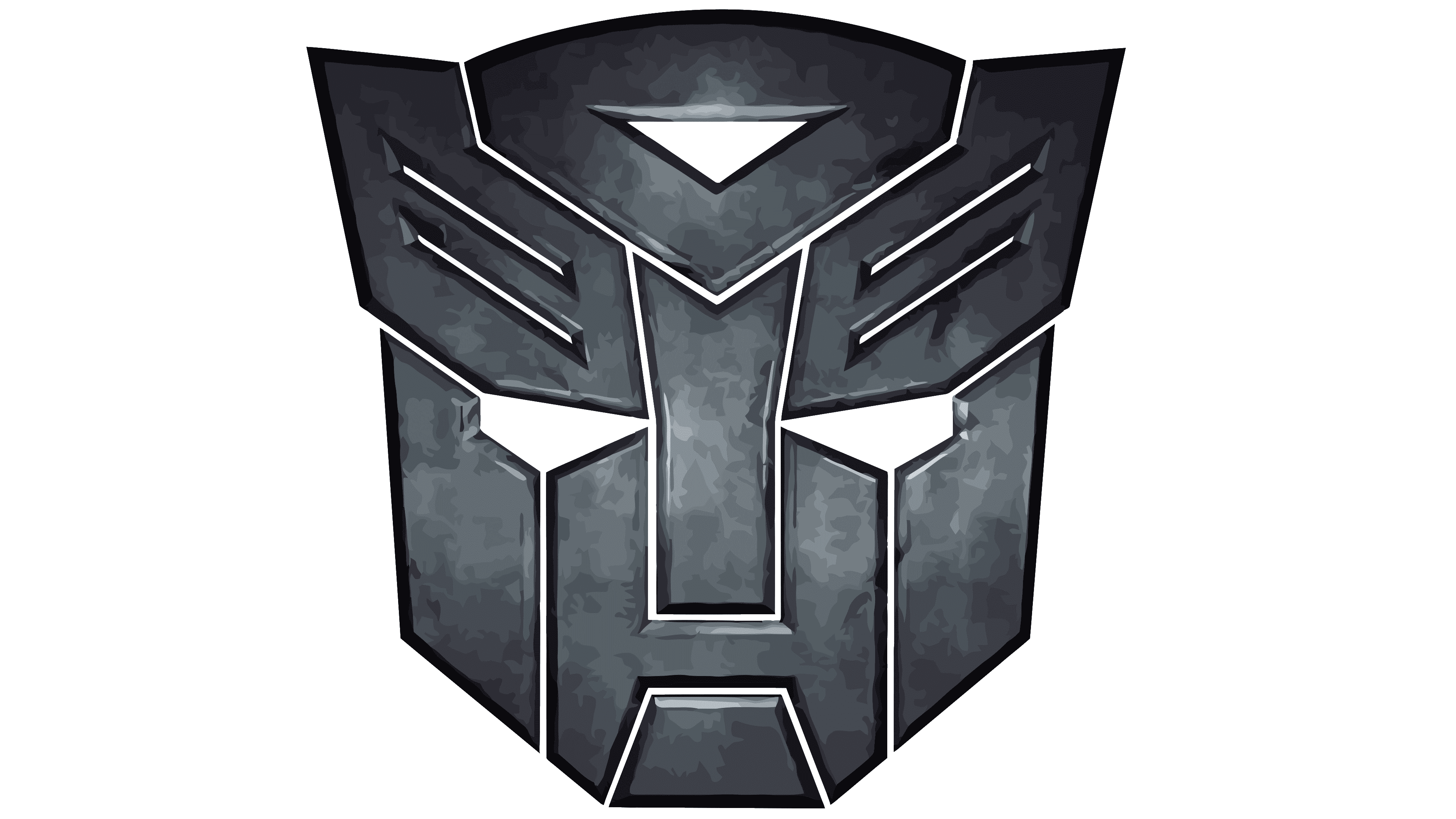
Icon
![]()
Faction insignia in the form of masks were used on Hasbro toys in the 1980s. They were intended to immediately determine the villain and the hero. There were several such symbols, but the main ones were two. And one of them is Autobot, a stylized copy of Prowl’s face.
A distinctive fraction mark is placed on toy packaging. Initially, it was stylized like metal – the glossy surface seemed to shine with light. As before, it consisted of plates of different configurations, resembling irregular polygons with through cuts. They are combined in such a way that they form a face with empty eye sockets. The mask was painted in three colors: red, white, and blue in the early version.
In 2007, the logo was changed to match the new film’s style. To do this, the developers removed the color, leaving the black face on a white background to make it look intimidating. For the same purpose, they made his evil eyes, thinning the lines and sharpening them at the bridge of the nose. The authors slightly raised the diagonal strokes on the improvised forehead.
Font and Colors

The Transformers’ identity is primarily conveyed through text, which the developers continually revised to align the symbology with the design of toys and characters across media. There are also individual icons that represent the factions.
For the logo, a custom font called Transformers Movie was created. Its developer is the Alphabet & Type studio. This option was recently approved and used in the movie of the same name. But earlier, a different typeface was used in the emblem – italic.
The palette of symbols is varied: blue, black, red, white, yellow, and silver with a touch of metal.