DreamWorks’s enchanting logo evokes childhood memories, warm family evenings, interesting movies, and cartoons. It creates a festive mood because viewers see it in the opening credits and eagerly await the new cinema.
DreamWorks: Brand overview
| Founded: | October 12, 1994 |
| Founder: | Steven Spielberg, Jeffrey Katzenberg, David Geffen |
| Headquarters: | California, United States |
| Website: | dreamworks.com |
Meaning and History
Steven Spielberg wanted the company logo to remind people of the Golden Age of Hollywood when the film industry was booming. The central image of the emblem was supposed to be a fisherman sitting on a crescent moon. It was anticipated that designers would use modern computer graphics.
However, the director changed his mind when Dennis Muren (head of the special effects department at Industrial Light and Magic) suggested drawing the logo by hand. His friend-artist Robert Hunt took on the job. He did everything required of him: he depicted a person with a fishing rod sitting on the moon’s edge. He also attached one of his sketches, replacing the adult fisherman with a boy. This alternative version was the one most liked by the creators of DreamWorks.
Interestingly, the image of the child Robert copied from his son William Hunt. Steven Spielberg borrowed the idea of the crescent moon from Amblin Entertainment: its emblem’s central element is a full moon, past which a bicycle flies.
Industrial Light and Magic created the final version of the logo. Producer Clint Goldman, art director Dave Carson, and Kaleidoscope Films (the film company that made the storyboards) worked on the animated version.
What is DreamWorks?
It is a brand that belongs to several companies. Firstly, there’s the film studio DreamWorks Pictures, where movies are made. Secondly, the animation studio DreamWorks Animation LLC deals only with the production of cartoons.
1998 – 2004
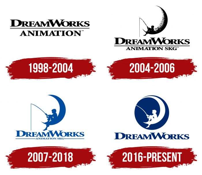
Initially, there were experiments, so the animation studio’s logo was textual. It represented the name in two lines. The word “DreamWorks” occupied the upper line, and the lower line occupied “Animation.” Both inscriptions were stretched and separated by a solid black line. The text font is the studio’s proprietary, usually the studio’s name.
2004 – 2006
The concept of the crescent moon was inspired by Steven Spielberg and visualized by artist Robert Hunt, and the final designer was Industrial Light & Magic. Instead of an adult fisherman, the author suggested depicting his son, and this idea appealed to the clients the most because the child looked harmonious.
The boy sits on the edge of the crescent moon and holds a cast fishing rod, winding the line on the reel as if he has already caught someone on the bait. The crescent moon has blurred outlines and represents a part of the Earth’s satellite’s relief. The inscription is reduced in size and shifted downward. The second part added the abbreviation “SKG.” This is the shortened version of the initials of the founders of the animation studio – Spielberg, Katzenberg, and Geffen.
2007 – 2018
Artists retained the previous concept but slightly reworked the design. They rotated the crescent moon, removed elements of its surface, positioned the boy straight, simplified the fishing rod (removed unnecessary elements), and bent it to show that it was stretched from the caught prey. At the bottom, the developers shortened the phrase “Animation SKG” and placed it between two lines. They also changed the color of the logo from black to blue.
2016 – today
At this time, the studio uses an emblem with swapped colors: everything that was sky blue became white and vice versa. Artists adjusted the figure of the boy, removing the bend on the trousers, the protruding chin forward, and the strand of hair sticking out on the top of the head. Now, he has tousled bangs, cropped trousers (like Tom Sawyer’s), a curved rod, and a cutting line (viewers only see the handle). Designers also placed all elements in a blue circle and elongated the upper part of the sickle, connecting it with the surrounding white background. In addition, they removed the second line from the name and enlarged “DreamWorks.”
DreamWorks: Interesting Facts
DreamWorks Animation, often just called DreamWorks, is a famous movie company that started in 1994 by three big names: Steven Spielberg, David Geffen, and Jeffrey Katzenberg. They wanted to make cool movies using new technology.
- How It Started: Steven Spielberg, David Geffen, and Jeffrey Katzenberg made DreamWorks to mix old-style storytelling with new tech.
- First Movie: Their first big movie was “Antz” in 1998. It was different because it was a computer-animated cartoon for grown-ups and kids.
- “Shrek” Changed Everything: 2001 they made “Shrek,” which was a huge deal. It won awards and made much money because kids and adults thought it was funny. It even started a bunch of other movies and stuff you could buy.
- Cool Tech: DreamWorks is known for making its movies look amazing. It uses special computer tricks to make characters and places look real and magical in movies like “How to Train Your Dragon” and “Kung Fu Panda.”
- More Than Movies: DreamWorks also makes fun rides and parks based on their movies, so people can feel like they’re stepping into those worlds for real.
- Joining NBCUniversal: In 2016, NBCUniversal bought DreamWorks, which helped DreamWorks share its movies with even more people.
- Big Influence: DreamWorks movies, especially “Shrek,” are popular online, with lots of jokes and fun quotes that people love to share.
- Stories from Everywhere: DreamWorks makes movies about adventures, like “Kung Fu Panda” and “Trolls,” that show off stories and music worldwide.
- Lots of Awards: They’ve won prizes for making great movies that look good and tell fun stories.
DreamWorks has made many movies that people worldwide love, thanks to their cool stories, fancy technology, and friends-like characters.
Font and Colors
The DreamWorks logo features a boy with a fishing rod sitting on the edge of a crescent moon. The little fisherman has caught something: his body is slightly tilted forward, and the fishing rod is bent. But there were other versions of the emblem where the child sits straight. They were almost unused because Spielberg immediately rejected them.
The color palette has changed several times. Designers experimented with the palette and background, sometimes removing, sometimes adding clouds. In one of the late logos, the word DreamWorks used as many as five colors.
In the latest version (from 2018), the boy and the moon are white. They are inside a black circle, under which the studio’s name is written. Before that (in 2016), the circle was blue. Even earlier (in 2007), the boy and the crescent were light blue, and the background was completely white.
The inscription under the graphic is made in a font resembling Minion Pro Black with clear serifs. Only proportions differ: the letters are stretched horizontally. Because of this, it seems that the symbols are slightly flattened.
Previously, the logo was adorned with the full name of the film company: “DreamWorks Animation SKG.” The abbreviation SKG is a tribute to its creators – Spielberg, Katzenberg, and Geffen. In 2016, “Animation SKG” was removed, leaving only the first word on the picture.
DreamWorks color codes
| Catalina Blue | Hex color: | #092e6e |
|---|---|---|
| RGB: | 9 46 110 | |
| CMYK: | 92 58 0 57 | |
| Pantone: | PMS 288 C |
FAQ
What does the DreamWorks logo mean?
The boy fisherman sitting on the crescent moon symbolizes anticipation and impatient waiting. He is also an embodiment of the fantastic atmosphere of DreamWorks’ movies and cartoons.
Does Paramount own DreamWorks?
No, Paramount Pictures is currently not listed as the owner of DreamWorks. They previously collaborated but then decided to break off all partnership relations.
Does DreamWorks belong to Disney?
No, DreamWorks has never been part of Disney. DreamWorks Pictures is owned by Universal Pictures, Alibaba Pictures, Entertainment One, and Reliance Entertainment. DreamWorks Animation LLC is a subsidiary of Universal Pictures.
Does DreamWorks still exist?
Yes, DreamWorks exists and continues to make new films.
