


 Viacom Logo PNG
The Viacom logo is soft, smooth, and pleasant, just like all the shows that have seen the light of day thanks to the company. The emblem signals a non-aggressive market expansion policy and portrays the media conglomerate as well coordinated.
Viacom began in 1971 as a forced spin-off from CBS. The U.S. Federal Communications Commission had adopted rules requiring major television networks to separate their syndication and program distribution units. CBS placed that business into Viacom International, a name formed from “Video & Audio Communications.” The new company received CBS content rights, but started mainly as a cable operator and distributor, not as a major broadcaster.
Through the 1970s, Viacom expanded through cable systems, small stations, and syndication deals. Its real change came in 1985, when it bought MTV Networks for about $690 million. The deal brought MTV, VH1, Nickelodeon, and Nick at Nite into one portfolio, giving Viacom youth, music, children’s, and retro television brands at a time when cable channels were gaining cultural weight.
In 1987, Sumner Redstone’s National Amusements completed a hostile takeover of Viacom for about $3.4 billion. Redstone then pushed the company into film, publishing, and home video. In 1994, Viacom bought Paramount Communications for $10 billion after a public fight with Barry Diller’s QVC Network. Paramount added Paramount Pictures, Simon & Schuster, theme parks, and television stations. That same year, Viacom acquired Blockbuster Video for about $8.4 billion, using its cash flow to support the Paramount deal.
In 1999, Viacom bought CBS Corporation for about $37 billion, reuniting with the company it had left in 1971. The combined group included CBS, UPN, MTV, Nickelodeon, Paramount Pictures, Simon & Schuster, Blockbuster, and cable assets, placing it beside Time Warner in the media market. In 2006, Redstone separated CBS and Viacom again. After 13 years apart, they merged in 2019 as ViacomCBS, which was later renamed Paramount Global.
Meaning and History
Viacom’s history began well before 1972. Its predecessor was organized as a distribution company and had sold films produced by CBS Studios since 1955. Initially, the owners renamed the company CBS Films, then CBS Enterprises, and finally separated the division and gave it its current name. However, after many years, the conglomerate was absorbed by CBS Studios twice, merging with it in 2000 and again in 2019.
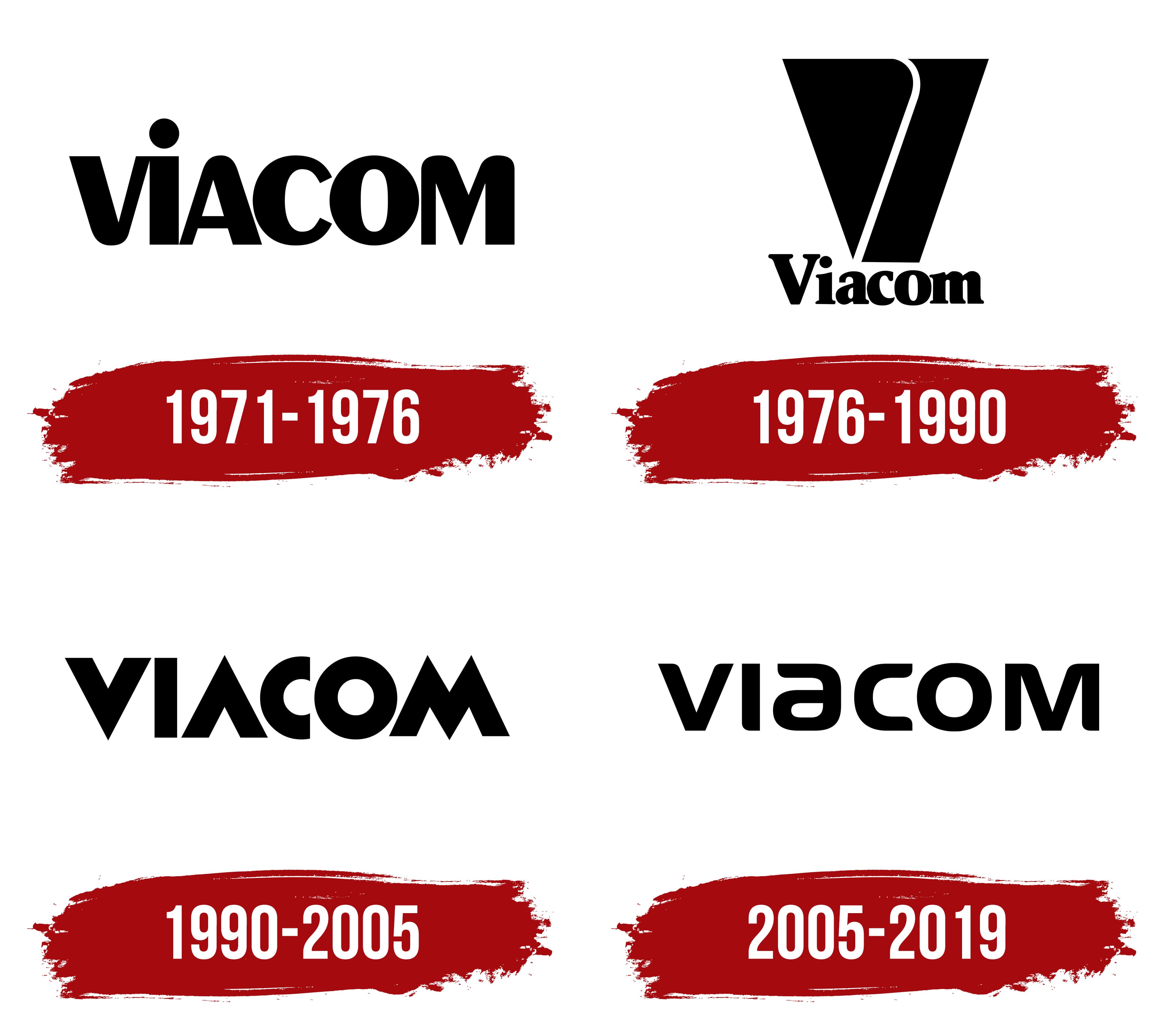
Throughout its history, the conglomerate’s logo underwent three changes to reflect the holding’s growth and expansion.
What is Viacom?
A major American media holding that owned the Nickelodeon channel and the MTV network. Closely related to CBS, from which it originated and with which it later merged several times. Now exists as the ViacomCBS corporation.
1971 – 1976
The company separated from CBS because the law prohibited producing and distributing films under a single name. The company chose the name Viacom and logo, derived from the Video & Audio Communications abbreviation.
The emblem uses the Peignot font. Rounded, smooth letters create a sense of softness and help please clients. The glyphs’ varying thickness emphasizes the new company’s individuality and distinction as an independent unit.
The lowercase letters of the inscription indicate youth and the first independent steps in the business world.
1976 – 1990
The company began a process of mergers and acquisitions, which led to an alliance with the major conglomerate Time Warner (Warner Bros., CNN, HBO Max), the launch of joint channels, and the formation of MTV Networks and MTV Europe.
The updated emblem included a graphic element: a large inverted trapezoid divided into two parts by a thin white line. The detail visually represented the first letter of the company’s name.
Underneath the V, the designers placed a compact Viacom inscription.
The new emblem was supposed to convey the company’s greatness and growth. Still, it drew a lot of negative feedback because the bulky upper part resembled a mountain looming over a small signature. The symbol’s official nickname became “V of Doom.” However, the company used the logo for 14 years despite its unpopularity among viewers.
1990 – 2005
In 1990, Chermayeff & Geismar introduced a new Viacom logo. It more accurately demonstrated the essence and main direction of the holding’s work.
Once again, the emblem became letter-based, featuring the name in an unusual font. The designers considered the company’s work developing music channels. Like a sharp, clear rhythm, the new emblem tapped out during a dance and captured a musician’s performance. The cropped C and O letters and the sharp angles of the other elements resembled records, disks, and turntable needles.
The emblem showed that Viacom knew exactly what to strive for and moved toward its goal without deviating. Like a part cut in half, the halved C hinted at the future merger with Paramount Communications, Inc., completed in 1994.
2005 – 2019

In 2000, the holding merged with its “parent” CBS Corporation, and in 2005, their paths diverged again. Viacom continued to grow and acquire additional channels and companies until it merged with CBS again in 2019 to form ViacomCBS.
The last visual sign of Viacom’s independence was presented in 2006. It used the same inscription, but smoothed out the sharp angles of the previous logo. The streamlined symbols strengthened the resemblance to music disks and highlighted the corporation’s ability to do business and always find its profitable niche.
Font and Colors
All Viacom logos are black and avoid bright colors. This choice reflects a focus on work, like the dark screen on which an image appears. The company presented itself as a foundation for the birth of beautiful films and programs while always remaining behind the scenes.
Black also signals the corporation’s power, its size, and the distribution of its channels across continents (MTV was broadcast in Europe, the USSR, and even Africa). It shows cooperation with all American cinema giants, resulting in new channels. The color conveys that the holding stood confidently and firmly for almost 50 years, occupying top market positions.

The inscription font resembles Neuropa Bold. Like wings, the smooth curves at the top of the V and M propel the company upward.