


 Showtime Logo PNG
The Showtime logo symbolizes partnership and the brand’s commitment to delivering premium entertainment to its subscribers. The emblem promises unlimited access to favorite shows and series, offering unique, exclusive film premieres created with the network’s direct involvement and support. Every detail of the logo emphasizes exclusivity, highlighting the privileges of choosing this content, which combines quality and access to top entertainment programs without limitations.
Showtime began in 1976, when Viacom launched it in California as a regional premium cable channel. The early schedule combined films, sports events, and specials without advertising, giving the service a premium format from the start. In 1978, the channel began expanding nationally and increased spending on original programming, putting it in direct competition with HBO.
In 1982, Showtime released its first original film, The Ratings Game, marking a move toward exclusive content. In 1983, Warner Communications, now WarnerMedia, took a stake in the business and helped form Showtime/The Movie Channel, Inc., expanding the channel’s library and reach. In 1986, the network launched Brothers, an early cable comedy with LGBT representation. Full control returned to the original owner in 1990, leading to deeper investment in original series and films.
During the 1990s, Life with Louie brought an Emmy for Outstanding Animated Program. In the late 1990s and early 2000s, Queer as Folk and The L Word gave the channel a stronger identity around adult drama and controversial themes. Dexter debuted in 2006 and became one of its defining hits. Showtime Anytime launched in 2007, giving subscribers online access as viewing habits began to change.
Shameless premiered in 2009 and ran until 2021. The 2010s brought Homeland, Ray Donovan, and Billions, while a standalone streaming service launched in 2015 for viewers without cable. The 2019 CBS Corporation merger created new corporate links under ViacomCBS, later Paramount Global. In 2020 and 2021, the channel released Your Honor and The Good Fight, and by 2022 its closer connection with Paramount+ expanded its streaming reach.
Meaning and History
What is Showtime?
This cable and streaming network has carved out a unique place in the entertainment industry with its bold content. Known for its diverse lineup of original shows, films, documentaries, and sports broadcasts, the network has gained fame for not shying away from controversial topics and complex storylines. It has earned recognition for supporting new talent and creating programs for adult audiences that often become the center of cultural discussion. The network’s original programming includes political thrillers, edgy reality shows, dark comedies, and gritty dramas. Its ability to produce thoughtful and daring content has made the network a key player in the media industry, with its shows in high demand among viewers and critics.
1976 – 1980

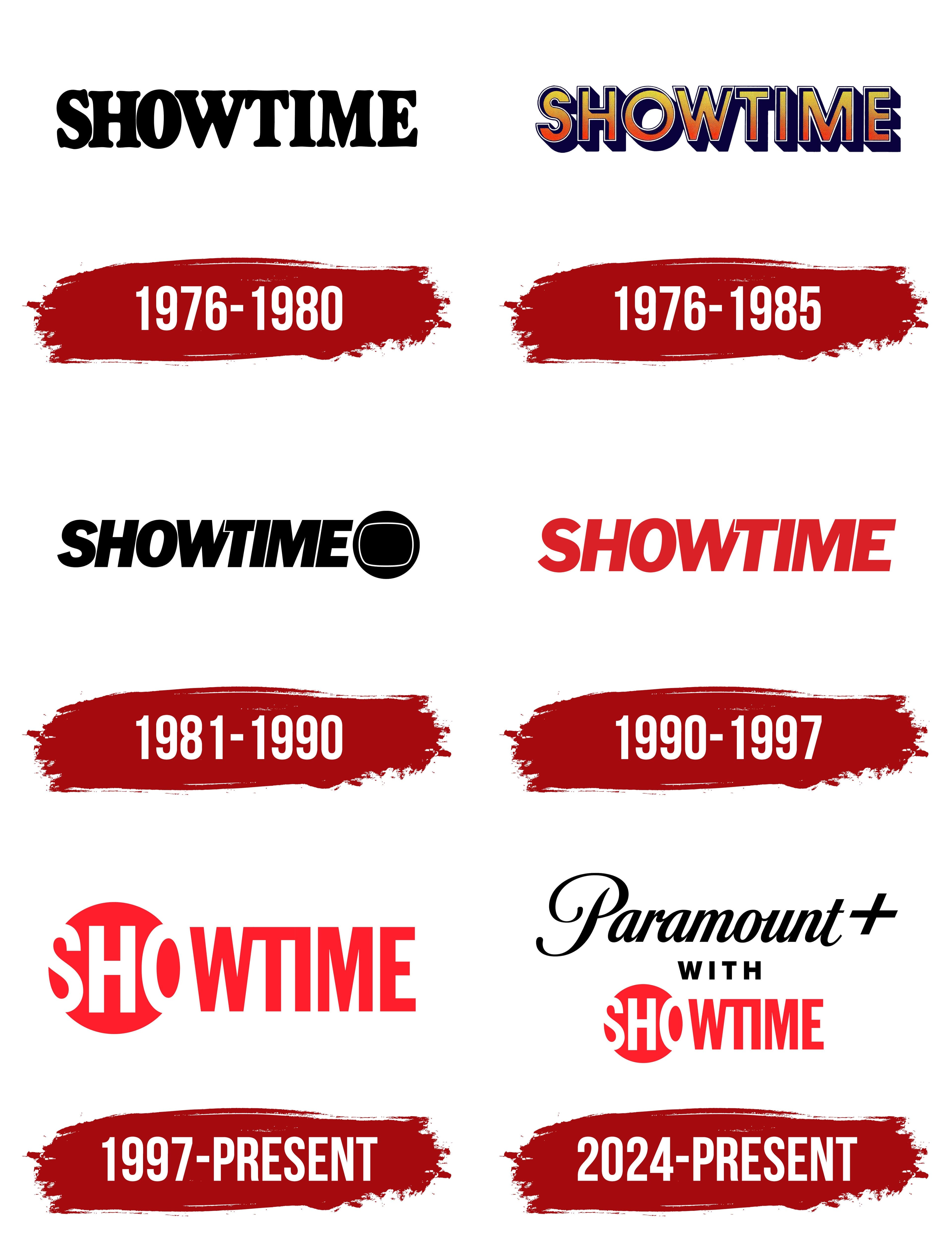
The first emblem of the Times-Mirror cable network appears both simple and meaningful. It reflects a company’s confidence that did not start from scratch but continued Channel One, gaining 10,000 subscribers from the outset. The tall, capitalized black lettering, with fine serifs, emphasizes the network’s drive for growth and development and its focus on showcasing significant, popular shows. The serifs add individuality, setting the channel apart from others. This unique approach helped the subscriber base grow fivefold in the first year, confirming the program’s success.
1976 – 1985
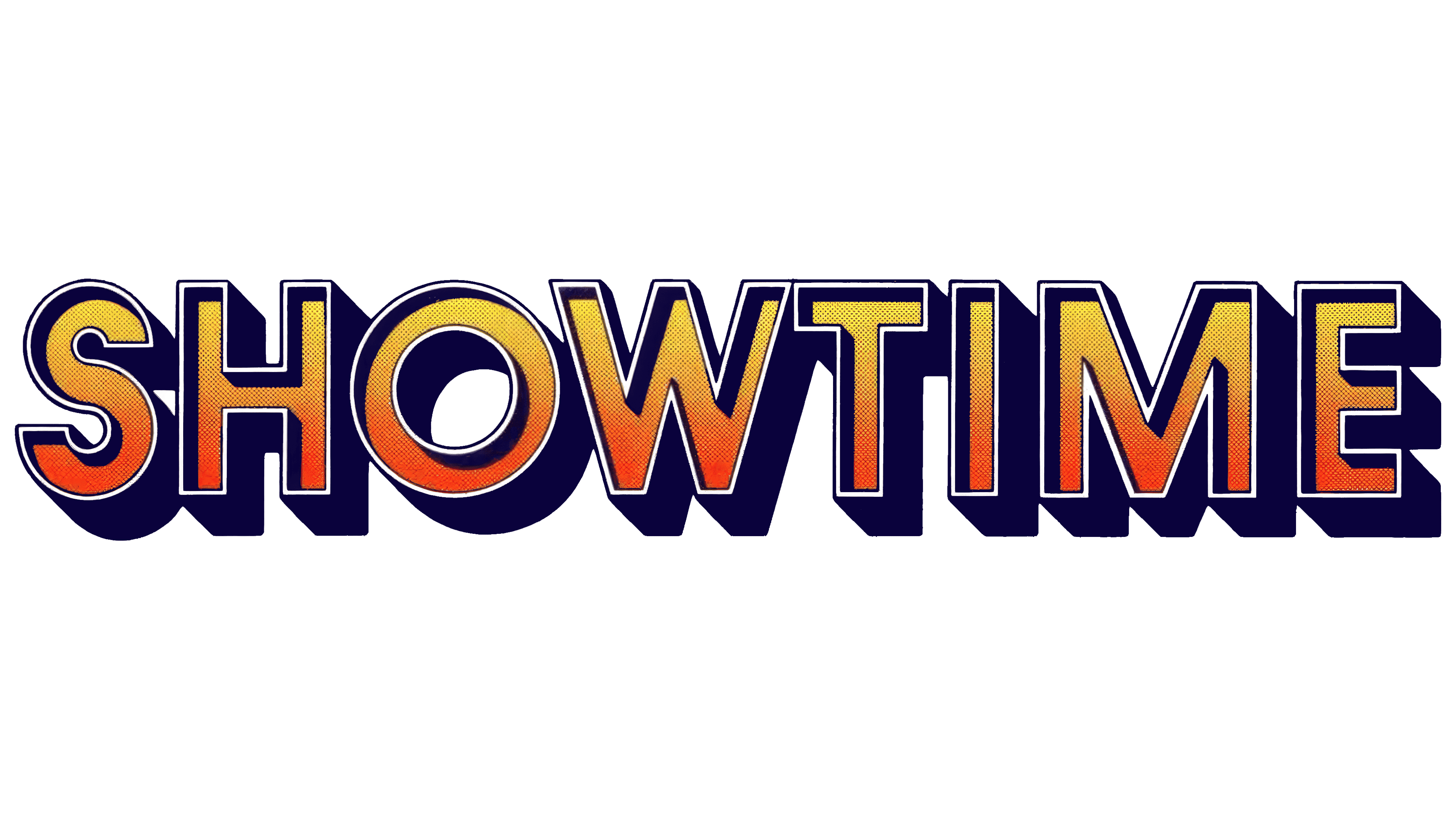
The channel launched on the Viacom network a week after Times-Mirror, and the brand received a brighter and more memorable design. The capital letters of the logo, executed with a three-dimensional effect in a rich yellow-orange gradient, created the atmosphere of a stage and a show. This design matched the program’s theme, especially the performances by popular artists. The silver border gave the logo a shine and a chic touch, enhancing the feeling of celebration and exclusivity. The design directly resonated with one of the program’s key shows, Celebration, which emphasized the central role of on-air entertainment projects.
1981 – 1990

The logo took on a more dynamic look as the network transitioned to 24-hour broadcasting and significantly expanded its program lineup. The capital letters are in italics, symbolizing movement and growth. A black schematic television on the right complements the image, visually emphasizing its connection to broadcast television. The logo’s color palette plays on the night’s theme, highlighting the channel’s round-the-clock operation. The slanted font also reflects rapid development and the constant pace of broadcasting, which continues without interruption, creating a sense of activity and unchanging energy.
1990 – 1997

When the channel began broadcasting premieres of independent films, its logo also changed, and the font became bright red. This rich shade emphasized the solemnity and significance of the first showings, enhancing the impact of debut screenings. The red color added drama to the logo and highlighted the project’s ambition, with many of its films so successful that they were even nominated for an Oscar. Removing the television image from the emblem symbolized an important moment in the company’s history: its renaming to Showtime Networks, Inc., reflecting a new level of independence and expansion.
1997 – today

The updated logo emphasized the abbreviation “SHO,” which was actively used in promotional materials and served as the channel’s identifier. This element was inside a bright red sphere, symbolizing Showtime’s exciting, dynamic world. The red color and contrasting white letters highlight the service’s premium status, offering viewers freedom of choice and the ability to create their own program without censorship or limitations.
A Showtime subscription feels like a real gift, as the channel carefully considers its audience’s interests and preferences. The remaining part of the name is in an elongated red font, giving the emblem a sense of aspiration and growth. This design approach emphasizes the brand’s ambitions, readiness for constant development, and drive for leadership.
2024 – today
The logo uniting Paramount+ and Showtime symbolizes the merger of two powerful brands within Paramount Global’s streaming platform. This move reflects the company’s strategy of consolidating content to attract a wide audience.
The first element of the emblem is the “Paramount+” inscription in a classic font with characteristic smooth lines and the emphasized “+” symbol. The font is rooted in Paramount’s history, long associated with high quality and the prestige of Hollywood cinema. The elegant black visual mark symbolizes the studio’s stability, reliability, and long-standing success.
The second element is the Showtime name, executed in bold, bright red. The name has always been associated with the emotion, tension, and drama characteristic of the channel’s programs. The bold, straightforward letters of the Showtime logo seem to proclaim the courage and strength of the content it offers viewers.
The neutral word “with,” set in simple black font between the two major brands, connects them and smoothly blends Paramount’s elegance with Showtime’s energy and audacity.
This emblem represents a new era in the brand’s history as streaming platforms become integral to the entertainment industry. Uniting two powerful brands into a single visual solution reflects the company’s ambition to lead the streaming market, offering viewers a diverse range of content and high-quality standards.