The universal WarnerMedia logo reflects its evolution from a company with a classic legacy to a modern media organization. The color scheme of the emblem creates an attractive contrast, and the modern font hints at a professional approach to the production of various types of content.
WarnerMedia: Brand overview
| Founded: | January 10, 1990 – April 8, 2022 |
| Founder: | Steve Ross |
| Headquarters: | New York City, U.S. |
| Website: | warnermedia.com |
In 1990, a merger took place between Time, Inc. and Warner Communications, which resulted in the creation of Time Warner. In 2001, this company merged with America Online and was renamed AOL Time Warner. Two years later, it removed the three-letter abbreviation from its name under the influence of the new chairman, Richard Parsons. The next major rebranding took place in 2018 when the company was bought by AT&T and transformed into WarnerMedia. It became a division controlling many brands: HBO, TBS, CNN, etc. However, its history came to an end in 2022 after a merger with Discovery, Inc. and the formation of Warner Bros. Discovery.
Meaning and History
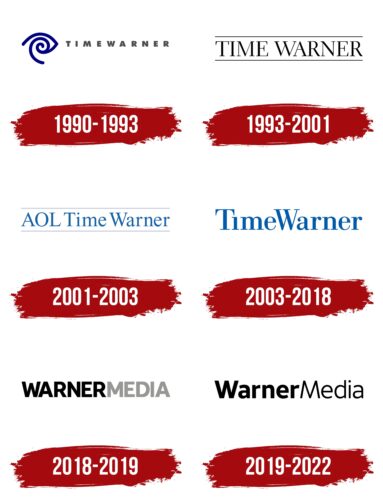
All the text logos that WarnerMedia had are very simple. Among them, only the old emblem stands out, featuring a stylized eye image. The remaining versions are traditional word marks, differing in font and color combinations. Each stage in the company’s history was accompanied by the emergence of a new visual symbol, as it frequently had to change not only its owners but also its name. The corporate style evolved under the influence of design studios such as Anspach Grossman Portugal, Landor Associates, Lippincott Mercer, and Wolff Olins.
What is WarnerMedia?
WarnerMedia is an American media company that appeared in 1990 under the name Time-Warner Inc. and disappeared in 2022 after a merger with Discovery. In its final years of existence, it belonged to AT&T Corporation and was the umbrella brand for such well-known trademarks as Warner Bros. Entertainment, TNT, CNN, and Home Box Office.
1990 – 1993
In 1990, Warner Communications and Time Inc. merged to become Time Warner. Designers from Chermayeff & Geismar developed a graphic mark for the newly formed company in the shape of a blue spiral, to which another curved line is attached. The upper part of the form resembles a hypnotized eye, while the center of the emblem resembles an ear shell. This is a stylized depiction of sensory organs needed to perceive media content. The inscription “TIMEWARNER,” situated on the right, consists of uppercase letters in gray and is set in the Futura Extra Bold typeface.
1993 – 2001
In 1993, New York design agency Anspach Grossman Portugal made the Time Warner logo more traditional, leaving only the brand name. Now it is made in the elegant Electra typeface with delicate serifs and is placed between two horizontal lines. All elements are black.
2001 – 2003
The company merged with America Online and supplemented its name with the acronym “AOL.” These same letters were added to the word mark, the color of which was changed to blue. In addition, designers from Landor Associates used Times New Roman instead of Electra to bring the inscription style closer to the classic and converted some glyphs to lowercase. The logo was presented in this form on January 11, 2001.
2003 – 2018
In 2003, the company again became known as Time Warner, which was reflected in its emblem. In this version, the phrase is written in the Bodoni BE Regular font. All letters, except the initial ones, are lowercase. The dot is missing above the “i” – it didn’t fit because of the overly narrow inter-letter intervals. Both words are written together and presented in blue. The logo started to be used on October 16 and was created by Swiss designer Joe Finocchiaro, who collaborated with the Lippincott Mercer team.
2018 – 2019
AT&T Corporation bought Time Warner and renamed it WarnerMedia, as Time Inc.’s assets were spun off into a separate company. In the new logo, the inscription is set in AT&T’s proprietary Aleck Sans typeface and divided into two color blocks: the black “WARNER” and the gray “MEDIA.” All letters are uppercase and bold.
2019 – 2022
In 2019, it was decided to modify the typeface and convert all letters, except for “W” and “M,” to lowercase. Now both parts of the inscription are black and differ only in different weights: in the word “MEDIA,” the glyphs are thinner than in “WARNER.” Wolff Olins carried out the rebranding. The new logo was used from October 2019 until 2022, when WarnerMedia disappeared as a result of a merger with Discovery.
Font and Colors
The inscription on the emblem, introduced in 2019, is rendered in two versions of the modified AT&T Aleck Sans font: thin and bold. This contrast draws attention to the brand name. The combination of black and white gives the logo a modern and business-like appearance.
WarnerMedia color codes
| Black | Hex color: | #000000 |
|---|---|---|
| RGB: | 0 0 0 | |
| CMYK: | 0 0 0 100 | |
| Pantone: | PMS Process Black C |


