


 Cinar Logo PNG
The Cinar logo seems to convey the feeling of numerous television waves carrying useful and important information to viewers. Its smooth lines and carefully chosen shades create a sense of dynamism, evoking associations with continuous movement and progress. The emblem reflects a commitment to development, symbolizing constant renewal and improvement in technology and content. This approach highlights the company’s significance in the television industry and its contributions to education and entertainment, fostering a sense of growth and forward momentum.
Cinar was founded in Montreal, Canada, in 1976 by Ronald Weinberg and Micheline Charest. The company began as a small distributor of educational European films for North America. Its name combined an Arabic word for cinema with the French word cinéma, reflecting its early link with film distribution.
During its first years, Cinar imported and dubbed foreign films and television programs for the U.S. and Canadian markets. In 1984, the company moved into production with an animated project based on The Wizard of Oz. The shift opened the way for children’s programming, which became its main business through the late 1980s and 1990s.
The company grew with shows for children and teenagers, including The Busy World of Richard Scarry and Arthur. In 1993, Cinar went public on the Toronto Stock Exchange, raising money for production and acquisitions. In 1997, it bought EducAction, expanding into educational software. By the late 1990s, the studio had international hits such as Caillou and Zoboomafoo, along with books and magazines tied to its shows.
In 1999, Cinar faced a major tax credit scandal involving false Canadian writing credits for work done by Americans. Weinberg and Charest left in 2000, and trading in the company’s shares was suspended. New management worked to stabilize the business. In 2004, investors led by Michael Hirsh, founder of Nelvana, bought the company and renamed it Cookie Jar Entertainment. Cookie Jar acquired DIC Entertainment in 2008, then DHX Media bought Cookie Jar in 2012. Many former Cinar and Cookie Jar series later remained part of the WildBrain library.
Meaning and History
What is Cinar?
This company became well-known for creating and releasing a wide range of animated series that captured the attention of children worldwide. Among the most popular educational series produced by the company are “Arthur” and “Caillou,” which became important elements of children’s programming. These shows stood out for their approach to teaching through entertainment, addressing life lessons and important social topics in ways accessible to young audiences. The company also actively collaborated with international partners to provide bilingual content, expanding its influence beyond North America. This approach made its productions popular across different cultures, continuing to combine education with entertainment.
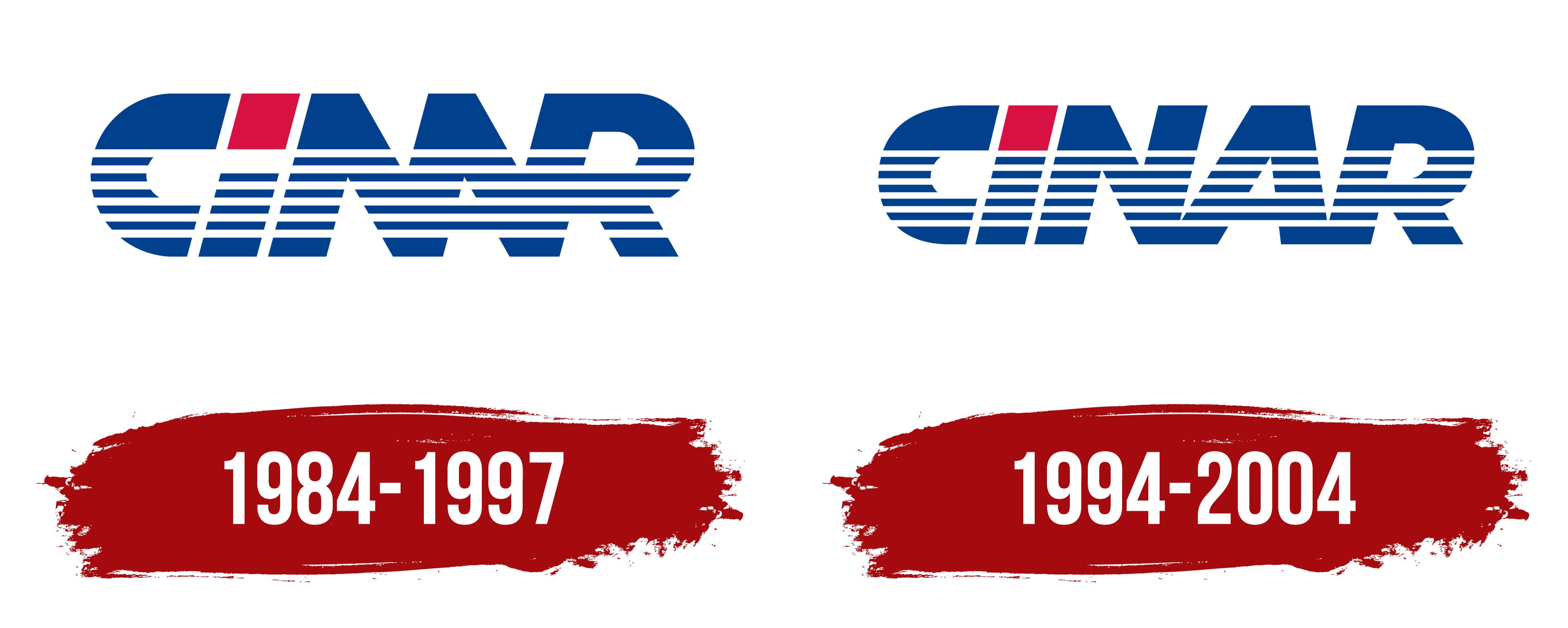
1984 – 1997
The channel’s first emblem features a simple yet symbolic name, associated with a tree: the plane tree. This majestic, branching plant, which can live up to two thousand years, symbolizes prosperity, longevity, and a large audience reach for the company. The green tree, in turn, emphasized the brand’s family orientation, as the founders were a married couple creating educational programs for the growing generation.
The plane tree is associated with growth, wisdom, and maturity, perfectly reflecting the essence of their work. The lines and stripes crossing the name symbolize television waves, hinting at broadcasting and the transmission of knowledge. The red dot above the letter “i” visually resembles the top of a TV tower, serving as a signal source and a source of information.
Interestingly, the letter “A” is merged with “N,” creating the impression of a double “N,” evoking associations with the well-known CNN channel. The bold, capital-letter font conveys a sense of strength and stability, emphasizing the company’s confident position in the industry. The deep blue color of the letters symbolizes trust, creativity, and professionalism, linking the logo to education through technological innovations.
1994 – 2004
CINAR’s logo, updated in 1993 after the company went public, symbolizes its ambition to expand internationally and strengthen its position in the European and U.S. markets. The main change in the design was that the letters of the emblem became separated, adding greater readability and individuality to the brand.
An interesting detail is the letter “i,” which connects the glyph to the dot, enhancing the feeling of continuity and stability. The font style combines strictness and dynamism: the letters appear massive and reliable, while the horizontal stripes cutting through them create an effect of movement and progress. This reflects the company’s focus on growth and innovation in its field.
The visual sign’s dominant blue color symbolizes stability, trust, and professionalism, qualities the company sought to establish in the eyes of its clients and partners. The red insert in the letter “i” adds contrast and attention to detail, highlighting CINAR’s focus on innovation and its ability to stand out from competitors.
The oval logo’s line design creates a sense of movement and global reach, highlighting the company’s growing ambitions beyond its original market.