 RoosterTeeth Logo PNG
The RoosterTeeth logo reflects the production company’s exceptional creative potential. It is suitably eccentric, serious, and allegorical, linked to the world of entertainment. This demonstrates the team’s ambition to evolve and showcases their creative potential.
Rooster Teeth began as a group of Texas friends who had worked in film, games, and early web culture before the company existed. Burnie Burns, Matt Hullum, and Joel Heyman made the independent film The Schedule in 1997. Burns later met Geoff Ramsey, Gustavo Sorola, Dan Godwin, and Jason Saldaña through Telenetwork and the gaming site drunkgamers.com, where they posted game reviews built around rough humor and amateur production.
The company was founded in April 2003 in a basement garage in Buda, Texas. Its first major project was Red vs. Blue, a machinima series made with Halo footage and original dialogue. The format was cheap, fast, and suited to the internet before YouTube. Episodes spread through forums and file-sharing networks, and the series became one of the longest-running episodic web shows, continuing until 2024.
Hosting video was expensive, so Rooster Teeth created a paid “Sponsorship” model in 2003, later renamed FIRST. Subscribers received early access and merchandise discounts, making the company an early example of direct audience funding. The studio expanded with Achievement Hunter in 2008 and RWBY in 2012, Monty Oum’s anime-inspired project that brought the brand a wider international audience.
Fullscreen bought Rooster Teeth in 2014 through Otter Media, which later came under AT&T, WarnerMedia, and Warner Bros. Discovery. After financial pressure and workplace scandals, the company was closed in March 2024. The “Roost Podcast Network” went to Night, RWBY was sold to Viz Media, and the site posted a farewell on May 15, 2024. In February 2025, Burns bought the Rooster Teeth brand through Box Canyon Productions, without major shows such as RWBY.
Meaning and History
The creative collaboration within the project began in 2003, when Burnie Burns and Matt Hullum invited friends to make parodic video game reviews. They emphasized this with the name Drunk Gamers, as they actually filmed the videos while intoxicated. However, this type of humor and mockery did not sit well with many video game publishers, leading to demands for a name change, citing a refusal to sponsor due to the non-serious approach. Consequently, the name Drunk Tank was coined, later replaced with the euphemism Rooster Teeth. Burnie Burns said it was a derogatory phrase taken from their debut series, Red vs. Blue, which they successfully tested with audiences.
What is RoosterTeeth?
RoosterTeeth is a U.S.-based production center that specializes in entertaining shows, videos, films, and game reviews, which are uploaded on its website and various video hosting platforms. It was established in the spring of 2003, coinciding with the release of the film Red vs. Blue. Its founders are Geoff Ramsey, Joel Heyman, Gus Sorola, Jason Saldaña, Matt Hullum, and Burnie Burns. Warner Bros. Discovery currently owns the company through its subsidiary Warner Bros. Discovery Global Streaming & Interactive Entertainment.
2003 – 2023
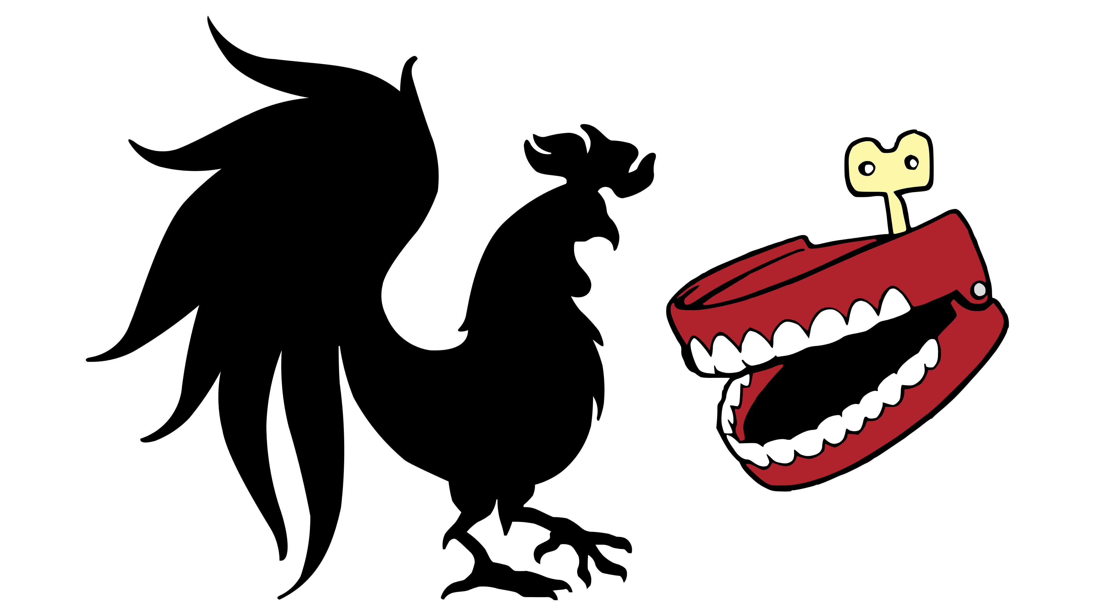
The RoosterTeeth logo consists of two elements that reflect the brand’s essence. At first glance, they seem unrelated, but miracles happen: a few sarcastic strokes by a designer, and voilà, a black rooster looks at a mechanical mouth biting it. The bird is abstractly depicted: its silhouette unmistakably features a comb, beak, wings, tail, chest, neck, and legs. The rooster is on the left. On the right is a red prosthetic jaw with large white teeth, wound up by a beige key.
For its tenth anniversary, the company introduced a personal emblem: a round black seal with a red ribbon featuring the white name. At the center of the disc is the number “10” against a grey horizontal stripe. The founding and anniversary dates of the comic group, “2003” and “2013,” are indicated to the right and left, respectively. The rooster and jaw are positioned at the top.
2023 – today
Despite being a textual emblem, the RoosterTeeth logo doesn’t contain letters; it uses individual glyphs. The style is informal, slightly satirical, and mocking. The symbols are so broad they resemble spots with a small white point (in R, O, e) or barely noticeable openings (in S, H). Notably, the lowercase ‘e’ in the logo is as large as the uppercase letters, and it was designed by the studio Guerilla Suit. The production company also uses a symbol shaped like a block ‘R,’ barely recognizable in blue because the artists fully merged the glyph with the image of a rooster, crowned with a large orange comb for authenticity.
Font and Colors
The RoosterTeeth logo is designed with a custom font. The letters are uppercase (except ‘e’), large, and extra-bold, but hand-drawn rather than printed. Their style is similar to bubble glyphs, with minimal internal space, indicated by a tiny solitary dot and a narrow slit. The brand’s color palette consists of five colors: blue, orange, red, black, and beige.