The elements of the emblem show that cinema focuses on a variety of film genres. The HBO Max logo promises an exciting adventure for those who decide to use the service. The sign hides maximum impressions and an impressive volume of TV shows.
HBO Max: Brand overview
Meaning and History
HBO Max was created in 2020, but the public learned about it a year earlier when WarnerMedia Corporation presented its new brand. The owners decided to use a familiar name for the streaming service. For reference, the television network HBO (Home Box Office) has been around since 1980, the Internet platform HBO Go since 2010, and HBO Now since 2015. So HBO Max joins them, becoming part of a large and cluttered system.
The prefix “Max” means the maximum amount of quality and exclusive content. It hints at a competitive advantage over Disney+ and ESPN+—that “max” is more than just “plus.” In addition, the service’s name is consonant with the word “Cinemax” (another WarnerMedia trademark).
The first version of the logo was unveiled on the day of the presentation. However, it did not satisfy the brand owners, so Trollbäck+Company developed a new trademark for HBO Max. Both versions share the black word “HBO” with a big round dot inside the “O.” It’s a tribute to the HBO Original Programming emblem that originated in the early 1980s.
2019 (pre-launch)
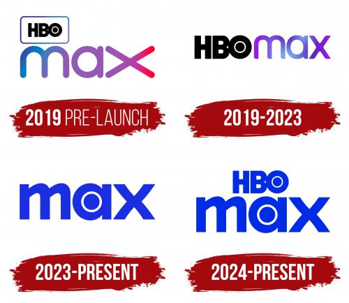
WarnerMedia Corporation unveiled a preliminary logo for the streaming platform in mid-2019. At the top was the black abbreviation “HBO” in a rectangular frame with rounded corners. It was almost three times smaller than the word “max,” which occupied the second line. A gradient fill was used for the frame and “max” – shades of blue and purple. Purple was smoothly transformed into red at the ends of the elongated letter “x” (on the right side).
2019 – 2023 (United States); 2021 – 2024 (Latin America and Europe)
The first logo did not catch on – already in October 2019, another version, created by the specialists of Trollbäck+Company, appeared on social networks. It also became the main logo for the service’s launch in 2020. This time, both parts of the name are on the same level and are the same size. The abbreviation “HBO” retains its original design: bold dark lines, very narrow letter spaces, and a circle inside the “O.” The word “max,” on the other hand, looks new, though it remains in lowercase. The developers cut off the rounded ends of the lines and reduced the stretched “x,” so now “max” is not perceived literally.
On the website of the New York-based agency Trollbäck+Company, it is said that the main task of the designers was to create a bright and recognizable corporate identity. At the same time, they were able to reflect the legacy of HBO Max by adding an element from the iconic HBO Original Programming logo.
2023 – today (USA, Europe)
The logo for the new “Max” service, which replaced HBO Max in May 2023, marks a significant shift in the brand’s history. This move represents a new phase in the evolution of the streaming service, now aimed at offering a broader range of content and appealing to a wider audience.
The new “Max” logo is characterized by its minimalism and simplicity. The most notable change is the removal of “HBO” from the name, leaving only “Max.” This reflects the expansion of the service’s content portfolio, which now includes premium series and films from HBO and a diverse range of content from other brands.
The soft, rounded font gives the logo a more friendly and accessible feel. Visually, it appears lighter than the previous version. Special attention is given to the letter “a,” where the center is replaced by a circle, subtly nodding to the iconic HBO emblem. This element connects to the brand’s legacy while introducing a new, fresher interpretation.
The logo’s color has also changed to a rich blue hue, making it bright and noticeable, especially on digital platforms.
The new logo’s symbolism lies in its transition to a more universal platform that aims to encompass all aspects of entertainment. Simplifying the name “Max” underscores the brand’s commitment to simplicity and universality while retaining its premium quality.
2024 – today (Netherlands and Belgium)
The HBO Max logo used in the Netherlands after the rebranding in June 2024 combines familiar style elements with fresh updates. Due to legal conflicts with the Dutch broadcasting company Omroep MAX, the brand retained the original “HBO Max” name to avoid trademark issues.
This logo is rendered in a vibrant blue color, emphasizing the brand’s modern and dynamic qualities. Compared to previous versions, the emblem appears more solid and refined, reflecting the company’s seriousness and professionalism while maintaining its recognizable identity.
HBO Max: Interesting Facts
HBO Max is a key streaming service that combines HBO’s rich catalog with a wide array of WarnerMedia titles, ranging from movies and series to original content.
- Launch: The platform started on May 27, 2020, offering a broad mix of content for various viewers right from the start.
- Wide-Ranging Library: Besides HBO’s hits like “Game of Thrones” and “The Sopranos,” the service added content from Warner Bros., DC, CNN, and more, making its library vast and diverse.
- Exclusive Content: The service introduced “Max Originals,” exclusive shows and specials, including “Love Life,” “The Flight Attendant,” and a “Friends” reunion.
- Simultaneous Film Releases: In 2021, Warner Bros. released its new movies on the platform the same day they came out in theaters, a move driven by the pandemic. This allowed subscribers to watch big films like “Dune” at home.
- Family-Friendly Options: The platform includes children’s programming from Cartoon Network and Looney Tunes, family movies, and parental controls.
- Going Global: After starting in the U.S., the service began expanding to Latin America and Europe, planning to replace HBO’s other international streaming services.
- Specialized Hubs: The service features “hubs” that organize content by brand or genre, such as DC and Studio Ghibli, making it easy to find specific shows or movies.
- Reviving Favorites: The platform has revived or offered reunion specials for cult classics like “The Fresh Prince of Bel-Air” and new seasons for shows like “Doom Patrol.”
- User-Friendly Design: Its interface includes curated recommendations from staff, providing a personal touch alongside algorithm-based suggestions.
- Strategic Partnerships: The service has partnered with companies like BBC Studios to expand its library, adding “Doctor Who” and other BBC content.
Font and Colors
After the refinement, the visual sign is now more proportionate. It consists only of the lettering. However, the “O” can be interpreted not as a letter but as a symbol with a hidden meaning. The large black circle in the center resembles a pupil, making the “O” remotely resemble an eye. There is a connection here with the main purpose of the streaming platform: streaming video content. It’s the eye of the attentive viewer who uses the streaming service to watch movies and shows.
Trollbäck+Company designers created a set of custom glyphs for the HBO Max logo. Sharp angles and large curves dominate the typography. The first half of the name is written in bold, sans serif capital letters – just like the abbreviation on the old HBO Original Programming logo. For the second half, lowercase letters are used to make the visual symbol friendly and well-proportioned.
The black word “HBO” is balanced by the blue-purple “max.” The colorful gradient reflects the wide range of content in the streaming platform’s catalog. There were plans to add a pink hue in a preliminary version of the logo (before the launch of HBO Max). But representatives of Trollbäck+Company decided to limit themselves to a more uniform gamut.
