 Studio Ghibli Logo PNG
The Studio Ghibli logo is incredibly creative and delicate, like a fresh breeze in Japanese animation. It inspires and evokes empathy for the characters in Hayao Miyazaki’s famous films. The emblem exudes a sense of spirituality and sentimentality, skillfully touching the delicate strings of the soul.
Studio Ghibli was founded in Tokyo, Japan, on June 15, 1985, by producer Toshio Suzuki and directors Hayao Miyazaki and Isao Takahata. The studio was founded after the success of Miyazaki’s 1984 film Nausicaä of the Valley of the Wind, which Tokuma Shoten released. Its name came from an Italian word for a hot Saharan wind.
The first Ghibli feature was Castle in the Sky in 1986. In 1988, the studio released My Neighbor Totoro and Grave of the Fireflies, two works with very different themes, from childhood fantasy to wartime tragedy. Kiki’s Delivery Service followed in 1989, helping the studio strengthen its position in Japanese animation.
In the early 1990s, Ghibli released Porco Rosso and Pom Poko, using European settings, Japanese folklore, and social themes. In 1997, Princess Mononoke became Japan’s highest-grossing film at the time and brought wider international attention. Spirited Away followed in 2001 and won the Academy Award for Best Animated Feature in 2003.
Later releases included Howl’s Moving Castle in 2004, Tales from Earthsea in 2006, Ponyo in 2008, and The Wind Rises in 2013. After announcing his retirement, Miyazaki returned to work on How Do You Live? In 2019, Ghibli announced a theme park in Aichi Prefecture. In 2020, a deal with Netflix brought older films to viewers outside the United States and Japan. Earwig and the Witch became its first computer-animated feature in 2021. Ghibli Park opened its first section in 2022, and in 2023 the studio continued work on new films and museum shorts.
Meaning and History
What is Studio Ghibli?
It is a famous Japanese animation film studio known for producing animated films. Its founders are directors Hayao Miyazaki and Isao Takahata, and producer Toshio Suzuki. The studio is known for its superb animation, compelling story, and elaborate characters. The studio’s best-known films include My Neighbor Totoro, Princess Mononoke, and Howl’s Moving Castle. The studio has received international recognition and numerous awards, establishing itself as a leading force in animation.
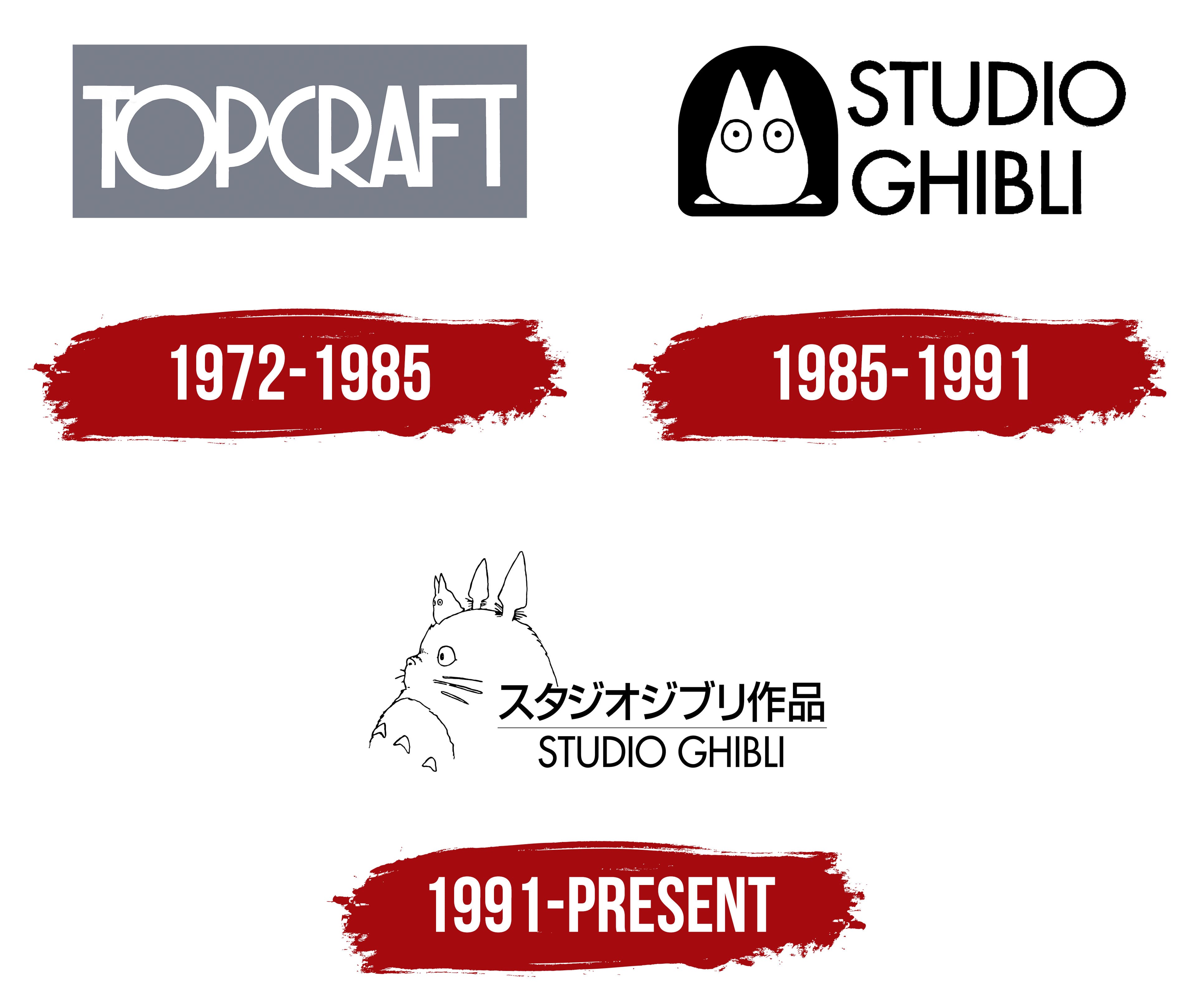
1972 – 1985

The predecessor to Studio Ghibli, Topcraft, had a straightforward logo. It was more practical than creative. The design was a classic combination of text and graphics, focusing on optimal readability across various media. This was achieved through the contrast between the background and the text, colored in gray and white, respectively. This combination didn’t evoke strong emotions; instead, it calmed and reassured, setting the tone for a serious appreciation of animated works.
The core element of the emblem is a rectangle. It’s wide, horizontal, and neutral, making it an ideal background that doesn’t draw attention away but instead focuses the viewer’s gaze on the most important part, the name. The light letters stand out well against the dark background.
The font used for the inscription is simple, light, smooth, and even. The tall letters occupy almost the entire inner space of the rectangle. They are thin and elegant, creating a sense of precision, with each edge and curve crafted perfectly. Despite the simplicity of the typeface, the arrangement of the text is quite complex, resembling a multi-structured design. This is due to the interconnected nature of the text: all the glyphs have points of contact.
The geometric symbols seem to flow into one another, forming the desired shapes. This approach likely conceals a touch of animation magic. The letters appear formal yet impart a sense of wonder and positive energy. They resemble hieroglyphs, behind whose complexity lies an expansive world full of harmony and meaning. In other words, the Studio Ghibli logo serves as a portal into the universe of modern Japanese animation.
1985 – 1991
After reorganizing the animation studio Topcraft, which split into several parts, its old logo ceased to exist, giving way to a more creative emblem. The famous director Hayao Miyazaki and his colleagues acquired one of the divisions, making the most iconic figure from his work the central element of the visual identity.
This secondary character is easily recognizable by its silhouette: a tiny creature depicted front-facing with tall, pointed ears. It sits and gazes intently ahead with wide-open eyes. The outline of this creature resembles several characters from the world of the Japanese animator:
- A small spirit companion of the large forest guardian from the film “My Neighbor Totoro.”
- The talking cat from the feature-length animated film “Kiki’s Delivery Service.”
In this case, the prototype was the smallest forest spirit Miyazaki created, Chibi Totoro. The film portrays it as a white “fluffball” with tall ears. According to IGN statistics, this figure ranks among the top 25 best anime characters. As noted by the Japanese director, this creature (the youngest) is 109 years old.
The forest spirit’s background is a black hole resembling an entrance. The cute character looks forward, with the animation company’s name next to it. The name is split into two levels to match the drawing’s height, thereby maintaining harmonious proportions. The inscription is rendered in a thin, grotesque font. The font combines both rounded and angular elements, achieving a perfect balance.
Although the letters are black, they convey a sense of lightness, simplicity, and positivity. This effect is supported by the light background, which contrasts with the dark entrance on the left. Interestingly, “ghibli” is not Japanese; it is the Libyan name for a wind blowing from the southeast (sirocco). In this context, Hayao Miyazaki infused it with the concept of rejuvenating the animation industry, a “breath of fresh air in animation.” This idea fits perfectly with the creative ethos of the Japanese studio.
1991 – today
The transformation of the Studio Ghibli logo is closely tied to the animation company’s artistic evolution. After the massive success of the film *My Neighbor Totoro,* its characters became globally recognizable, naturally boosting the studio’s visibility behind the anime. As a result, the studio updated its visual identity by choosing its most popular and iconic character, Totoro, the forest guardian created by Miyazaki.
King Totoro, as the character is called, is depicted in profile. He is turned to the left, looking straight ahead. According to legend, this creature is the oldest of the three forms:
- He is 1,302 years old.
- The middle form, Chu Totoro, is 679 years old.
- The youngest, Chibi Totoro, is 109 years old.
On the head of the large forest guardian sits the smallest spirit helper, gazing intently forward. Two tall mushrooms grow behind him, replacing King Totoro’s ears.
The illustration has a fine contour line harmonizing with the nearby inscriptions. One is in Japanese (at the top), and the other is in English (at the bottom). The designers retained the previous font style, grotesque, elegant, and capitalized, with a perfect balance of angles and curves. This matches the film company’s concept of a fresh breeze in the animation industry, evoking a sense of lightness and airiness. This effect is further enhanced by the wide spaces within the letters and the narrow strokes.
The first and second lines are separated by a barely visible stripe that adds balance to the logo, visually uniting the text and the image. The characters are also soft, flowing, and elegant, reminiscent of the beloved animated characters. The emblem is rendered in black and white, symbolizing elegance, mystery, seriousness, purity, sincerity, and openness, and harmoniously representing the concept of the Japanese animation studio. Essentially, the logo reflects playful imagination and professional simplicity.