The clear and rigorous Kärcher logo floats above the surface. The emblem demonstrates that the company’s developments are ahead of its time and competitors. The color scheme carries a positive message: all mechanisms work without failures and only bring the user joy.
Karcher: Brand overview
| Founded: | 2 January 1935 |
| Founder: | Alfred Kärcher |
| Headquarters: | Winnenden, Germany |
| Website: | kaercher.com |
Meaning and History
The company entered the market in 1935, presenting innovative ideas in the field of heating devices.
The debut of the famous emblem of the German concern took place simultaneously with its opening. She decorated the first products and was used on all media – from advertising to business documents. Despite the long period of work, the company uses only one logo, almost without changing it. Clarification “almost” is because the manufacturer made one single change to the brand logo, which was, in fact, insignificant. In general, in the entire history of the trademark’s existence, it has had two very similar logo options.
What is Kärcher?
Kärcher is a German manufacturer of cleaning equipment and high-pressure washers. It is a leader in the cleaning technology industry and offers many products. Its representatives operate worldwide, but the head office is located in Winnenden. The brand was created in 1935 by Alfred Kärcher.
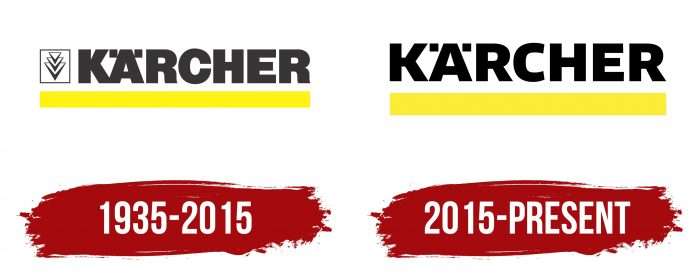
1935 – 2015
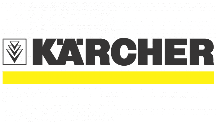
The debut logo appeared along with the first products – the dark gray “Kärcher” lettering above the yellow line. On the left was the original graphic element: three inverted triangles in a square.
The brand name that has become a trademark is derived from the surname Alfred Kärcher. It was he who was the creator and owner of an industrial enterprise. His heirs now own the business, so the Kärcher logo reflects the link between generations. And today, this word is used to refer to any high-pressure cleaner.
2015 – today
The firm is remarkable for its consistency: its symbolism has never changed for 80 years. The only redesign was carried out in 2015. The developers removed the geometric shapes, leaving only the inscription and the underline. Alfred Kärcher GmbH & Co. holds the rights to both versions of the logo. KG.
Karcher: Interesting Facts
Kärcher, founded in 1935 by Alfred Kärcher, is a top name in cleaning technology. Initially starting with industrial heating elements, Kärcher switched to cleaning technologies, shaping its future.
- High-Pressure Cleaner: In 1950, Kärcher created the first European hot water high-pressure cleaner, revolutionizing cleaning with its efficiency.
- Worldwide Operations: Kärcher’s products are sold in over 160 countries, and it has manufacturing sites across the globe, showing its significant role in the cleaning industry.
- Product Variety: The company makes a wide range of cleaning equipment for personal and professional use, including pressure washers, vacuum cleaners, steam cleaners, and more, as well as specially designed cleaning agents.
- Innovation Focus: With over 1,300 patents, Kärcher’s strong investment in research and development showcases its commitment to leading the cleaning technology field.
- Preserving Cultural Heritage: Kärcher helps clean and restore historic sites worldwide, including Mount Rushmore, the Christ the Redeemer statue, and St. Peter’s Square’s Colonnades.
- Eco-Friendly Practices: The company focuses on environmental sustainability, developing products that save water and biodegradable cleaning agents.
- Recognizable Color: Kärcher’s equipment is known for its distinctive yellow color, which was chosen in 1974 to stand out in the market and is now a brand trademark.
- Training Centers: Kärcher provides training for professional users and dealers at its centers to ensure effective and efficient use of its products.
- World Records: The company has achieved world records with its cleaning equipment, including the largest area cleaned with a pressure washer and the most cars washed in 8 hours, proving its products’ performance and reliability.
- Still Family-Owned: Despite its global reach and success, Kärcher remains family-owned, focusing on quality, innovation, and social responsibility.
Kärcher has grown from a small family business to a leader in cleaning technology. Its products and efforts continue to influence the cleaning industry and benefit communities worldwide, strongly emphasizing innovation, quality, and eco-friendliness.
Font and Colors
The 2015 emblem differs from the previous one in the absence of a graphic sign and the font. For example, “R” has disappeared miniature serifs, and “C” is more open. The increased indentation between letters: “K” and “Ä” no longer merge. All characters are uppercase.
The changes also affected the color scheme. The inscription is now black, not dark gray, as it used to be. However, variants with a white “Kärcher” on a black background are allowed. The wide rectangular stripe under the word is bright yellow.
Karcher color codes
| Canary Yellow | Hex color: | #ffee00 |
|---|---|---|
| RGB: | 255 238 0 | |
| CMYK: | 0 7 100 0 | |
| Pantone: | PMS 102 C |
| Black | Hex color: | #000000 |
|---|---|---|
| RGB: | 0 0 0 | |
| CMYK: | 0 0 0 100 | |
| Pantone: | PMS Process Black C |
