


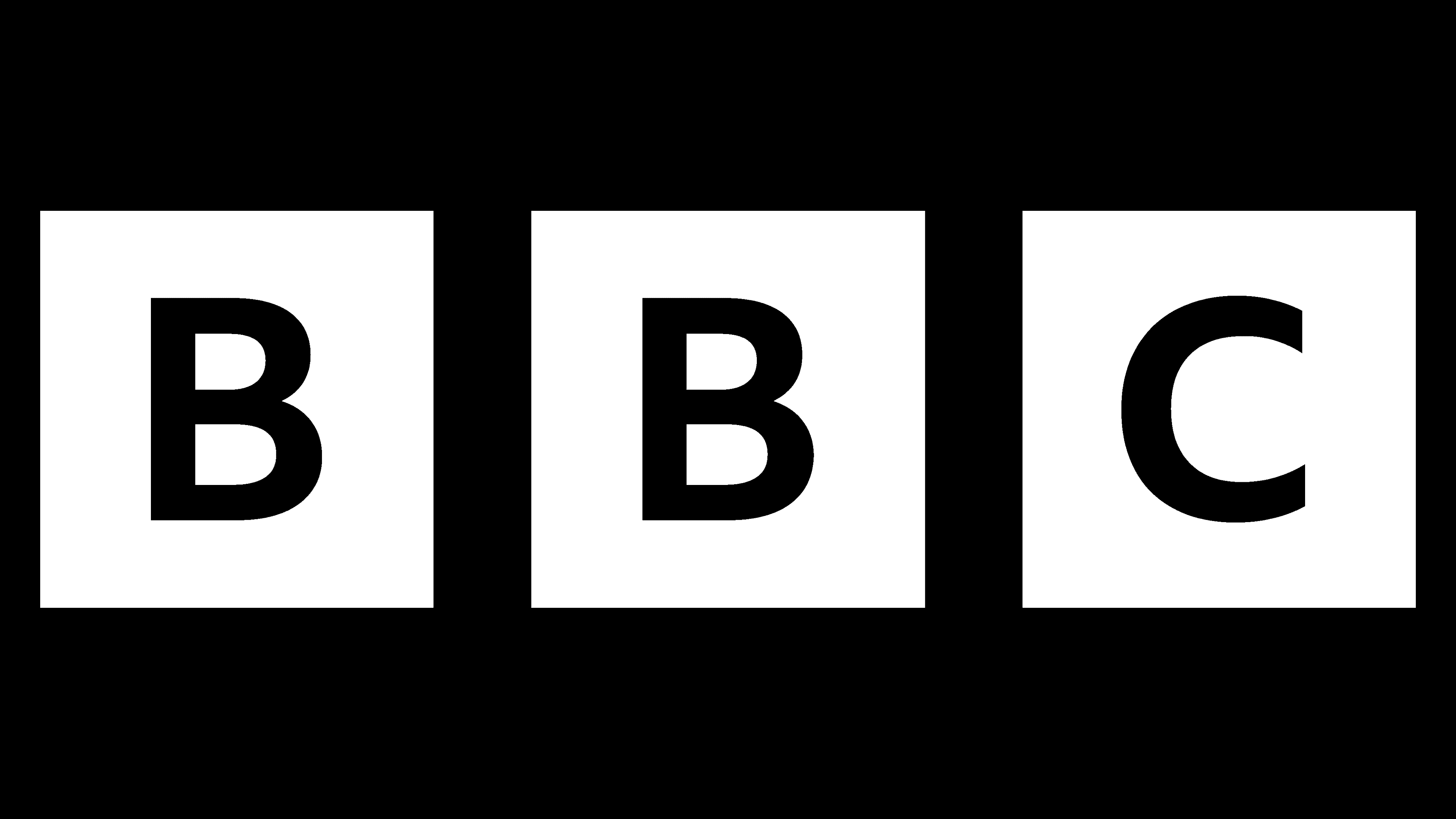
![]() BBC Logo PNG
BBC Logo PNG
The BBC logo can be called a classic of minimalism. The emblem shows commitment to tradition, as the British Broadcasting Corporation adheres to strict branding standards. Shapes and colors are carefully chosen to create a balance, even in the smallest details.
The development of world radio and television broadcasting is closely linked to the creation and development of the world-famous British Broadcasting Corporation, the BBC. It was the product of the joint decision made on October 18, 1922, to create the British Broadcasting Company, a collaboration of several leading private British corporations in broadcasting and electricity. It was nationalized in 1927. Today, the corporation broadcasts domestically and worldwide through a special division called the World Service. Being a public corporation, not a state, it is administered by the Board of Control and the 12 Royal Trustees.
Over such a long period, the BBC has undergone many changes. It began as a broadcaster and, through its constant development, quickly reacted to the emergence of a new form of information presentation television, immediately making it one of the main areas of its activities. It launched an experimental television broadcast in 1932. Each stage of its development informed the company’s image, style, logo, and brand mark. However, the first logo, created in 1958, has undergone only minor changes, demonstrating a classic British commitment to tradition.
Meaning and History
![]()
During its first two years, the BBC covered London, the West Midlands, the North West, the South West, the East, the North East, Scotland, Wales, Yorkshire and the Humber, and Northern Ireland.
In January 1927, due to the national importance of informing the public and controlling the information being filed, it was decided to nationalize and rename the company. Retaining its acronym, the company was named the British Broadcasting Corporation.
1932 was a year of radical change. That year, the BBC Empire Service, an international news broadcasting channel, began operating. In the same summer, Baird’s company began producing televisions, marking the realization of the idea of mass broadcasting. In that year, the company broadcast television in experimental mode. And in two years, it became permanent, but with a restriction on the broadcasting time.
In 1936, the BBC Television Service began its operations, covering up to 40,000 homes before the outbreak of World War II.
One year after the war, on March 26, 1946, the Russian Service was broadcast to the USSR. The first Russian-language broadcast was a conversation between Stalin and correspondents from the United States. At the same time, TV broadcasting was resumed.
Until 1955, the BBC was the only television network in Britain. As a broadcasting company, it had a monopoly until the seventies.
In ’58, the company’s first logo was created, which became its face on all television channels. Since then, the corporation has begun to pay closer attention to market demand for television services, its image, and its design.
From 1965 to 1991, the company increased its capacity, increased opportunities, launched new radio channels, closed obsolete ones, and constantly expanded its coverage. The development of science enabled the BBC, which immediately introduced all the novelties and achievements of modern technology, to successfully compete for leadership in the global information market, where competition in its field has intensified over the years. So, on March 11, 1991, the first satellite channel, BBC World Service Television, went on air.
The end of the last century was marked by the corporation’s transition to digital broadcasting in all directions.
The new 21st century, with all its features, has led to significant changes in corporate structure. Some international radio and television broadcasting channels were shut down. The corporation began redirecting its efforts to the Internet.
All these events influenced the formation of the company’s image. However, its logo underwent only minor changes, demonstrating conservatism while confirming the company’s recognizability even at a glance. Today, it is known worldwide.
1958 – 1963
![]()
The first logo was created amid the company’s expansion into the international broadcasting market. Abram Games Studio designed the brand sign. The sign consisted of three black squares, each with one letter of the name’s abbreviation typed in white, in a slanted Univers font. The logo was intended as an on-air image.
1963 – 1971
![]()
The changes to the 1963 logo mainly affected only the black squares. They were given a slant symmetrical to the slant of the letters. This brand mark would already be applied to the company’s cameras and television equipment, and would also serve as an emblem at the end of broadcasts.
1971 – 1992
![]()
For over 20 years, the company has not paid much attention to rebranding. It wasn’t until 1971 that the logo would be slightly modified. The black blocks where the acronym is placed would acquire rounded edges. The distance between them has increased somewhat. The late 1980s and early 1990s were a period when a company’s image significantly influenced its popularity and consumer interest. This required creating programs under its brand, ensuring viewers watched a BBC-produced program rather than a fake one. Despite the introduction of a new logo in 1988, this version remained in use until 1992.
1988 – 1998
![]()
In ’98, the Michael Peters Design Agency was brought in to develop the brand mark’s design. As a new solution, the pointed corners of the black blocks were restored, retaining the 17˚ acute angle. The spaces between the blocks remained the same distance apart. The Helvetica Neue font was used to create graphic unity for the text, and the edges of the text and the blocks were also sharpened. Thus, the visual symmetry and harmony of the entire composition were achieved. A novelty was the lines under each block, equal in length to their base. Each of these lines had blue, red, and green colors. They had a double meaning. This was a tribute to the colors of the flags of Scotland, Wales, and Northern Ireland, reflecting the correspondence to the three phosphors characteristic of color television. In 1997, the mark was used alongside the BBC Radio Clwyd emblem until the station’s closure.
1997 – today
![]()
In 1997, Martin Lambi-Nairn introduced a new corporate logo. It no longer had colored lines; the black blocks became squares again. The letters were restored to a vertical orientation without tilt, reminiscent of the original version created in 1958. The lettering was in the 1926 Gill Sans font created by Eric Gill. This version lasted the longest.
2021 – today
![]()
This year saw the unveiling of a new trademark that used a font designed by Dalton Maag in 2017. Its public unveiling drew considerable censure and outrage from viewers. Virtually no one noticed the dramatic changes to the new logo, even as the company claimed a large amount of money was spent on the rebranding. The company’s response did not appease its opponents. The explanation that no cardinal changes were required because this is the style and historic design of the emblem that the brand is recognized by its viewers, that those who know and respect the channel only need to hear the three cherished letters, did not explain where the taxpayers’ money went, because the company is public.
Font and Colors
Traditionally, all the emblems, including the most recent one, are designed in a strict British style, combining two contrasting colors: black and white. The new logo was the final demonstration of British conservatism in terms of its approach to image. All previous versions remained faithful to the general style, three black squares with white capital letters inside each. Some differences from the previous ones were expressed using the signature typeface, BBC Reith Sans Bold. The letters in this style look neater and more stylish. The black squares had subtle rounding and were slightly farther apart.
Such changes were not perceived as significant by the audience. Nevertheless, unlike the previous one, the new emblem is more visually pleasing. The distance from the edges of the squares to each side of the letters placed in them is strictly the same. The composition is so precisely and harmoniously aligned that one can speak of its high style. The font itself stands out for its elegance and softness of visual perception.