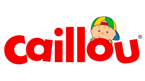
The Caillou logo is friendly and playful. The emblem shows a shy and curious toddler looking at the viewer, ready to make friends. The symbol invites you into a world of childhood and interesting stories.
Caillou: Brand overview
| Founded: | 1997 |
| Founder: | Hélène Desputeaux, Christine L’Heureux |
| Headquarters: | Canada |
| Website: | en.caillou.com |
Caillou – is a children’s educational cartoon based on the books by Hélène Desputeaux. It was released in Canada in both English and French. It spans five seasons, each featuring 20-minute episodes about a four-year-old boy and his family. It was aired on channels such as Teletoon, Treehouse TV, and PBS Kids. It concluded in 2010, with a continuation planned for 2023.
Meaning and History
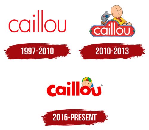
The series emblem gradually transformed. The direction shifted from depersonalization to direct interest in dialogue. Initially, the cartoon, like the logo, was closely tied to the books and had a verbal expression. However, over time, it developed a life of its own, and the emblem was enlivened by incorporating images of the main character and his friends. Initially, Caillou was engrossed in his own affairs and world. However, in the latest version of the logo, he became directly interested in his viewers. The rebrandings gradually fostered a close personal connection between the fans and the character.
What is Caillou?
It’s a children’s series and show consisting of 92 episodes, broken down into short segments interspersed with songs and puppet performances in the show. The series is actively broadcasted in Canada (Family Jr.) and the USA (Comcast/NBCUniversal, Cartoon Network). Since the beginning of filming, 15 million books have been sold based on which the series was filmed.
1997 – 2010
The first logo of the series barely resembled a children’s story: the cartoon’s title was in thin red letters. The emblem corresponds to the logo of the book series, which later served as the basis for the episodes.
The word Caillou – is the name of the main character who possesses a vivid imagination. In French, the original language of the books, the name means “pebble” and hints that the cartoon’s hero is bald. The creators of the series used this device so that children with different hair colors and lengths could identify with Caillou and understand that being different from others is normal.
The choice of name resonates with an interesting ritual invented by renowned French pediatrician and psychologist Françoise Dolto. She asked children to pay for their consultations with a pebble, giving them a sense of being full-fledged members of society who pay for their own services.
Red hue – is the color of surprise, adventure, and openness, which are all traits of the young hero. The thickness of the letters indicates his young age and the thin line between the real and the imaginary world. Caillou is just discovering himself and understanding who he is, which is why his name is still written tentatively and thinly.
2010 – 2013
By the fifth season, which was aired on a new channel, the logo was revised.
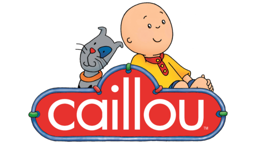
It was given more of a sense of childhood and individual characteristics. The boy’s name is written in white letters on a red plate, which resembles a car bumper because Caillou adores transportation.
Behind the plate is the character himself, who dreamily looks up, emphasizing the hero’s unique imagination, which he uses in each episode.
Next to the boy sits Gilbert – his beloved cat. The animal also looks up but in the other direction. This technique shows that the pet likes to ponder life, but not in a fanciful way.
The white letters hint at new discoveries and the young age of the hero.
2015 – today
In 2015, the series logo was updated during the broadcast on the American channel PBS Kids due to the release of additional videos for the 25th anniversary of the franchise (the first book was released in 1989).
The new emblem was a red title with dancing letters and a boy peeking out from behind it in a multicolored cap.
The playful tone of the emblem emphasized the orientation toward the children’s audience. Letters of different heights and inclinations show a fun pastime and episodes dedicated to various issues.
In this logo, Caillou looks attentively at the viewer and watches him, showing his interest, the desire to get acquainted, and making children feel comfortable with the character. The letter O, which the hero holds on to, resembles a ball and is a prototype of children’s toys and an offer to play.
Font and Colors
The bright colors of the logo show a bright children’s world full of fun, surprise, and novelty. The main shade chosen is red, which, like playful laughter, animates the emblem. The color reflects emotions, love, and joy from knowing the world. Indicates the various incidents around which the series are built.
The font of the inscription was created for the series. Its full and round glyphs tell about the rich and full life of Caillou: many close people and a huge world of fantasies, which for the baby mixes with reality.
Caillou color codes
| Red | Hex color: | #f30000 |
|---|---|---|
| RGB: | 243 0 0 | |
| CMYK: | 0 100 100 5 | |
| Pantone: | PMS 172 C |
| Bice Green | Hex color: | #01b13c |
|---|---|---|
| RGB: | 1 177 60 | |
| CMYK: | 99 0 66 31 | |
| Pantone: | PMS 354 C |
| Yellow | Hex color: | #ffd200 |
|---|---|---|
| RGB: | 255 210 0 | |
| CMYK: | 0 18 100 0 | |
| Pantone: | PMS 109 C |
| French Blue | Hex color: | #0179c6 |
|---|---|---|
| RGB: | 1 121 198 | |
| CMYK: | 99 39 0 22 | |
| Pantone: | PMS 3005 C |
| Deep Peach | Hex color: | #ffc697 |
|---|---|---|
| RGB: | 255 198 151 | |
| CMYK: | 0 22 41 0 | |
| Pantone: | PMS 1555 C |


