Designers have created a “Nordic” emblem with elements of cartoon style for the Canadian animation studio. Despite the external cold, the Nelvana logo radiates hope, dreaminess, confidence, resilience, and faith in a brighter future.
Nelvana: Brand overview
| Founded: | July 30, 1971 |
| Founder: | Michael Hirsh, Patrick Loubert, Clive A. Smith |
| Headquarters: | Toronto, Ontario, Canada |
| Website: | nelvana.com |
Meaning and History
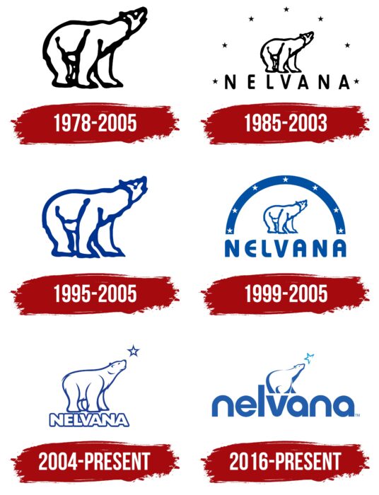
During the development of the company, the logo was redesigned six times. However, the main element, namely the polar bear, which looks at the polar star, remained unchanged.
What is Nelvana?
It is one of the largest Canadian animation studios, with over 40 years of experience. In addition to producing animated films, she is also known as a distributor of animated series, including on such cult sites as Nickelodeon.
1978 – 2005
The first version of the Nelvana logo appeared in 1978. It consisted of a single element, namely the emblem of the studio. It is an image of a bear turned to the right with its muzzle up. The image was made in black and white. Despite this, he looked quite confident and modern.
1985 – 2003
The image of the bear remained unchanged. At the same time, he was inside an arc consisting of seven black stars. Also, a verbal inscription appeared for the first time, which was an animal. For the name Nelvana, a classic sans-serif font was chosen. It consisted of large capital letters with thin lines. At the same time, there is a significant space between the symbols, which makes the logo lighter and more open to users.
1995 – 2005
Another redesign of the logo brought minimal changes to the original version of the logo. The black outline in the polar bear drawing has been replaced with a light blue one.
At the same time, the second version of the updated logo was presented. In it, the image of the bear also has a blue and white color scheme. The emblem is inside a blue arc, which is seven white stars. The name of the studio has an identical classic sans-serif font. However, the color has also been changed to blue.
1999 – 2005
The new redesign of Nelvana made small changes to the previous version. Significantly changed the style of writing verbal inscriptions. The studio’s name has become more voluminous and almost immediately catches the eye. Also, the lines in the letters are more rounded. All symbols are now closer to the arc and the main image, which indicates the interaction of elements. The arch uses a blue gradient to make the Nelvana logo look more modern and confident.
2004 – today
For the first time, changes were made to the image of the bear. Now he looks more natural, thanks to the attention to detail, such as the appearance of wool and high-quality rendering of the muzzle. Of the seven stars, only one remained, and the arch was completely removed from the logo. Thus, the picture began to look more realistic and modern. The verbal inscription has become voluminous thanks to white letters with blue outlines and a barely noticeable shadow. There was virtually no spacing between characters.
2016 – today
The most recent redesign has resulted in significant changes to the logo. Now the key element is the name “Nelvana,” which is twice as large as the image of the animal. It seems that the bear was left as a tribute to tradition. Moreover, the star has also been simplified. Now it has become not five-pointed but four-pointed. If we talk about the name, then the updates concerned the size of the word inscription and the font. It has become more modern and confident, and the rounded corners in the letters immediately catch the eye. In addition, for the first time, lowercase characters are used rather than uppercase.
Font and Colors
Different fonts were used at different stages of Nelvana’s functioning, ranging from classic sans-serif to modern style with three-dimensional letters and rounded corners.
The black and white color scheme, which the company actively used for the first time after the studio’s launch, was replaced with blue and white. The latter seems to be more suited to Nelvana’s profile of creating projects aimed at children. A polar bear with blue outlines looks interesting and fresh and arouses genuine interest among potential customers.
Nelvana color codes
| Medium Sapphire | Hex color: | #225eac |
|---|---|---|
| RGB: | 34 94 172 | |
| CMYK: | 80 45 0 33 | |
| Pantone: | PMS 2945 C |
| Spanish Sky Blue | Hex color: | #12a0db |
|---|---|---|
| RGB: | 18 160 219 | |
| CMYK: | 92 27 0 14 | |
| Pantone: | PMS 801 C |
