


![]() AMC Logo PNG
AMC Logo PNG
The AMC logo looks at the user from the TV screen. The emblem promises to fill the space with interesting and exciting content; the main thing is to stay on the channel. The sign shows that the company respects the audience’s preferences.
AMC began on October 1, 1984, when Rainbow Programming Services, a Cablevision unit, launched American Movie Classics. The channel focused on classic Hollywood films, mostly from before 1950, shown without ads, cuts, or colorization. Its early schedule included Marx Brothers marathons, 1940s noir, and old westerns. In 1988, AMC moved from premium cable to basic cable, gaining a larger audience but adding advertising. By 1990, it broadcast 24 hours a day.
In 1993, AMC introduced the Film Preservation Festival, built around restored and rare films. Rainbow then expanded its cable portfolio with Independent Film Channel in 1994 and Romance Classics (later WE tv) in 1997. By the early 2000s, Turner Classic Movies had secured much of the major classic film library from Warner Bros., MGM, and RKO, forcing AMC to rethink its place in television.
In 2002, AMC shifted toward modern films and original programming. The major break came in 2007 with Mad Men, after HBO and Showtime had passed on the project. Matthew Weiner’s 1960s advertising drama won 16 Emmys and a Peabody Award. In 2008, Breaking Bad, starring Bryan Cranston, also won 16 Emmys. In 2009, AMC introduced the slogan “Story Matters Here.”
The Walking Dead debuted in 2010 and became the highest-rated basic cable series among US viewers aged 18 to 49, with some episodes drawing more than 17 million viewers. In 2011, Cablevision spun AMC Networks into a public company on NASDAQ. The company bought a 49.9% stake in BBC America in 2014, launched the horror service Shudder in 2015, and by 2024 used AMC+ to combine network library titles with new originals.
Meaning and History
![]()
AMC Networks Inc. currently owns the AMC cable channel. It is its namesake brand, formerly known as American Movie Classics. It replaced Montage as the broadcaster of classic movies in North America. The program originally contained black-and-white films from the 1930s and 1950s and was free of commercials. This changed in 2002 to include contemporary shows, TV series, and commercial blocks. After the change in content, the acronym “AMC” lost its original meaning; now it is considered an independent name and is not deciphered.
The network’s logos have changed as often as its eras. Except for the first one, almost all had a similar structure: an inscription inside a quadrangle.
1984 – 1989
![]()
In 1984, Rainbow Programming Services added a new network to its portfolio, American Movie Classics. The logo featured this name: the designers set it in a column, using a font with contrasting stroke thickness. On each side of the second word were two five-pointed stars, from which three horizontal lines ran sideways.
1989 – 1993
![]()
At the end of the 1980s, the channel got a new graphic sign consisting of three overlapping rhombuses. A dark rhombus was shown in the foreground, and two light rhombuses were behind it. Visible parts of the figures in the background formed a discontinuous frame. The word combination “AMERICAN MOVIE CLASSICS,” traditionally divided into three lines, was written on top of the geometric composition. The designers chose a high-contrast white font with serifs and shadows.
1993 – 1999
![]()
The redesigned logo contained a khaki rhombus with two beige mini-triangles on each side. The frame, separated by thin lines, created a visual effect of volume. The orange acronym “AMC” overlapped the design, and the network’s full name was written in a thin, elegant, sans-serif typeface at the bottom.
1999 – 2002
![]()
A new logo appeared when the channel began airing commercials at the turn of the century. The rhombus was turned white and given an asymmetrical blue border. The word “AMC” was slightly reduced, with the designers replacing the wide serifs with pointed serifs. The corners of the diamond-shaped base, by contrast, were rounded. The phrase “AMERICAN MOVIE CLASSICS” disappeared. The author of this version is PMcD Design.
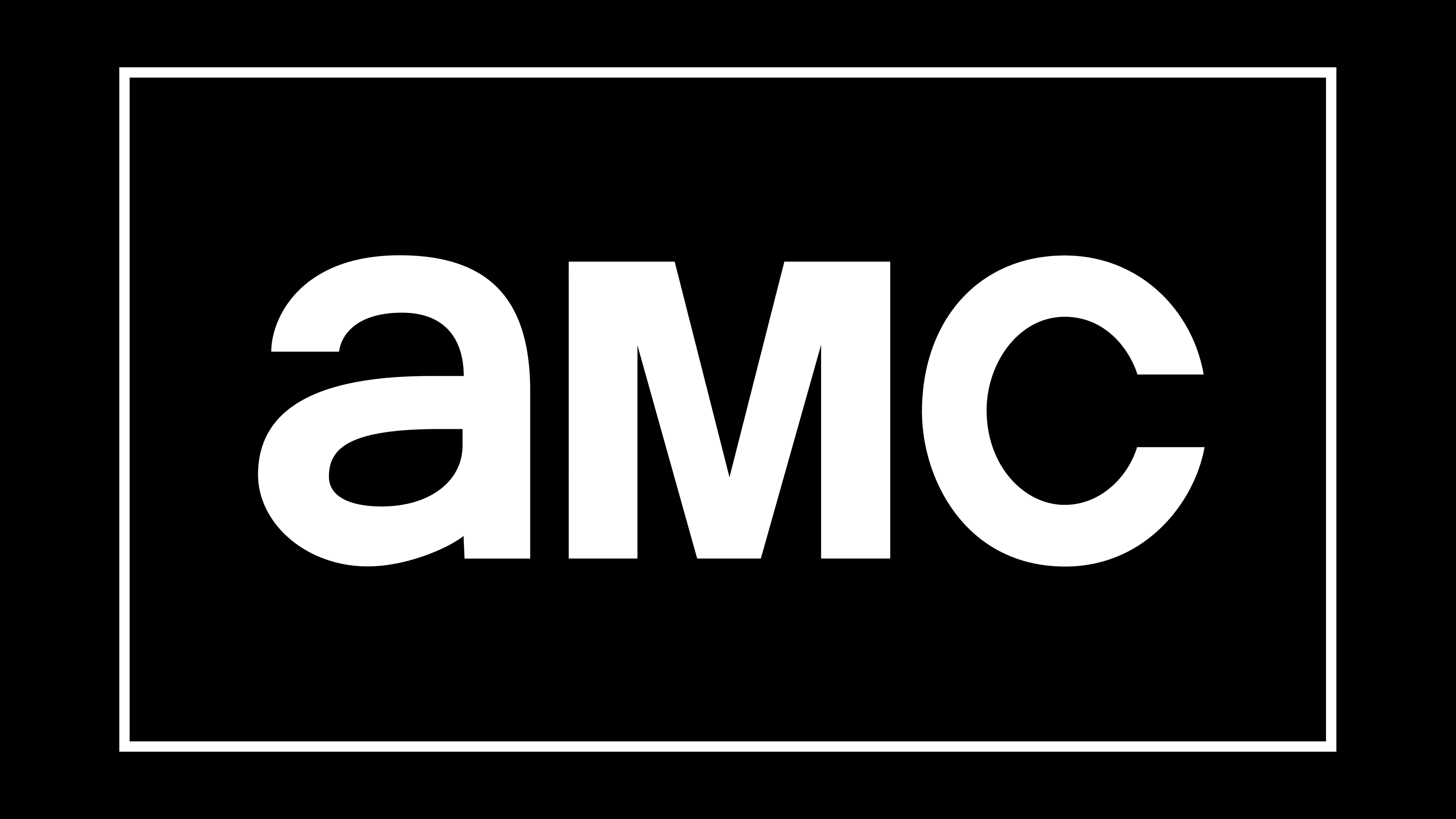
2002 – 2013
![]()
In 2002, the network significantly expanded its program beyond the standard format. At the same time, it changed its visual identity, entrusting the process to Trollbäck & Company. The specialists redesigned the logo for a minimalist look. They put the black “AMC” lettering inside a white rectangle with a dark border. The first “a” looked lowercase, and the second “M” looked like a capital letter. At the same time, all three letters were the same size.
2013 – 2016
![]()
When the third season of The Walking Dead ended, the channel announced another rebranding. Designers redesigned the emblem again, depicting the base as a golden rectangle with a gradient.
2016 – 2019
![]()
The rectangle went black after a slight update, and the lettering went white.
2019 – today
![]()
In 2019, Trollbäck & Company brought back the 2002 design, making the outer outline a little thinner. The base is now white again, and the abbreviation is presented in black.
Font and Colors
The AMC logo has no noteworthy graphic elements. It is used only as the TV channel’s “signature,” containing only its name and a rectangular frame. This distinguishes the modern emblem from earlier versions before 2000, which were decorated with various motifs, from rhombuses to stars.
The uppercase and lowercase letters were combined in the “AMC” abbreviation, where the designers combined a and c with a capital M and set them to the same height. Trollbäck & Company chose the font. It’s somewhat similar to Coolvetica and a bit more similar to the New Rail Alphabet (NRA), but the overlap between them isn’t 100%.
The black-and-white palette evokes the colors of the classic movies that started the network. It’s also a tribute to the trendy minimalism used for the logo design.